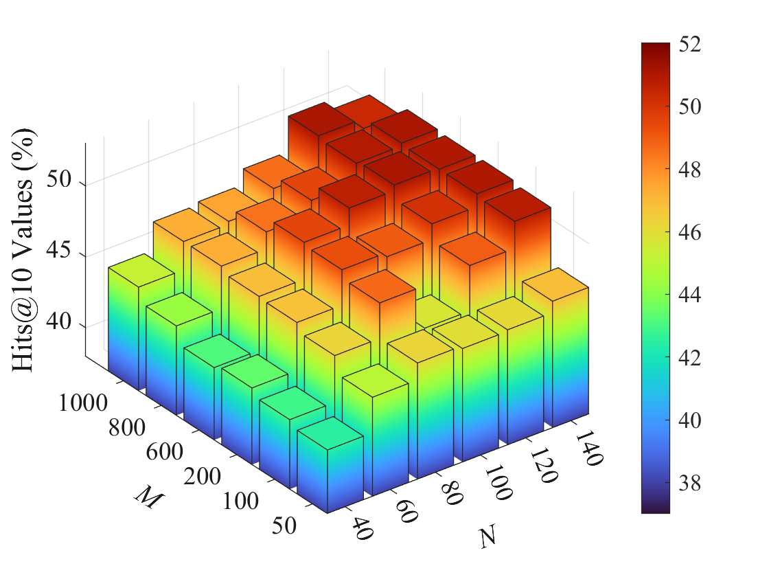
## 3D Bar Chart: Hits@10 Values vs. Parameters M and N
### Overview
This image is a 3D bar chart visualizing the performance metric "Hits@10 Values (%)" as a function of two independent parameters, labeled **M** and **N**. The chart uses both bar height and a color gradient to represent the value of the Hits@10 metric. A color scale bar is provided on the right side of the chart for reference.
### Components/Axes
* **Vertical Axis (Z-axis):** Labeled **"Hits@10 Values (%)"**. The scale runs from approximately 38% to 52%, with major tick marks at 40, 45, and 50.
* **Left Horizontal Axis (X-axis):** Labeled **"M"**. It represents a categorical or discrete numerical parameter with the following values, listed from front to back: **50, 100, 200, 600, 800, 1000**.
* **Right Horizontal Axis (Y-axis):** Labeled **"N"**. It represents a second categorical or discrete numerical parameter with the following values, listed from left to right: **40, 60, 80, 100, 120, 140**.
* **Color Bar/Legend:** Positioned vertically on the far right of the image. It maps the color of the bars to the numerical Hits@10 value. The scale ranges from **38 (dark blue/purple)** at the bottom to **52 (dark red)** at the top, with intermediate labels at 40, 42, 44, 46, 48, and 50.
### Detailed Analysis
The chart displays a grid of 36 bars (6 values of M × 6 values of N). The height and color of each bar correspond to the Hits@10 value for that specific (M, N) pair.
**Trend Verification:**
1. **Trend with M:** For a fixed value of N, the bar height (and thus Hits@10 value) generally **increases** as M increases from 50 to 1000. This is visible as the bars get taller and shift from blue/green towards yellow/red as you move from the front (M=50) to the back (M=1000) of the chart along any row.
2. **Trend with N:** For a fixed value of M, the bar height generally **increases** as N increases from 40 to 140. This is visible as the bars get taller and shift from blue/green towards yellow/red as you move from the left (N=40) to the right (N=140) of the chart along any column.
3. **Combined Peak:** The highest bars, colored dark red, are located in the **back-right corner** of the chart, corresponding to the highest values of both parameters: **M=1000 and N=140**. The value here is approximately **52%**.
4. **Combined Low:** The lowest bars, colored dark blue, are located in the **front-left corner**, corresponding to the lowest values: **M=50 and N=40**. The value here is approximately **38%**.
**Approximate Value Extraction (by visual interpolation from color bar):**
* **Front Row (M=50):** Values range from ~38% (N=40) to ~44% (N=140). The gradient is from blue to green/yellow.
* **Back Row (M=1000):** Values range from ~46% (N=40) to ~52% (N=140). The gradient is from orange to dark red.
* **Left Column (N=40):** Values range from ~38% (M=50) to ~46% (M=1000).
* **Right Column (N=140):** Values range from ~44% (M=50) to ~52% (M=1000).
### Key Observations
1. **Monotonic Increase:** The performance metric (Hits@10) shows a clear, monotonic increase with both parameters M and N across the entire tested range. There are no visible local maxima or minima within the grid.
2. **Synergistic Effect:** The increase appears to be synergistic. The gain from increasing M is more pronounced at higher values of N, and vice-versa. The steepest gradient (fastest color change) is along the diagonal from (M=50, N=40) to (M=1000, N=140).
3. **Color-Height Correlation:** The color gradient perfectly correlates with bar height, providing a redundant and clear visual encoding of the data value. The color bar is essential for precise value estimation.
### Interpretation
This chart demonstrates the relationship between two hyperparameters (M and N) and a model's retrieval or ranking performance (Hits@10). The data suggests that **increasing both M and N leads to better performance**, with the best results achieved when both parameters are set to their highest tested values (M=1000, N=140).
The "Hits@10" metric typically measures the percentage of test queries where the correct answer appears within the top 10 retrieved results. Therefore, the chart indicates that larger model capacity or complexity (which M and N likely represent, such as embedding dimensions, number of layers, or dataset size) correlates with improved accuracy in this task.
The absence of a performance plateau within the tested range implies that further gains might be possible by increasing M and N beyond 1000 and 140, respectively, though this would likely come with increased computational cost. The smooth, predictable trend suggests a stable and well-behaved relationship between these parameters and model performance for the given task.