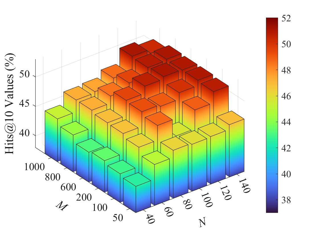
## 3D Bar Chart: Hits@10 Values (%) vs. M and N
### Overview
The image is a 3D bar chart visualizing the "Hits@10 Values (%)" as a function of two variables, M and N. The chart displays a grid of bars, where the height and color of each bar represent the "Hits@10 Values (%)" for specific combinations of M and N. The color gradient ranges from dark blue (low values) to dark red (high values), as indicated by the colorbar on the right.
### Components/Axes
* **Vertical Axis (Hits@10 Values (%)):** Ranges from approximately 38% to 52%.
* **M Axis:** Ranges from 50 to 1000.
* **N Axis:** Ranges from 40 to 140.
* **Colorbar:** A vertical colorbar on the right side of the chart maps the "Hits@10 Values (%)" to a color gradient. The colorbar ranges from dark blue (38) to dark red (52).
### Detailed Analysis
The chart displays a grid of bars, each representing a combination of M and N values. The height and color of each bar correspond to the "Hits@10 Values (%)" for that specific combination.
* **M Values:** 50, 100, 200, 600, 800, 1000
* **N Values:** 40, 60, 80, 100, 120, 140
**Data Points (Approximate):**
To accurately describe the data, I will describe the trend for each 'N' value as 'M' increases.
* **N = 40:** The "Hits@10 Values (%)" starts around 43% (blue-green) for M=50 and gradually increases to approximately 47% (orange) as M increases to 1000.
* **N = 60:** The "Hits@10 Values (%)" starts around 44% (green) for M=50 and gradually increases to approximately 48% (orange-red) as M increases to 1000.
* **N = 80:** The "Hits@10 Values (%)" starts around 45% (green-yellow) for M=50 and gradually increases to approximately 49% (red) as M increases to 1000.
* **N = 100:** The "Hits@10 Values (%)" starts around 46% (yellow) for M=50 and gradually increases to approximately 50% (red) as M increases to 1000.
* **N = 120:** The "Hits@10 Values (%)" starts around 45% (green-yellow) for M=50 and gradually increases to approximately 49% (red) as M increases to 1000.
* **N = 140:** The "Hits@10 Values (%)" starts around 43% (green) for M=50 and gradually increases to approximately 47% (orange) as M increases to 1000.
### Key Observations
* The "Hits@10 Values (%)" generally increases as both M and N increase, but the effect of M seems more pronounced.
* The highest "Hits@10 Values (%)" (around 50-52%) are observed when both M and N are at their highest values (M=1000, N=100).
* The lowest "Hits@10 Values (%)" (around 43%) are observed when both M and N are at their lowest values (M=50, N=40).
### Interpretation
The chart suggests that increasing both M and N leads to higher "Hits@10 Values (%)". The parameter M appears to have a more significant impact on the "Hits@10 Values (%)" than the parameter N. The optimal performance, as indicated by the highest "Hits@10 Values (%)", is achieved when both M and N are maximized. This could indicate that a larger sample size (M) and a higher number of features (N) contribute to better performance in the context of whatever this data represents.