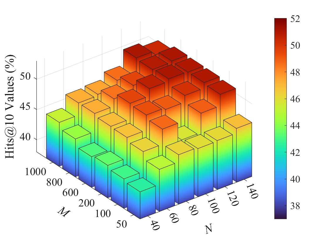
## 3D Bar Chart: Hits@10 Values vs. M and N
### Overview
The image presents a 3D bar chart visualizing the relationship between two variables, 'M' and 'N', and their impact on 'Hits@10 Values (%)'. The chart uses a color gradient to represent the magnitude of the 'Hits@10 Values (%)', with red indicating higher values and blue indicating lower values. The chart appears to represent a performance metric (Hits@10) as a function of two parameters (M and N).
### Components/Axes
* **X-axis (Horizontal):** Labeled 'N', ranging from approximately 40 to 140, with markers at 40, 60, 80, 100, 120, and 140.
* **Y-axis (Depth):** Labeled 'M', ranging from approximately 100 to 1000, with markers at 100, 200, 400, 600, 800, and 1000.
* **Z-axis (Vertical):** Labeled 'Hits@10 Values (%)', ranging from approximately 38% to 52%.
* **Color Legend:** Located in the top-right corner, representing 'Hits@10 Values (%)'. The color gradient transitions from dark blue (approximately 38%) to red (approximately 52%), with intermediate colors of green and yellow representing values in between. The legend has markers at 38, 40, 42, 44, 46, 48, 50, and 52.
### Detailed Analysis
The chart displays a grid of bars, where each bar's height represents the 'Hits@10 Values (%)' for a specific combination of 'M' and 'N'.
* **Trend:** The chart shows a general trend of increasing 'Hits@10 Values (%)' as both 'M' and 'N' increase. The highest values are concentrated in the top-right corner of the chart (high 'M' and high 'N'). The lowest values are concentrated in the bottom-left corner (low 'M' and low 'N').
* **Specific Values (Approximate):**
* When N = 40 and M = 100, Hits@10 Values (%) ≈ 40%.
* When N = 40 and M = 1000, Hits@10 Values (%) ≈ 42%.
* When N = 140 and M = 100, Hits@10 Values (%) ≈ 44%.
* When N = 140 and M = 1000, Hits@10 Values (%) ≈ 51%.
* When N = 80 and M = 600, Hits@10 Values (%) ≈ 46%.
* When N = 60 and M = 400, Hits@10 Values (%) ≈ 44%.
* The peak value appears to be around 51-52% when both M and N are at their highest values.
* The lowest value appears to be around 38-40% when both M and N are at their lowest values.
### Key Observations
* The chart demonstrates a positive correlation between 'M', 'N', and 'Hits@10 Values (%)'.
* The effect of increasing 'M' appears to be more pronounced than increasing 'N', as the bars tend to increase more rapidly along the 'M' axis.
* There is a relatively smooth gradient across the chart, suggesting a consistent relationship between the variables.
### Interpretation
The data suggests that the performance metric 'Hits@10 Values (%)' improves as the values of parameters 'M' and 'N' increase. This could indicate that larger values of 'M' and 'N' lead to better results in whatever system or process is being measured. The chart provides a visual representation of this relationship, allowing for a quick assessment of how changes in 'M' and 'N' affect performance. The consistent gradient suggests a predictable and reliable relationship between the variables. The 'Hits@10' metric likely refers to the proportion of times a correct result appears within the top 10 results returned by a system (e.g., a search engine or recommendation system). 'M' and 'N' could represent parameters related to the size of the dataset, the complexity of the model, or the amount of training data used. The chart is a valuable tool for optimizing the values of 'M' and 'N' to maximize 'Hits@10 Values (%)'.