## 3D Bar Chart: Hits@10 Values as a Function of M and N
### Overview
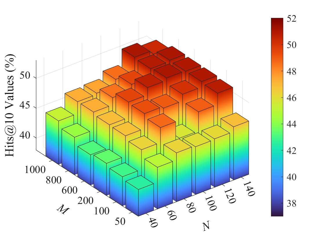
The image depicts a 3D bar chart visualizing the relationship between two variables, **M** (x-axis) and **N** (y-axis), and their impact on **Hits@10 Values (%)** (z-axis). The chart uses a color gradient (blue to red) to represent values ranging from 38% to 52%, with a legend on the right side. Bars are arranged in a grid, with height and color intensity indicating the magnitude of Hits@10 Values.
---
### Components/Axes
1. **X-Axis (M)**: Labeled "M," with values ranging from **40 to 140** in increments of 20.
2. **Y-Axis (N)**: Labeled "N," with values ranging from **50 to 1000** in increments of 100.
3. **Z-Axis (Hits@10 Values %)**: Labeled "Hits@10 Values (%)", with values from **38% to 52%**.
4. **Legend**: Positioned on the right, mapping colors to percentage values:
- **Blue**: 38% (lowest)
- **Green**: 42–44%
- **Yellow**: 44–46%
- **Orange**: 46–48%
- **Red**: 48–52% (highest)
---
### Detailed Analysis
- **Bar Structure**:
- Bars are organized in a grid, with each bar corresponding to a unique combination of **M** and **N**.
- Height and color intensity increase with higher Hits@10 Values.
- Example: The tallest bar (52%) is at **M=140, N=1000** (top-right corner), while the shortest (38%) is at **M=40, N=50** (bottom-left corner).
- **Color Gradient**:
- Blue dominates the lower-left region (low M and N).
- Red dominates the upper-right region (high M and N).
- Intermediate values (green/yellow/orange) occupy the middle ranges.
- **Trends**:
- **Positive Correlation**: As **M** and **N** increase, Hits@10 Values consistently rise.
- **Nonlinear Growth**: The steepest increase occurs at higher M and N values (e.g., M=100–140, N=800–1000).
---
### Key Observations
1. **Outlier**: The bar at **M=140, N=1000** (52%) is the only value exceeding 50%, standing out as the maximum.
2. **Consistency**: No bars fall below 38% or above 52%, indicating bounded data.
3. **Spatial Pattern**: The gradient forms a "hill" shape, with the peak at the top-right and the base at the bottom-left.
---
### Interpretation
The chart demonstrates that **Hits@10 Values (%)** are strongly influenced by both **M** and **N**, with higher values of these variables leading to significantly improved performance. The 3D structure highlights the interplay between the two variables, suggesting a multiplicative or synergistic effect. For example:
- Doubling **M** (from 40 to 80) while keeping **N** constant (e.g., 50) increases Hits@10 from ~38% to ~42%.
- Increasing **N** from 50 to 1000 at **M=140** boosts Hits@10 from ~48% to 52%.
This pattern implies that optimizing both **M** and **N** is critical for maximizing Hits@10, with diminishing returns observed at the upper bounds of the variables. The absence of values outside the 38–52% range suggests the dataset is well-constrained, possibly reflecting a controlled experimental setup.