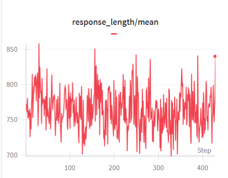
## Line Chart: response_length/mean
### Overview
The image displays a line chart tracking the metric "response_length/mean" over a series of steps. The chart shows a single, highly volatile red line plotted against a white background with light gray grid lines. The data exhibits significant fluctuation without a clear, sustained upward or downward trend across the observed range.
### Components/Axes
* **Chart Title:** "response_length/mean" (centered at the top). A small red dash is positioned directly below the title, likely serving as a legend indicator for the single data series.
* **X-Axis (Horizontal):**
* **Label:** "Step" (positioned at the bottom-right corner of the axis).
* **Scale:** Linear scale from 0 to just beyond 400.
* **Major Tick Marks:** Labeled at 100, 200, 300, and 400.
* **Y-Axis (Vertical):**
* **Scale:** Linear scale from 700 to 850.
* **Major Tick Marks:** Labeled at 700, 750, 800, and 850.
* **Data Series:** A single, continuous red line representing the "response_length/mean" value at each step.
* **Final Data Point:** A distinct red dot marks the final data point at the far right of the chart, corresponding to a step value slightly beyond 400.
### Detailed Analysis
* **Trend Verification:** The red line does not exhibit a consistent monotonic trend. It is characterized by high-frequency, high-amplitude oscillations throughout the entire range from step 0 to step ~420.
* **Data Range and Key Points:**
* **Initial Value (Step ~0):** The line begins at approximately 750.
* **Highest Peak:** The maximum value occurs early in the series, around step 30-50, reaching approximately 850.
* **Other Significant Peaks:** Notable peaks occur around step 180 (~850) and step 250 (~840).
* **Lowest Troughs:** The line dips to its lowest values, near 700, at several points, most prominently around steps 150 and 300.
* **Final Value (Step ~420):** The series ends at a value of approximately 840, indicated by the red dot.
* **Volatility:** The metric shows extreme volatility. The value frequently swings by 50-100 units within a short span of 10-20 steps. The amplitude of these fluctuations remains relatively consistent across the entire chart.
### Key Observations
1. **High Variance:** The primary characteristic of the data is its noise and lack of stability. The mean response length does not settle into a predictable pattern.
2. **Absence of Clear Trend:** Despite the volatility, there is no visually obvious long-term increasing or decreasing trend. The data oscillates around a central tendency roughly between 750 and 800.
3. **Early Maximum:** The highest recorded value appears very early in the process (within the first 15% of steps).
4. **Consistent Fluctuation Band:** The data predominantly stays within the 700-850 band, with only the earliest peak touching the upper limit.
### Interpretation
This chart likely visualizes a performance or behavioral metric from an iterative process, such as machine learning model training (where "Step" could be training iterations or batches) or a system monitoring log. The metric "response_length/mean" suggests it tracks the average length of outputs (e.g., text generations, API responses) generated at each step.
The extreme volatility indicates that the process is highly unstable with respect to this metric. The average output length is not converging or following a controlled trajectory. This could be due to:
* **Exploration in Training:** An RLHF or fine-tuning process where the model is actively exploring different response styles.
* **Noisy Data or Rewards:** The underlying data or reward signal guiding the process is inconsistent.
* **System Instability:** In a non-ML context, it could indicate an uncontrolled process with significant random variation.
The lack of a downward trend might suggest that efforts to stabilize or reduce response length (if that was a goal) are not effective. Conversely, the lack of an upward trend suggests the process is not systematically increasing length. The final value being near the upper range of the historical data is a notable point, but given the high variance, it is unclear if this is significant or just another fluctuation. To derive more meaning, this chart would need to be correlated with other metrics (e.g., loss, accuracy, user feedback) from the same process.