## Line Chart: Response Length/Mean vs. Step
### Overview
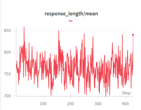
The image is a line chart displaying the "response_length/mean" over a series of "steps". The chart shows fluctuations in response length, with a general trend of stability, except for a notable spike at the end.
### Components/Axes
* **Title:** response\_length/mean
* **X-axis:** Step, with markers at approximately 0, 100, 200, 300, and 400.
* **Y-axis:** Response Length/Mean, with markers at 700, 750, 800, and 850.
* **Legend:** A single entry, represented by a short red line, corresponding to the red line in the chart.
### Detailed Analysis
* **Data Series:** The chart contains a single data series, represented by a red line.
* **Trend:** The red line fluctuates between approximately 720 and 850 for most of the steps. There is a noticeable spike at the end (around step 400), reaching a value of approximately 840.
* **Specific Values:**
* At Step 0, the response length/mean is approximately 810.
* At Step 100, the response length/mean is approximately 770.
* At Step 200, the response length/mean is approximately 750.
* At Step 300, the response length/mean is approximately 770.
* At Step 400, the response length/mean is approximately 840.
### Key Observations
* The response length/mean is generally stable, fluctuating within a range of approximately 130 units.
* The most significant change occurs at the end of the series, with a sharp increase in response length/mean.
### Interpretation
The chart illustrates the variability in response length/mean over a series of steps. The stability of the response length/mean for most of the steps suggests a consistent process. The spike at the end indicates a potential change or anomaly in the process that warrants further investigation. The data suggests that the system or process being measured experienced a significant change in its response length towards the end of the observed period.