\n
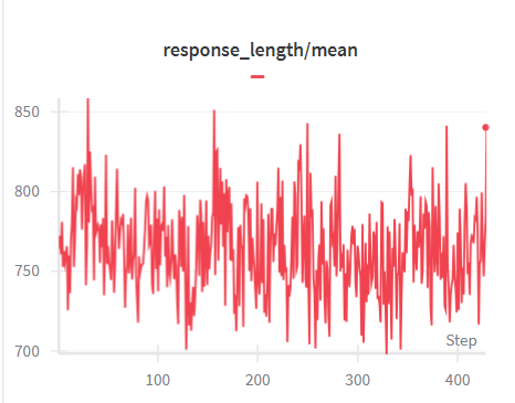
## Line Chart: Response Length / Mean
### Overview
The image displays a line chart illustrating the relationship between "response_length" and "mean" over a series of "Steps". The chart shows a fluctuating line, indicating variations in response length relative to the mean.
### Components/Axes
* **Title:** "response\_length/mean" positioned at the top-center of the chart.
* **X-axis:** Labeled "Step", ranging from approximately 0 to 400. The axis is divided into increments of 100.
* **Y-axis:** Ranges from approximately 700 to 850. The scale is linear, with increments of approximately 50.
* **Data Series:** A single line, colored red, representing the "response\_length/mean" values.
### Detailed Analysis
The red line exhibits a highly volatile pattern.
* **Initial Trend (Step 0-100):** The line starts at approximately 820 and generally declines, with significant fluctuations, reaching a low point around 730 at Step 50.
* **Mid-Range Trend (Step 100-300):** The line oscillates between approximately 730 and 840, with frequent peaks and troughs. There is no clear upward or downward trend during this period.
* **Final Trend (Step 300-400):** The line remains volatile, but shows a slight upward trend, culminating in a peak of approximately 845 at Step 400.
Approximate data points (readings are approximate due to the chart's resolution):
* Step 0: ~820
* Step 50: ~730
* Step 100: ~780
* Step 150: ~830
* Step 200: ~750
* Step 250: ~800
* Step 300: ~770
* Step 350: ~810
* Step 400: ~845
### Key Observations
* The response length/mean is highly variable, with fluctuations of approximately 100-120 units around the mean.
* There is no consistent long-term trend; the line oscillates without a clear upward or downward direction.
* The highest value observed is around 845, and the lowest is around 730.
* The final data point at Step 400 shows a slight increase, but it's unclear if this indicates a sustained trend.
### Interpretation
The chart suggests that the response length, relative to the mean, is subject to significant random variation. This could be due to several factors, such as:
* **Data Noise:** The underlying data may contain inherent noise or errors.
* **External Factors:** External variables not represented in the chart may be influencing the response length.
* **System Dynamics:** The system generating the responses may exhibit inherent instability or fluctuations.
The lack of a clear trend suggests that the response length is not systematically increasing or decreasing over time. The final uptick at Step 400 could be a temporary fluctuation or the beginning of a new trend, but further data would be needed to confirm this. The chart is useful for identifying the range of variation in response length and for detecting potential anomalies or outliers.