## Bar Chart: Causal Attribution: The Impact of Exogenous "Luck"
### Overview
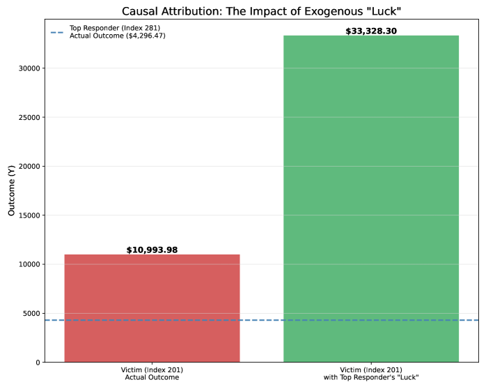
This is a vertical bar chart comparing two financial outcomes for a single subject ("Victim (Index 201)") under different conditions. The chart visually demonstrates the significant positive impact of applying an exogenous factor labeled "Top Responder's 'Luck'" to the victim's actual outcome. A reference line shows the actual outcome of a separate "Top Responder" for comparison.
### Components/Axes
* **Chart Title:** "Causal Attribution: The Impact of Exogenous 'Luck'"
* **Y-Axis:**
* **Label:** "Outcome (¥)" (The symbol "¥" indicates the currency is likely Japanese Yen or Chinese Yuan).
* **Scale:** Linear scale from 0 to over 30,000.
* **Major Tick Marks:** 0, 5000, 10000, 15000, 20000, 25000, 30000.
* **X-Axis (Categories):**
1. **Left Bar (Red):** "Victim (Index 201) Actual Outcome"
2. **Right Bar (Green):** "Victim (Index 201) with Top Responder's 'Luck'"
* **Legend (Top-Left Corner):**
* A blue dashed line icon labeled: "Top Responder (Index 281) Actual Outcome ($4,296.47)"
* *Note: The legend uses a dollar sign ($), while the y-axis uses a yen/yuan sign (¥). This is a notable inconsistency in the source data.*
* **Data Labels (On top of bars):**
* Red Bar: **$10,993.98**
* Green Bar: **$33,328.30**
* **Reference Line:** A horizontal blue dashed line runs across the chart at the y-value corresponding to $4,296.47, visually anchored to the legend description.
### Detailed Analysis
1. **Data Series & Values:**
* **Victim's Actual Outcome (Red Bar):** The outcome is **$10,993.98**. The bar extends from the x-axis to just above the 10,000 mark on the y-axis.
* **Victim's Outcome with Luck (Green Bar):** The outcome is **$33,328.30**. The bar extends from the x-axis to a point between the 30,000 and 35,000 (implied) marks on the y-axis.
* **Top Responder's Actual Outcome (Blue Dashed Line):** The outcome is **$4,296.47**. This line is positioned below the 5,000 mark on the y-axis.
2. **Trend & Comparison:**
* The visual trend is a dramatic increase. The green bar ("with Luck") is approximately **3.03 times taller** than the red bar ("Actual Outcome").
* Both victim outcomes are substantially higher than the Top Responder's actual outcome. The victim's actual outcome is ~2.55 times the Top Responder's, and the outcome with luck is ~7.76 times the Top Responder's.
### Key Observations
* **Magnitude of Impact:** The application of "Top Responder's 'Luck'" results in an absolute increase of **$22,334.32** ($33,328.30 - $10,993.98) for the victim.
* **Currency Symbol Discrepancy:** The y-axis is labeled in ¥ (Yen/Yuan), but all data labels and the legend use $ (Dollar). This suggests a potential error in chart creation or that the values are being presented in a different currency than the axis label implies.
* **Relative Performance:** The "Top Responder" (Index 281) has a lower actual outcome than the "Victim" (Index 201) in both scenarios presented. The chart's narrative focuses on the victim's potential gain from the responder's "luck," not the responder's own performance.
### Interpretation
The chart is designed to argue for a strong causal effect of an external, luck-based factor. It visually separates the victim's inherent outcome (red bar) from the outcome achievable when augmented by an external positive shock (green bar). The large disparity between the bars is the central message: "luck" is portrayed as a transformative element.
The inclusion of the Top Responder's much lower actual outcome (blue line) serves a dual purpose:
1. It establishes a baseline for the "luck" source, showing that the responder's own typical result is modest.
2. It highlights that the victim, even without the luck factor, outperforms the responder. This frames the "luck" as an additive bonus on top of an already superior base performance, rather than a corrective equalizer.
The currency symbol inconsistency is a critical flaw that undermines the data's credibility. A technical reader must question whether the values are directly comparable or if a conversion is missing. Assuming the numerical values are correct in their own context, the chart effectively communicates a narrative of substantial, externally-driven gain.