## Heatmap: Numerical Grid
### Overview
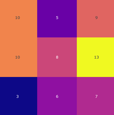
The image is a heatmap representing a 3x3 grid of numerical values. Each cell is colored according to its value, with a color gradient ranging from dark blue (lowest values) to bright yellow (highest values).
### Components/Axes
* **Grid:** 3 rows and 3 columns.
* **Values:** The numerical values within each cell.
* **Color Gradient:** The color of each cell corresponds to its numerical value.
### Detailed Analysis
Here's a breakdown of the values and their corresponding colors:
* **Row 1:**
* Cell 1 (top-left): 10 (orange)
* Cell 2 (top-center): 5 (purple)
* Cell 3 (top-right): 9 (red-orange)
* **Row 2:**
* Cell 1 (middle-left): 10 (orange)
* Cell 2 (middle-center): 8 (pink)
* Cell 3 (middle-right): 13 (yellow)
* **Row 3:**
* Cell 1 (bottom-left): 3 (dark blue)
* Cell 2 (bottom-center): 6 (purple)
* Cell 3 (bottom-right): 7 (purple-pink)
### Key Observations
* The highest value is 13, located in the middle-right cell.
* The lowest value is 3, located in the bottom-left cell.
* The values are not uniformly distributed.
### Interpretation
The heatmap visually represents the distribution of numerical values across a 3x3 grid. The color gradient allows for a quick assessment of the relative magnitudes of the values. The data suggests that the highest values are concentrated in the middle-right cell, while the lowest value is in the bottom-left cell. The heatmap provides a clear and intuitive way to compare the values and identify patterns.