\n
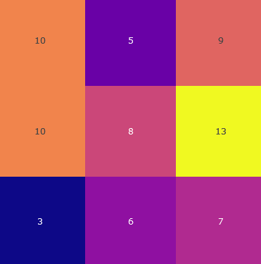
## Heatmap: 3x3 Grid with Numerical Values
### Overview
The image displays a 3x3 grid (matrix) of colored squares, each containing a numerical value. It functions as a simple heatmap or data matrix where color and number together represent a data point. There are no explicit row or column labels, titles, or a legend provided within the image itself.
### Components/Axes
* **Structure:** A 3x3 grid forming 9 distinct cells.
* **Data Representation:** Each cell is defined by a unique color and contains a centered integer.
* **Labels/Axes:** None present. The grid has no labeled rows or columns.
* **Legend:** None present. The meaning of the color scale is not defined.
### Detailed Analysis
The grid is analyzed row by row, from top to bottom, left to right.
**Row 1 (Top):**
1. **Top-Left Cell:** Color: Orange. Value: `10`.
2. **Top-Middle Cell:** Color: Deep Purple. Value: `5`.
3. **Top-Right Cell:** Color: Salmon/Light Red. Value: `9`.
**Row 2 (Middle):**
1. **Middle-Left Cell:** Color: Orange (visually identical to Top-Left). Value: `10`.
2. **Center Cell:** Color: Mauve/Dusty Pink. Value: `8`.
3. **Middle-Right Cell:** Color: Bright Yellow. Value: `13`.
**Row 3 (Bottom):**
1. **Bottom-Left Cell:** Color: Dark Blue/Navy. Value: `3`.
2. **Bottom-Middle Cell:** Color: Purple (lighter/different hue than Top-Middle). Value: `6`.
3. **Bottom-Right Cell:** Color: Magenta/Dark Pink. Value: `7`.
### Key Observations
1. **Value Range:** The numerical values range from a low of `3` (Bottom-Left) to a high of `13` (Middle-Right).
2. **Color-Value Correlation:** While no legend exists, a visual pattern suggests color intensity may correlate with value. The highest value (`13`) is in the brightest color (yellow), and the lowest (`3`) is in the darkest color (navy blue).
3. **Duplicate Value & Color:** The value `10` appears twice, in the Top-Left and Middle-Left cells, and both are the same shade of orange.
4. **Color Variation:** Two distinct purple hues are used: a deep purple for value `5` (Top-Middle) and a lighter purple for value `6` (Bottom-Middle).
5. **Spatial Distribution:** The highest value (`13`) is located in the middle-right position. The lowest value (`3`) is in the bottom-left corner. The center cell holds a mid-range value (`8`).
### Interpretation
This image is a raw data visualization, likely a heatmap matrix, presenting nine data points in a grid format. The absence of labels, titles, and a legend makes it impossible to determine the specific context (e.g., what the rows, columns, or colors represent). However, the data itself suggests a distribution where:
* One cell (Middle-Right, yellow, `13`) is a significant outlier on the high end.
* One cell (Bottom-Left, navy, `3`) is an outlier on the low end.
* The remaining values cluster between `5` and `10`.
* The repetition of the value `10` with the same color in the first column may indicate a consistent measurement or category for that column.
To be fully interpretable, this matrix requires accompanying metadata defining the row and column categories and a color scale legend explaining the relationship between hue and numerical value. As it stands, it is an abstract representation of a 3x3 dataset with a clear visual emphasis on the extreme values.