## Heatmap: Value Distribution Across Rows and Columns
### Overview
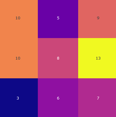
The image is a 3x3 heatmap with numerical values in colored cells. The rows are labeled with values (10, 10, 3) in the first column, and the columns are labeled with values (5, 8, 13) in the top row. Each cell contains a numerical value, and the color of the cell corresponds to the magnitude of the value, as defined by a legend.
### Components/Axes
- **Rows**: Labeled with values **10**, **10**, and **3** (leftmost column).
- **Columns**: Labeled with values **5**, **8**, and **13** (top row).
- **Legend**:
- **Dark purple**: Low values (3–5).
- **Medium purple**: Medium values (6–8).
- **Yellow**: High values (9–13).
- **Color Gradient**: The heatmap transitions from dark purple (low) to yellow (high), with red appearing in the middle range (6–8).
### Detailed Analysis
| Row \ Column | 5 | 8 | 13 |
|--------------|-------|-------|-------|
| **10** | 10 (red) | 5 (dark purple) | 9 (red) |
| **10** | 10 (red) | 8 (medium purple) | 13 (yellow) |
| **3** | 3 (dark purple) | 6 (medium purple) | 7 (medium purple) |
- **Row 1 (10)**:
- Column 5: **10** (red, medium value).
- Column 8: **5** (dark purple, low value).
- Column 13: **9** (red, medium value).
- **Row 2 (10)**:
- Column 5: **10** (red, medium value).
- Column 8: **8** (medium purple, medium value).
- Column 13: **13** (yellow, high value).
- **Row 3 (3)**:
- Column 5: **3** (dark purple, low value).
- Column 8: **6** (medium purple, medium value).
- Column 13: **7** (medium purple, medium value).
### Key Observations
1. **Highest Value**: **13** (yellow) in the bottom-right cell (Row 3, Column 13).
2. **Lowest Value**: **3** (dark purple) in the bottom-left cell (Row 3, Column 5).
3. **Medium Values**: Most cells (6–8) are medium purple, except for the red cells (9, 10).
4. **Color Discrepancy**: The legend specifies **medium purple** for values 6–8, but the cells with values **9** and **10** are red, which is not explicitly listed in the legend. This suggests a potential inconsistency in the color mapping.
### Interpretation
- The heatmap illustrates a distribution of values across rows and columns, with the highest value (13) concentrated in the bottom-right corner and the lowest (3) in the bottom-left.
- The medium values (6–8) dominate the central cells, while the red cells (9, 10) introduce ambiguity due to their color not aligning with the legend. This could indicate an error in the legend or an intentional design choice to highlight specific ranges.
- The row labeled **3** (bottom row) shows a gradual increase in values from left to right (3 → 6 → 7), suggesting a trend of increasing magnitude.
- The column labeled **13** (rightmost column) contains the highest values (9, 13, 7), indicating a potential correlation between column position and value magnitude.
### Conclusion
The heatmap effectively visualizes value distributions, but the red cells (9, 10) deviate from the legend’s defined color ranges. This inconsistency may require clarification to ensure accurate interpretation. The data suggests a spatial pattern where higher values cluster in specific regions, though further analysis is needed to resolve the color-legend mismatch.