## Joint Plot: Domain 1 vs. Domain 2 Regression Analysis
### Overview
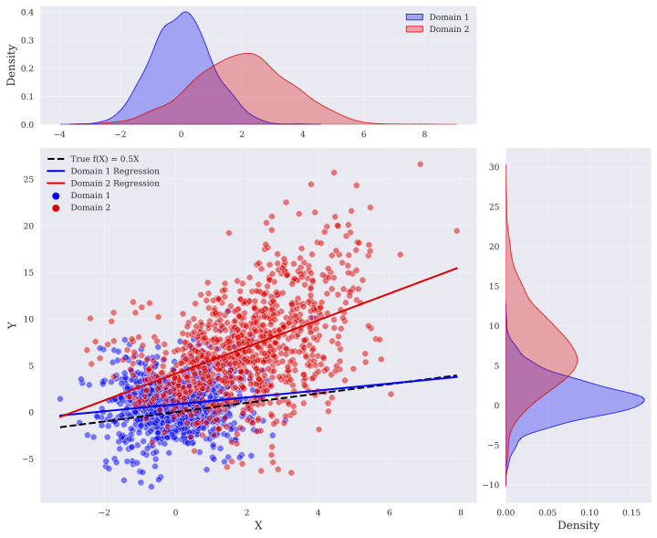
This image is a joint plot visualization comparing two datasets, labeled "Domain 1" (blue) and "Domain 2" (red). The central component is a scatter plot displaying the relationship between an independent variable (X) and a dependent variable (Y). The plot includes regression lines for both domains and a reference line representing a "True" function. Marginal density plots are positioned at the top (for X) and the right (for Y) to show the distribution of data points for each domain.
### Components/Axes
**1. Main Scatter Plot (Center)**
* **X-Axis:** Represents the independent variable, ranging from approximately -3 to 8.
* **Y-Axis:** Represents the dependent variable, ranging from approximately -5 to 25.
* **Legend (Top-Left):**
* `--` (Black dashed line): "True f(X) = 0.5X"
* `—` (Blue solid line): "Domain 1 Regression"
* `—` (Red solid line): "Domain 2 Regression"
* `●` (Blue circle): "Domain 1"
* `●` (Red circle): "Domain 2"
**2. Top Marginal Plot (Density of X)**
* **X-Axis:** Aligned with the main scatter plot X-axis (-4 to 9).
* **Y-Axis:** Labeled "Density," ranging from 0.0 to 0.4.
* **Content:** Shows the probability density distribution of X for both domains.
**3. Right Marginal Plot (Density of Y)**
* **X-Axis:** Labeled "Density," ranging from 0.0 to 0.15.
* **Y-Axis:** Aligned with the main scatter plot Y-axis (-10 to 30).
* **Content:** Shows the probability density distribution of Y for both domains.
---
### Detailed Analysis
#### Trend Verification
* **True f(X) = 0.5X (Black Dashed Line):** This line originates near the origin (0,0) and slopes upward with a constant gradient. It passes through coordinates such as (2, 1), (4, 2), and (6, 3).
* **Domain 1 (Blue):**
* **Visual Trend:** The blue scatter points are tightly clustered around the "True f(X)" line.
* **Regression Line:** The blue regression line is nearly identical to the black dashed line, indicating that Domain 1 closely follows the function $Y = 0.5X$.
* **Domain 2 (Red):**
* **Visual Trend:** The red scatter points are more dispersed and generally occupy a higher Y-value range than Domain 1 for any given X.
* **Regression Line:** The red regression line is significantly steeper than the "True f(X)" line and starts at a higher Y-intercept (approximately Y=2 when X=0).
#### Distribution Analysis
* **X-Distribution (Top Plot):**
* **Domain 1 (Blue):** Peaks near X=0. The distribution is relatively narrow.
* **Domain 2 (Red):** Peaks near X=2. The distribution is wider and shifted to the right compared to Domain 1.
* **Y-Distribution (Right Plot):**
* **Domain 1 (Blue):** Peaks near Y=0. The distribution is concentrated between Y=-5 and Y=5.
* **Domain 2 (Red):** Peaks near Y=8. The distribution is much broader, extending from Y=0 up to Y=25.
---
### Key Observations
* **Alignment:** Domain 1 is highly consistent with the "True f(X)" function.
* **Divergence:** Domain 2 exhibits a clear "concept drift" or bias. Not only is the intercept higher (indicating a baseline offset), but the slope is steeper, indicating that the relationship between X and Y in Domain 2 is fundamentally different from the "True" function.
* **Outliers:** There are several red (Domain 2) points that appear as outliers, particularly in the upper-right quadrant (e.g., X=8, Y=20) and the upper-left quadrant (e.g., X=4, Y=25).
---
### Interpretation
This visualization demonstrates a scenario of **Domain Shift** or **Dataset Bias**.
* **The "True" Baseline:** The black dashed line represents the ground truth relationship ($Y = 0.5X$). Domain 1 acts as the "source" or "training" domain, which perfectly captures this ground truth.
* **The Shifted Domain:** Domain 2 represents a "target" or "test" domain that has undergone a transformation. The data in Domain 2 is not just noisy; it is systematically different. The higher intercept suggests an additive bias, while the steeper slope suggests a multiplicative bias (or a change in the underlying generative process).
* **Implications:** If a machine learning model were trained on Domain 1 to predict Y based on X, it would perform poorly on Domain 2. The model would consistently under-predict Y for Domain 2 because it expects the relationship to follow the shallower slope of the "True" function. This plot is a diagnostic tool used to identify why a model might fail when deployed on a new, unseen dataset.