## Scatter Plot with Density Plots: Domain Comparison
### Overview
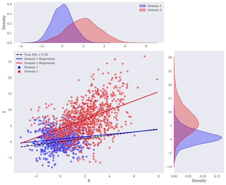
The image presents a scatter plot comparing two domains (Domain 1 and Domain 2) with regression lines, accompanied by density plots showing the distribution of data points for each domain along both the X and Y axes. The scatter plot visualizes the relationship between X and Y variables for each domain, while the density plots provide insights into the marginal distributions of X and Y for each domain.
### Components/Axes
* **Main Scatter Plot:**
* X-axis: Labeled "X", ranges from approximately -3 to 8.
* Y-axis: Labeled "Y", ranges from approximately -10 to 25.
* Data Points:
* Domain 1: Represented by blue dots.
* Domain 2: Represented by red dots.
* Regression Lines:
* Domain 1 Regression: Blue line.
* Domain 2 Regression: Red line.
* True f(X) = 0.5X: Dashed black line.
* **Top Density Plot:**
* X-axis: Ranges from approximately -4 to 8.
* Y-axis: Labeled "Density", ranges from 0 to 0.4.
* Density Curves:
* Domain 1: Blue curve.
* Domain 2: Red curve.
* **Right Density Plot:**
* X-axis: Labeled "Density", ranges from 0 to 0.15.
* Y-axis: Ranges from approximately -10 to 30.
* Density Curves:
* Domain 1: Blue curve.
* Domain 2: Red curve.
* **Legend:** Located at the top-right of the main scatter plot area.
* Domain 1: Blue color.
* Domain 2: Red color.
* True f(X) = 0.5X: Black dashed line.
* Domain 1 Regression: Blue line.
* Domain 2 Regression: Red line.
### Detailed Analysis
* **Scatter Plot Data Points:**
* Domain 1 (blue): Data points are concentrated in the lower-left quadrant, with X values generally ranging from -3 to 3 and Y values from -8 to 5.
* Domain 2 (red): Data points are more spread out, with X values ranging from -1 to 8 and Y values from -2 to 25.
* **Regression Lines:**
* True f(X) = 0.5X (black dashed): Starts at approximately (-2, -1) and ends at approximately (8, 4).
* Domain 1 Regression (blue): Starts at approximately (-2, -2) and ends at approximately (8, 2).
* Domain 2 Regression (red): Starts at approximately (-2, 0) and ends at approximately (8, 15).
* **Top Density Plot (X-axis distribution):**
* Domain 1 (blue): The density curve peaks around X = 0, indicating a higher concentration of data points around this value.
* Domain 2 (red): The density curve peaks around X = 3, indicating a higher concentration of data points around this value.
* **Right Density Plot (Y-axis distribution):**
* Domain 1 (blue): The density curve peaks around Y = -2, indicating a higher concentration of data points around this value.
* Domain 2 (red): The density curve peaks around Y = 5, indicating a higher concentration of data points around this value.
### Key Observations
* Domain 1 data points are clustered more tightly than Domain 2 data points.
* Domain 2 exhibits a wider range of both X and Y values compared to Domain 1.
* The regression line for Domain 2 has a steeper slope than the regression line for Domain 1 and the "True f(X) = 0.5X" line.
* The density plots confirm the different distributions of X and Y values for the two domains.
### Interpretation
The data suggests that Domain 2 exhibits a stronger positive correlation between X and Y compared to Domain 1. The steeper slope of the Domain 2 regression line indicates a greater change in Y for a given change in X. The density plots highlight the distributional differences, with Domain 1 being centered around lower X and Y values compared to Domain 2. The "True f(X) = 0.5X" line serves as a reference, showing how the actual relationship between X and Y deviates for each domain. The scatter plot and density plots together provide a comprehensive view of the differences in the relationship between X and Y for the two domains. Domain 1 appears to be more tightly clustered around a lower mean, while Domain 2 is more dispersed and exhibits a stronger positive correlation.