## Scatter Plot with Marginal Density Distributions: Domain Comparison
### Overview
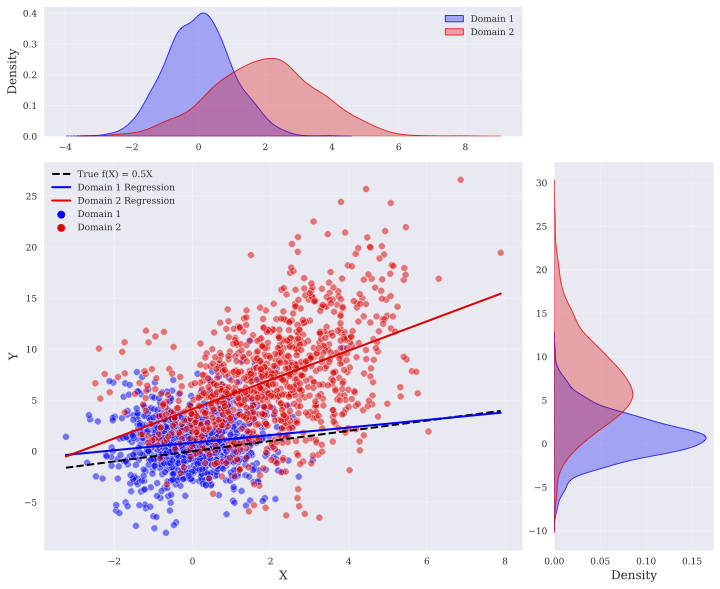
The image is a multi-panel statistical visualization comparing two data domains (Domain 1 and Domain 2). It consists of a central scatter plot showing the relationship between variables X and Y, with marginal density plots on the top (for X) and right (for Y). The chart includes regression lines for each domain and a line representing the true underlying function.
### Components/Axes
**Central Scatter Plot:**
* **X-Axis:** Labeled "X". Scale ranges from approximately -3 to 8, with major tick marks at -2, 0, 2, 4, 6, 8.
* **Y-Axis:** Labeled "Y". Scale ranges from approximately -10 to 30, with major tick marks at -5, 0, 5, 10, 15, 20, 25, 30.
* **Legend (Top-Left of Scatter Plot):**
* `-- True f(X) = 0.5X` (Black dashed line)
* `— Domain 1 Regression` (Solid blue line)
* `— Domain 2 Regression` (Solid red line)
* `● Domain 1` (Blue circular points)
* `● Domain 2` (Red circular points)
**Top Marginal Density Plot (for X):**
* **Y-Axis:** Labeled "Density". Scale ranges from 0.0 to 0.4.
* **X-Axis:** Shares the same scale and alignment as the central plot's X-axis.
* **Legend (Top-Right):**
* `Domain 1` (Blue filled area)
* `Domain 2` (Red filled area)
**Right Marginal Density Plot (for Y):**
* **X-Axis:** Labeled "Density". Scale ranges from 0.00 to 0.15.
* **Y-Axis:** Shares the same scale and alignment as the central plot's Y-axis.
* **Legend:** Implicitly uses the same color scheme as the top density plot (Blue for Domain 1, Red for Domain 2).
### Detailed Analysis
**1. Data Distribution (Scatter Plot):**
* **Domain 1 (Blue Points):** Concentrated in the lower-left quadrant. Points cluster densely between X ≈ -2 to 2 and Y ≈ -5 to 5. The overall trend shows a gentle positive slope.
* **Domain 2 (Red Points):** More widely dispersed, primarily in the central and upper-right areas. Points span X ≈ -1 to 8 and Y ≈ 0 to 25, with some outliers near Y=30. The trend shows a stronger positive slope than Domain 1.
**2. Regression Lines & True Function:**
* **True f(X) = 0.5X (Black Dashed):** A straight line with a slope of 0.5, passing through the origin (0,0). It serves as a baseline.
* **Domain 1 Regression (Blue Solid):** A straight line with a slope slightly less than 0.5. It lies very close to, but slightly below, the true function line for most of its length.
* **Domain 2 Regression (Red Solid):** A straight line with a slope noticeably greater than 0.5. It starts near the origin but diverges upward from the true function as X increases.
**3. Marginal Distributions:**
* **Distribution of X (Top Plot):**
* Domain 1 (Blue): Unimodal, symmetric distribution centered near X = 0. Peak density ≈ 0.4.
* Domain 2 (Red): Unimodal, slightly right-skewed distribution centered near X = 2. Peak density ≈ 0.25. The distributions overlap significantly between X = 0 and X = 2.
* **Distribution of Y (Right Plot):**
* Domain 1 (Blue): Unimodal, symmetric distribution centered near Y = 0. Peak density ≈ 0.15.
* Domain 2 (Red): Unimodal, right-skewed distribution centered near Y = 5. Peak density ≈ 0.08. The spread (variance) of Domain 2's Y values is much larger than Domain 1's.
### Key Observations
1. **Domain Separation:** The two domains occupy largely different regions of the X-Y space, with Domain 1 representing lower values of both variables and Domain 2 representing higher, more variable values.
2. **Relationship Strength:** The positive correlation between X and Y appears stronger in Domain 2 (steeper regression line, more vertical spread) than in Domain 1.
3. **Model Bias:** The regression line for Domain 1 closely approximates the true function `f(X)=0.5X`. The regression for Domain 2 systematically overestimates Y for a given X compared to the true function.
4. **Variance Heterogeneity:** Domain 2 exhibits significantly higher variance in both X and Y dimensions compared to the tightly clustered Domain 1.
### Interpretation
This visualization demonstrates a classic case of **dataset shift** or **domain divergence**. The two domains likely come from different underlying conditions or populations.
* **Domain 1** appears to be drawn from a distribution that closely follows the true generative process `f(X)=0.5X` with low noise. Its marginal distributions are tight and centered near zero.
* **Domain 2** represents a different regime. Its data is shifted (higher mean X and Y) and exhibits greater noise (higher variance). A model trained solely on Domain 2 would learn a biased relationship (steeper slope) that does not generalize to the true function or to Domain 1.
The marginal density plots are crucial for diagnosis. They show that the domains differ not just in their X-Y relationship, but in the fundamental distributions of the individual variables. This suggests that any predictive model applied across both domains would need techniques like domain adaptation or invariant feature learning to perform reliably. The outlier points in Domain 2 (very high Y) could represent rare events or measurement errors within that specific domain.