## Composite Plot: Domain 1 and Domain 2 Data Distributions and Relationships
### Overview
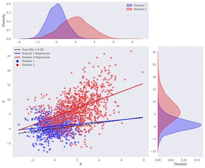
The image is a composite visualization containing three subplots: two density plots (top-left and bottom-right) and a scatter plot (center). It compares two domains (Domain 1 in blue, Domain 2 in red) across X and Y variables, with regression lines and a true function reference.
---
### Components/Axes
1. **Top-Left Density Plot (X Distribution)**
- **X-axis**: Labeled "X" (range: -4 to 8)
- **Y-axis**: Labeled "Density" (range: 0 to 0.4)
- **Legend**:
- Blue: Domain 1
- Red: Domain 2
- **True Function**: Dashed black line labeled "True f(X) = 0.5X"
2. **Bottom-Right Density Plot (Y Distribution)**
- **X-axis**: Labeled "Density" (range: 0 to 0.15)
- **Y-axis**: Labeled "Y" (range: -10 to 25)
- **Legend**:
- Blue: Domain 1
- Red: Domain 2
3. **Center Scatter Plot (X vs. Y Relationship)**
- **X-axis**: Labeled "X" (range: -2 to 8)
- **Y-axis**: Labeled "Y" (range: -5 to 25)
- **Data Points**:
- Blue: Domain 1 (clustered near origin)
- Red: Domain 2 (spread across higher X and Y values)
- **Regression Lines**:
- Blue: Domain 1 regression (positive slope)
- Red: Domain 2 regression (steeper positive slope)
- **True Function**: Dashed black line (slope = 0.5)
---
### Detailed Analysis
1. **Top-Left Density Plot (X Distribution)**
- **Domain 1 (Blue)**:
- Peaks at X ≈ 0 with density ≈ 0.3.
- Distribution is narrow, centered around X = 0.
- **Domain 2 (Red)**:
- Peaks at X ≈ 2 with density ≈ 0.25.
- Distribution is broader, extending from X ≈ -1 to X ≈ 4.
2. **Bottom-Right Density Plot (Y Distribution)**
- **Domain 1 (Blue)**:
- Peaks at Y ≈ 0 with density ≈ 0.15.
- Distribution is narrow, centered around Y = 0.
- **Domain 2 (Red)**:
- Peaks at Y ≈ 10 with density ≈ 0.12.
- Distribution is broader, extending from Y ≈ 5 to Y ≈ 15.
3. **Center Scatter Plot (X vs. Y Relationship)**
- **Domain 1 (Blue)**:
- Points cluster tightly around the origin (X ≈ 0, Y ≈ 0).
- Regression line has a moderate positive slope (≈ 0.5), closely aligning with the true function.
- **Domain 2 (Red)**:
- Points are widely scattered, with higher X and Y values.
- Regression line has a steeper slope (≈ 1.2), deviating significantly from the true function.
---
### Key Observations
1. **Domain 1** exhibits a tight, centered distribution in both X and Y, with a regression line that closely matches the true function (slope = 0.5).
2. **Domain 2** shows a broader, more dispersed distribution in both X and Y, with a regression line that diverges from the true function (slope ≈ 1.2).
3. The true function (dashed black line) acts as a reference, highlighting that Domain 1’s data aligns better with the hypothesized relationship (Y = 0.5X), while Domain 2’s data suggests a stronger linear dependency (Y ≈ 1.2X).
---
### Interpretation
- **Data Behavior**:
- Domain 1’s data is consistent with the true function, suggesting it may originate from a process governed by Y = 0.5X.
- Domain 2’s data deviates from the true function, indicating either a different underlying mechanism (e.g., Y = 1.2X) or external noise/confounding factors.
- **Implications**:
- The divergence in regression slopes implies that Domain 1 and Domain 2 may represent distinct populations or experimental conditions.
- The true function’s alignment with Domain 1’s regression line could validate its applicability to Domain 1, while Domain 2 may require a separate model.
- **Anomalies**:
- Domain 2’s red points in the scatter plot extend beyond the true function’s range, suggesting potential outliers or a non-linear relationship not captured by the linear regression.
This visualization underscores the importance of domain-specific modeling, as assumptions about data relationships (e.g., the true function) may not universally apply across all datasets.