# Technical Document Extraction: Pareto Frontier Analysis
## 1. Document Overview
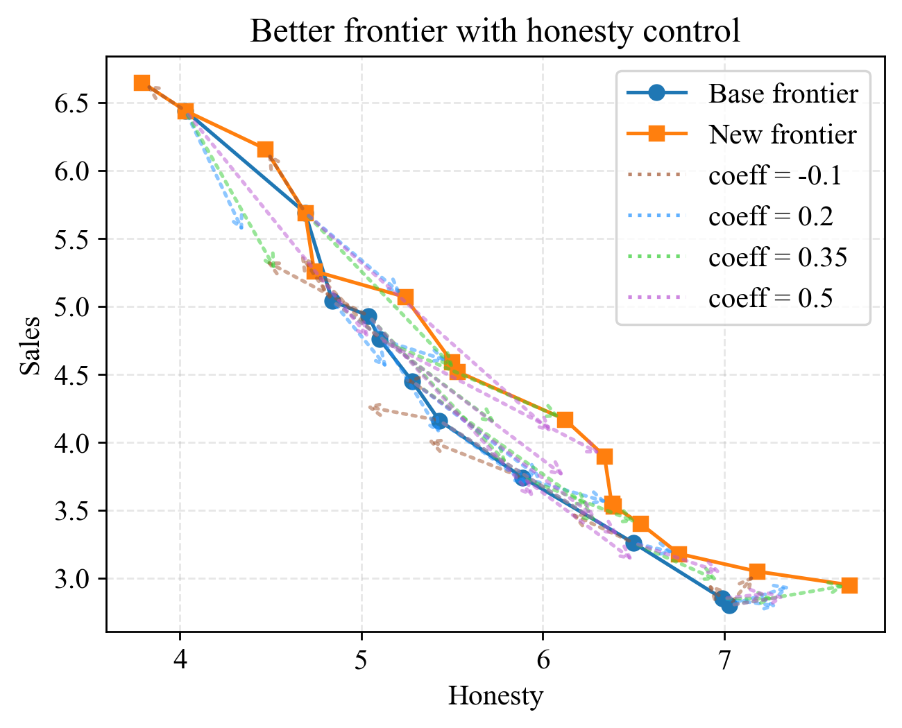
This image is a line graph illustrating the relationship between "Honesty" and "Sales," specifically comparing a "Base frontier" against a "New frontier" achieved through honesty control. The chart demonstrates a trade-off where higher honesty generally correlates with lower sales, but the "New frontier" shows an optimization (outward shift) compared to the base.
## 2. Component Isolation
### A. Header
* **Title:** Better frontier with honesty control
### B. Main Chart Area
* **X-Axis Label:** Honesty
* **X-Axis Markers:** 4, 5, 6, 7
* **Y-Axis Label:** Sales
* **Y-Axis Markers:** 3.0, 3.5, 4.0, 4.5, 5.0, 5.5, 6.0, 6.5
* **Grid:** Light gray dashed grid lines for both axes.
### C. Legend (Spatial Placement: Top Right [x≈0.7, y≈0.8])
The legend contains six entries:
1. **Base frontier:** Solid blue line with circular markers (●).
2. **New frontier:** Solid orange line with square markers (■).
3. **coeff = -0.1:** Dotted brown line with arrowheads.
4. **coeff = 0.2:** Dotted light blue line with arrowheads.
5. **coeff = 0.35:** Dotted green line with arrowheads.
6. **coeff = 0.5:** Dotted purple line with arrowheads.
---
## 3. Data Series Analysis and Trends
### Base frontier (Solid Blue, Circular Markers)
* **Trend:** Slopes downward from left to right. It represents the initial trade-off curve.
* **Key Data Points (Approximate):**
| Honesty | Sales |
| :--- | :--- |
| 4.0 | 6.4 |
| 4.8 | 5.1 |
| 5.1 | 4.9 |
| 5.3 | 4.5 |
| 5.4 | 4.2 |
| 5.9 | 3.8 |
| 6.5 | 3.3 |
| 7.0 | 2.8 |
### New frontier (Solid Orange, Square Markers)
* **Trend:** Slopes downward from left to right but sits consistently above and to the right of the Base frontier. This indicates that for a given level of honesty, higher sales are achieved, or for a given level of sales, higher honesty is achieved.
* **Key Data Points (Approximate):**
| Honesty | Sales |
| :--- | :--- |
| 3.8 | 6.7 |
| 4.0 | 6.4 |
| 4.5 | 6.2 |
| 4.7 | 5.7 |
| 4.7 | 5.3 |
| 5.3 | 5.1 |
| 5.5 | 4.6 |
| 5.5 | 4.5 |
| 6.1 | 4.2 |
| 6.3 | 3.9 |
| 6.4 | 3.6 |
| 6.5 | 3.4 |
| 6.7 | 3.2 |
| 7.2 | 3.1 |
| 7.7 | 2.9 |
### Coefficient Vectors (Dotted Lines with Arrows)
These lines represent the directional shifts or "forces" applied to the data points under different control coefficients.
* **coeff = -0.1 (Brown):** Generally points downward and slightly left, suggesting a negative impact on both metrics.
* **coeff = 0.2 (Light Blue):** Points upward and right, contributing to the expansion of the frontier.
* **coeff = 0.35 (Green):** Points upward and right, showing a stronger push toward the New frontier.
* **coeff = 0.5 (Purple):** Points upward and right, representing the most aggressive shift toward higher honesty and sales.
---
## 4. Summary of Findings
The visualization confirms that "honesty control" successfully shifts the Pareto frontier outward.
* **The Base frontier** establishes a baseline where honesty of 7.0 results in sales of ~2.8.
* **The New frontier** improves this, where an honesty level of 7.0 results in sales of ~3.1, and the maximum honesty reached extends to 7.7 (at sales of 2.9).
* The **dotted vector lines** illustrate the movement of individual data points from the base state toward the optimized state, with higher positive coefficients (0.35, 0.5) showing the most significant gains in the "Honesty" dimension.