\n
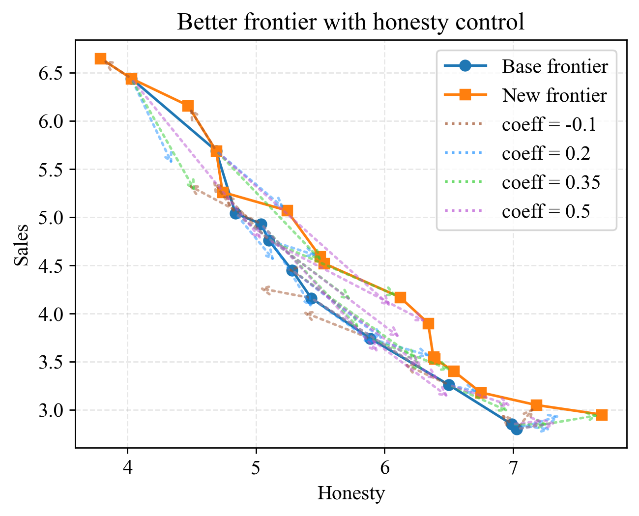
## Line Chart: Better frontier with honesty control
### Overview
This image presents a line chart illustrating the relationship between "Honesty" and "Sales" under different coefficient conditions. The chart compares a "Base frontier" and a "New frontier" alongside several coefficient values (-0.1, 0.2, 0.35, and 0.5). The chart appears to demonstrate how varying levels of honesty impact sales, with different coefficients potentially representing different control mechanisms or adjustments.
### Components/Axes
* **Title:** "Better frontier with honesty control" (positioned at the top-center)
* **X-axis:** "Honesty" (ranging approximately from 3.8 to 7.2)
* **Y-axis:** "Sales" (ranging approximately from 2.8 to 6.7)
* **Legend:** Located in the top-right corner, containing the following labels and corresponding colors:
* "Base frontier" - Blue
* "New frontier" - Orange
* "coeff = -0.1" - Light Green Dotted
* "coeff = 0.2" - Teal Dotted
* "coeff = 0.35" - Purple Dotted
* "coeff = 0.5" - Magenta Dotted
* **Gridlines:** Present to aid in reading values.
### Detailed Analysis
The chart displays six distinct lines representing the different conditions.
* **Base frontier (Blue):** This line starts at approximately (3.8, 6.6), decreases steadily to approximately (7.2, 3.0). The slope is consistently negative.
* **New frontier (Orange):** This line begins at approximately (3.8, 6.5), decreases more rapidly than the "Base frontier" initially, then flattens out, ending at approximately (7.2, 2.8).
* **coeff = -0.1 (Light Green Dotted):** Starts at approximately (3.8, 6.4), decreases to approximately (7.2, 3.1).
* **coeff = 0.2 (Teal Dotted):** Starts at approximately (3.8, 6.3), decreases to approximately (7.2, 3.0).
* **coeff = 0.35 (Purple Dotted):** Starts at approximately (3.8, 6.2), decreases to approximately (7.2, 2.9).
* **coeff = 0.5 (Magenta Dotted):** Starts at approximately (3.8, 6.1), decreases to approximately (7.2, 2.7).
All lines exhibit a negative correlation between "Honesty" and "Sales" – as "Honesty" increases, "Sales" tend to decrease. The rate of decrease varies depending on the coefficient value.
### Key Observations
* The "New frontier" line shows a steeper initial decline in sales compared to the "Base frontier".
* Higher coefficient values (0.35 and 0.5) result in a more pronounced decrease in sales as honesty increases.
* The lines representing different coefficient values converge towards the lower right of the chart, suggesting that at higher levels of honesty, the impact of the coefficient diminishes.
* The "Base frontier" and the lines with coefficients of -0.1 and 0.2 are relatively close together, indicating a similar trend.
### Interpretation
The chart suggests that increasing "Honesty" generally leads to a decrease in "Sales". The "New frontier" represents a scenario where this decrease is more rapid initially, potentially due to a more stringent honesty policy or a different market dynamic. The coefficients likely represent the strength of a control mechanism or adjustment applied to the relationship between honesty and sales. Negative coefficients might indicate a penalty for dishonesty, while positive coefficients could represent a reward for honesty (though the chart shows sales *decreasing* with increasing honesty, so the interpretation of the coefficients is complex).
The convergence of the lines at higher honesty levels suggests that beyond a certain point, further increases in honesty have a diminishing impact on sales. This could be because the market has already reached a saturation point for honesty or because other factors become more dominant in influencing sales. The chart implies a trade-off between honesty and sales, and the optimal level of honesty depends on the specific context and the desired outcome. The chart is attempting to model a complex system, and the coefficients are likely parameters within that model.