TECHNICAL ASSET FINGERPRINT
01c55c7ff3970cef3965992a
Click to view fullscreen
Press ESC or click to close
FOUND IN PAPERS
EXPERT: healer-alpha-free VERSION 1
RUNTIME: free/openrouter/healer-alpha
INTEL_VERIFIED
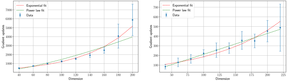
## [Two Scatter Plots with Trend Lines]: Gradient Updates vs. Dimension
### Overview
The image contains two separate but related scatter plots arranged side-by-side. Both plots display the relationship between "Dimension" (x-axis) and "Gradient updates" (y-axis). Each plot includes empirical data points with error bars and two fitted trend lines: an "Exponential fit" and a "Power law fit". The plots appear to compare how the number of gradient updates required scales with the dimensionality of a problem, likely in a machine learning or optimization context.
### Components/Axes
**Common Elements (Both Plots):**
* **X-axis Label:** "Dimension"
* **Y-axis Label:** "Gradient updates"
* **Legend (Located in the top-left corner of each plot):**
* `--- Exponential fit` (Red dashed line)
* `--- Power law fit` (Green dashed line)
* `● Data` (Blue circular markers with vertical error bars)
* **Grid:** Both plots have a light gray grid for reference.
**Left Plot Specifics:**
* **X-axis Scale:** Linear, ranging from 40 to 200, with major ticks at 40, 60, 80, 100, 120, 140, 160, 180, 200.
* **Y-axis Scale:** Linear, ranging from 0 to 7000, with major ticks at 0, 1000, 2000, 3000, 4000, 5000, 6000, 7000.
**Right Plot Specifics:**
* **X-axis Scale:** Linear, ranging from 50 to 225, with major ticks at 50, 75, 100, 125, 150, 175, 200, 225.
* **Y-axis Scale:** Linear, ranging from 100 to 700, with major ticks at 100, 200, 300, 400, 500, 600, 700.
### Detailed Analysis
**Left Plot Data & Trends:**
* **Data Series Trend:** The blue data points show a clear, accelerating upward trend. The number of gradient updates increases slowly at lower dimensions and then rises sharply.
* **Approximate Data Points (Dimension, Gradient updates ± error):**
* (40, ~500 ± small error)
* (60, ~700 ± small error)
* (80, ~1000 ± small error)
* (100, ~1200 ± small error)
* (120, ~1500 ± moderate error)
* (140, ~2000 ± moderate error)
* (160, ~2500 ± large error)
* (180, ~4000 ± very large error)
* (200, ~6000 ± extremely large error)
* **Fit Lines:**
* The **red dashed "Exponential fit"** line curves upward sharply, closely following the data points at higher dimensions (160-200).
* The **green dashed "Power law fit"** line also curves upward but is less steep than the exponential fit at the highest dimensions. It appears to slightly under-predict the data points at dimensions 180 and 200.
* **Error Bars:** The vertical error bars on the data points grow significantly larger as the Dimension increases, indicating increasing variance or uncertainty in the measurements at higher dimensions.
**Right Plot Data & Trends:**
* **Data Series Trend:** The blue data points show a steady, roughly linear or slightly curving upward trend across the entire range.
* **Approximate Data Points (Dimension, Gradient updates ± error):**
* (50, ~100 ± moderate error)
* (75, ~150 ± moderate error)
* (100, ~200 ± moderate error)
* (125, ~250 ± moderate error)
* (150, ~300 ± large error)
* (175, ~350 ± large error)
* (200, ~450 ± very large error)
* (225, ~500 ± very large error)
* **Fit Lines:**
* The **red dashed "Exponential fit"** line starts below the data at low dimensions, crosses it around dimension 150, and then rises above it at the highest dimensions.
* The **green dashed "Power law fit"** line appears to pass more centrally through the data points across the entire range, suggesting it may be a better fit for this dataset.
* **Error Bars:** Similar to the left plot, the error bars increase in size with Dimension, though the absolute scale of the errors is smaller than in the left plot.
### Key Observations
1. **Scaling Behavior:** Both plots demonstrate that the computational cost (gradient updates) increases with problem dimensionality. The left plot shows a much more dramatic, potentially exponential, increase compared to the more moderate increase in the right plot.
2. **Model Comparison:** The relative performance of the exponential vs. power law fits differs between the two plots. In the left plot, the exponential fit seems superior at high dimensions. In the right plot, the power law fit appears more consistent across the range.
3. **Increasing Uncertainty:** A critical observation is the systematic growth of error bars with dimension in both plots. This indicates that measurements become less precise or more variable as the problem size scales.
4. **Different Regimes:** The two plots likely represent different experimental conditions, algorithms, or problem types, given the order-of-magnitude difference in the y-axis scales (thousands vs. hundreds of updates).
### Interpretation
This technical visualization is analyzing the **scaling laws** of an iterative optimization process. The core question being investigated is: "How does the number of iterations required for convergence (gradient updates) grow as the size of the problem (dimension) increases?"
* **The Data Suggests:** The relationship is super-linear (worse than linear) in both cases. The left plot's data is consistent with an exponential or high-degree polynomial scaling, which is often undesirable for large-scale applications as it implies rapidly escalating costs. The right plot suggests a more manageable, possibly power-law scaling.
* **Relationship Between Elements:** The fitted lines (exponential and power law) are theoretical models being tested against empirical data (blue points). The error bars provide crucial context about the reliability of each data point. The divergence of the fit lines at high dimensions highlights the importance of choosing the correct scaling model for extrapolation.
* **Notable Anomalies/Outliers:** There are no obvious outlier data points that deviate from the overall trend. However, the **extremely large error bar at Dimension=200 in the left plot** is a significant feature. It suggests that at this high dimension, the process becomes highly unstable or sensitive to initial conditions, leading to vastly different outcomes across trials.
* **Underlying Implication:** The plots serve as a diagnostic tool. If the goal is to scale an algorithm to high dimensions, the process characterized by the left plot would be a major concern, while the process in the right plot is more promising. The analysis helps researchers understand fundamental limits and choose or design algorithms with better scaling properties.
DECODING INTELLIGENCE...