\n
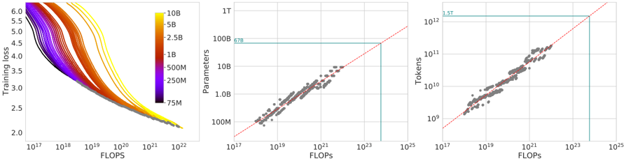
## Chart: Training Performance and Scaling Laws
### Overview
The image presents three charts arranged horizontally. The first chart is a heatmap-style line plot showing Training Loss vs. FLOPS, colored by model size (Parameters). The second chart shows Parameters vs. FLOPS, and the third chart shows Tokens vs. FLOPS. All charts use logarithmic scales on both axes. The charts appear to investigate the relationship between computational cost (FLOPS), model size (Parameters), training data size (Tokens), and training performance (Loss).
### Components/Axes
* **Chart 1 (Left):**
* X-axis: FLOPS (Floating Point Operations Per Second), scale is logarithmic from 10<sup>17</sup> to 10<sup>23</sup>.
* Y-axis: Training Loss, scale is linear from 2.0 to 6.0.
* Color Scale (Legend): Represents model size in Parameters, ranging from 75M (dark purple) to 10B (yellow). Intermediate values are 250M (green), 500M (orange), 1B (light orange), 2.5B (red), 5B (yellow-orange), and 10B (yellow). The legend is positioned on the top-right.
* **Chart 2 (Center):**
* X-axis: FLOPS, scale is logarithmic from 10<sup>17</sup> to 10<sup>25</sup>.
* Y-axis: Parameters, scale is logarithmic from 10<sup>7</sup> (10M) to 10<sup>10</sup> (10B).
* Trend Line: A red line indicating a linear relationship.
* Annotation: "678" is placed near a data point.
* Highlighted Region: A light blue rectangle in the top-right corner.
* **Chart 3 (Right):**
* X-axis: FLOPS, scale is logarithmic from 10<sup>17</sup> to 10<sup>25</sup>.
* Y-axis: Tokens, scale is logarithmic from 10<sup>8</sup> to 10<sup>12</sup>.
* Trend Line: A red line indicating a linear relationship.
* Annotation: "1.5T" is placed near a data point.
* Highlighted Region: A light blue rectangle in the top-right corner.
### Detailed Analysis or Content Details
* **Chart 1:** The lines generally slope downwards, indicating that as FLOPS increase (more computation), training loss decreases. The color gradient shows that larger models (yellow) tend to have lower loss values at higher FLOPS, but also exhibit more variability. The lines are densely packed at lower FLOPS values, and spread out as FLOPS increase.
* Approximate data points (reading from the chart, with uncertainty):
* At FLOPS = 10<sup>17</sup>, Loss ranges from approximately 5.5 to 6.0 across all model sizes.
* At FLOPS = 10<sup>22</sup>, Loss ranges from approximately 2.2 to 3.5, with the lowest losses associated with the largest models (yellow).
* **Chart 2:** The data points show a strong positive correlation between Parameters and FLOPS. The red trend line appears to fit the data well.
* Approximate data points:
* At FLOPS = 10<sup>17</sup>, Parameters are approximately 10M (10<sup>7</sup>).
* At FLOPS = 10<sup>25</sup>, Parameters are approximately 10B (10<sup>10</sup>).
* The annotated point "678" appears to be near FLOPS = 10<sup>21</sup> and Parameters = 100M (10<sup>8</sup>).
* **Chart 3:** The data points also show a strong positive correlation between Tokens and FLOPS. The red trend line appears to fit the data well.
* Approximate data points:
* At FLOPS = 10<sup>17</sup>, Tokens are approximately 10<sup>8</sup>.
* At FLOPS = 10<sup>25</sup>, Tokens are approximately 10<sup>12</sup>.
* The annotated point "1.5T" appears to be near FLOPS = 10<sup>23</sup> and Tokens = 1.5 x 10<sup>12</sup>.
### Key Observations
* **Scaling Laws:** The charts suggest adherence to scaling laws, where increasing model size (Parameters) and training data (Tokens) generally leads to improved performance (lower Loss), but at a computational cost (FLOPS).
* **Linear Relationships:** The relationships between Parameters/Tokens and FLOPS appear approximately linear on the logarithmic scales.
* **Model Size Impact:** Larger models consistently achieve lower loss values at higher FLOPS.
* **Data Density:** The data is more concentrated at lower FLOPS values, suggesting that fewer experiments were conducted at very high computational costs.
### Interpretation
The data presented strongly supports the idea of scaling laws in deep learning. Increasing the number of parameters in a model and the amount of training data (measured in tokens) generally leads to improved performance, as indicated by the decreasing training loss. However, this improvement comes at a significant computational cost, measured in FLOPS. The approximately linear relationships observed on the logarithmic scales suggest that the computational cost scales predictably with model size and data size. The annotations ("678", "1.5T") likely represent specific experimental configurations or milestones. The highlighted regions in the top-right corners of the second and third charts may indicate the limits of the data or areas where the scaling laws begin to deviate. The heatmap in the first chart provides a visual representation of how model size influences the training loss curve, demonstrating that larger models require more computation to achieve optimal performance. The spread of the lines in the first chart also suggests that there is some variance in training outcomes even for models of the same size, potentially due to factors such as initialization or optimization algorithms.