# Technical Data Extraction: Time-Series SAX Representation
## 1. Document Overview
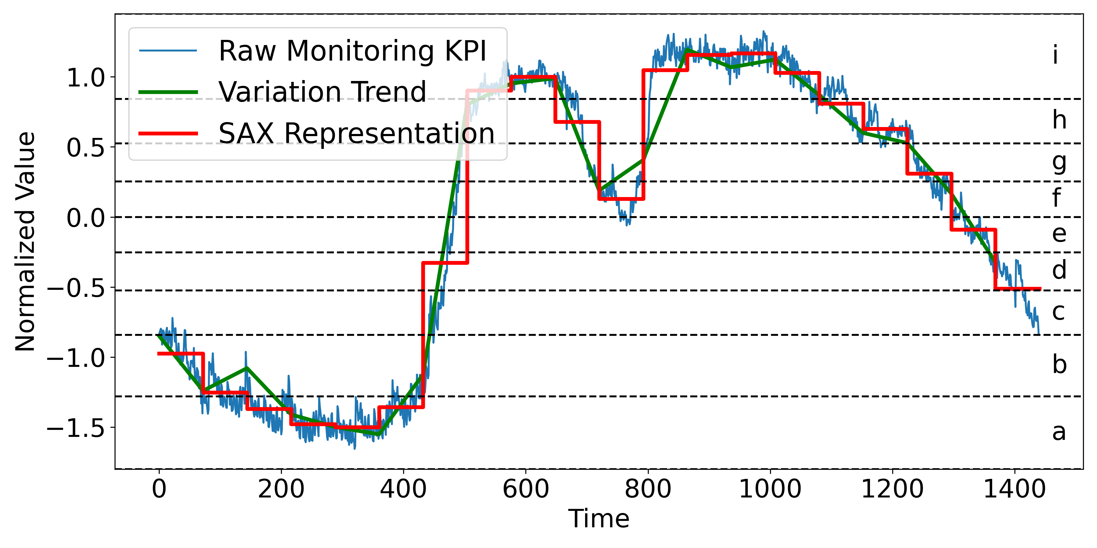
This image is a technical line chart illustrating the transformation of a high-frequency time-series signal into a Symbolic Aggregate Approximation (SAX) representation. It displays three distinct data series plotted against time, with a secondary symbolic categorization on the right-hand side.
## 2. Component Isolation
### A. Header / Legend
* **Location:** Top-left corner [x: 100, y: 50] to [x: 450, y: 280].
* **Legend Items:**
* **Raw Monitoring KPI:** Represented by a thin blue line.
* **Variation Trend:** Represented by a thick green line.
* **SAX Representation:** Represented by a thick red "step" line.
### B. Main Chart Area (Axes and Markers)
* **Y-Axis (Vertical):**
* **Label:** "Normalized Value"
* **Scale:** Ranges from -1.5 to 1.0 (with data extending slightly above 1.0).
* **Major Tick Marks:** -1.5, -1.0, -0.5, 0.0, 0.5, 1.0.
* **X-Axis (Horizontal):**
* **Label:** "Time"
* **Scale:** Ranges from 0 to 1400.
* **Major Tick Marks:** 0, 200, 400, 600, 800, 1000, 1200, 1400.
* **Symbolic Alphabet (Right Margin):**
* Nine horizontal dashed lines divide the Y-axis into discrete bins.
* Each bin is labeled with a lowercase letter from **a** to **i** (bottom to top).
## 3. Data Series Analysis and Trends
### Series 1: Raw Monitoring KPI (Thin Blue Line)
* **Trend:** High-frequency, noisy signal. It starts at approx. -0.8, dips to a minimum near -1.6 around Time 300, rises sharply between Time 400 and 600 to a peak above 1.0, and then gradually declines back toward -0.8 by Time 1400.
* **Characteristics:** Contains significant jitter/noise throughout the duration.
### Series 2: Variation Trend (Thick Green Line)
* **Trend:** A piecewise linear approximation of the blue line. It smooths the noise to show the underlying directional movement.
* **Logic Check:** It follows the "valleys" and "peaks" of the blue line but ignores the high-frequency oscillations.
### Series 3: SAX Representation (Thick Red Step Line)
* **Trend:** A horizontal "step" function. It discretizes the signal into fixed-width time segments (approximately 70-80 time units wide).
* **Logic Check:** The height of each red horizontal segment corresponds to the average value of the signal within that time window, mapped to the symbolic bins (a-i).
## 4. Symbolic Mapping (SAX Bins)
The chart uses horizontal dashed lines to define the following symbolic regions:
| Symbol | Approximate Normalized Value Range |
| :--- | :--- |
| **i** | > 0.85 |
| **h** | 0.55 to 0.85 |
| **g** | 0.25 to 0.55 |
| **f** | 0.0 to 0.25 |
| **e** | -0.25 to 0.0 |
| **d** | -0.5 to -0.25 |
| **c** | -0.85 to -0.5 |
| **b** | -1.25 to -0.85 |
| **a** | < -1.25 |
## 5. Sequence Extraction (SAX String)
Based on the red step line's vertical position relative to the lettered bins, the approximate symbolic sequence represented is:
`b -> b -> a -> a -> a -> a -> b -> d -> h -> i -> i -> g -> c -> f -> i -> i -> i -> h -> g -> g -> e -> d -> c`
*(Note: Each step represents a discrete time interval of roughly 75 units).*