# Technical Document Extraction: Line Chart Analysis
## Chart Overview
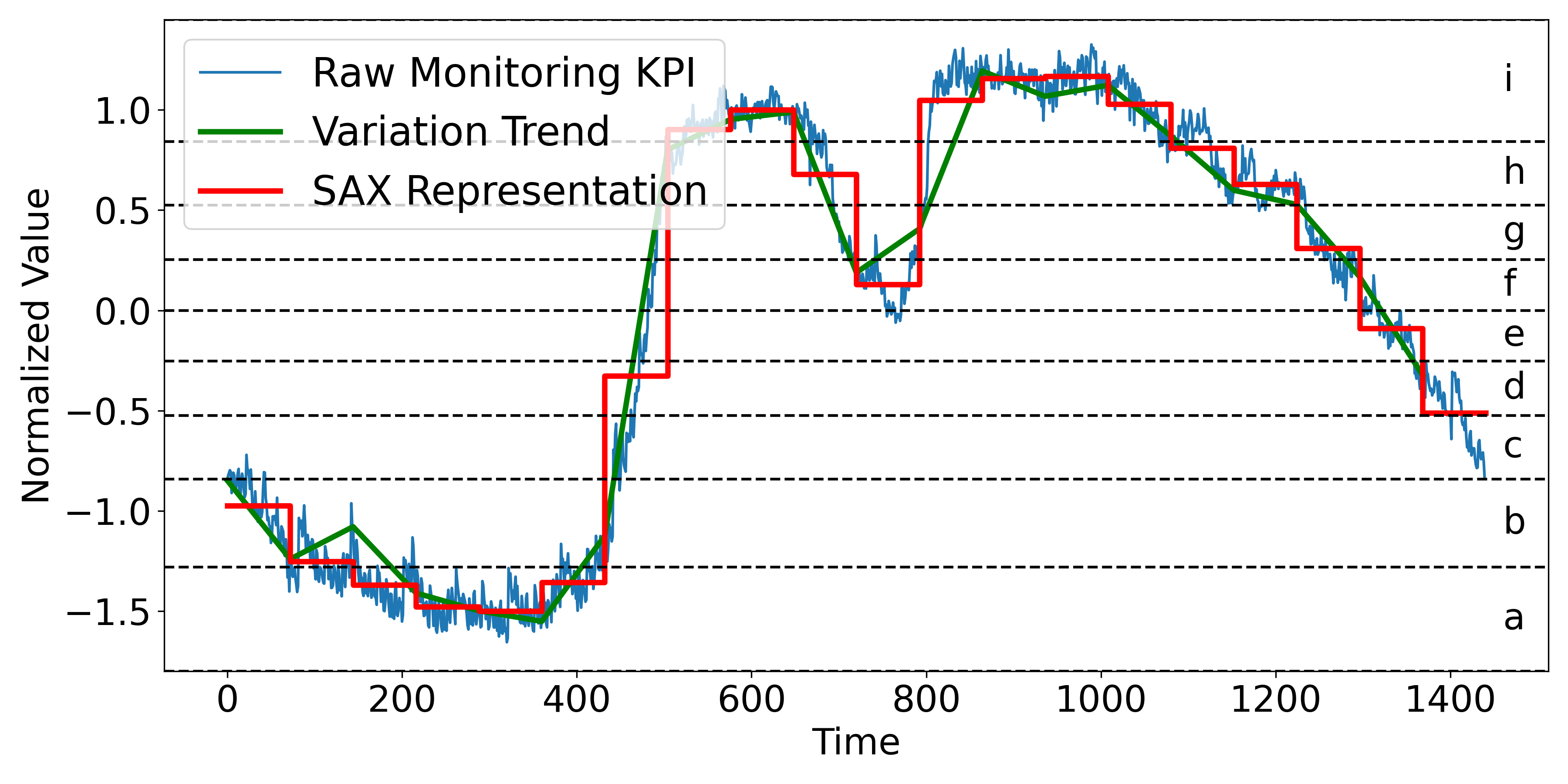
The image depicts a line chart with three data series plotted against a normalized value axis over time. Key components include:
### Axis Labels
- **X-axis**: "Time" (ranging from 0 to 1400)
- **Y-axis**: "Normalized Value" (ranging from -1.5 to 1.0)
### Legend
- **Location**: Top-left corner
- **Entries**:
- Blue line: "Raw Monitoring KPI"
- Green line: "Variation Trend"
- Red line: "SAX Representation"
### Axis Markers
Vertical dashed lines labeled with letters `a` to `i` at specific y-values:
- `a`: -1.5
- `b`: -1.0
- `c`: -0.5
- `d`: 0.0
- `e`: 0.5
- `f`: 1.0
- `g`: 1.5 (not visible in data range)
- `h`: 2.0 (not visible in data range)
- `i`: 2.5 (not visible in data range)
---
## Data Series Analysis
### 1. Raw Monitoring KPI (Blue Line)
- **Trend**:
- Starts at ~-1.2 (near `b`)
- Dips to ~-1.5 (near `a`)
- Sharp rise to ~1.0 (near `f`)
- Fluctuates between 0.8–1.2 (800–1000)
- Gradual decline to ~-0.8 (end)
- **Key Points**:
- [0, -1.2] (start)
- [200, -1.5] (minimum)
- [500, 1.0] (peak)
- [1400, -0.8] (end)
### 2. Variation Trend (Green Line)
- **Trend**:
- Mirrors blue line but with smoother transitions
- Peaks at ~1.0 (500–600)
- Sharp drop to ~0.2 (700–800)
- Stabilizes near 0.5–0.8 (800–1200)
- Declines to ~-0.5 (end)
- **Key Points**:
- [0, -1.2] (start)
- [500, 1.0] (peak)
- [800, 0.2] (trough)
- [1400, -0.5] (end)
### 3. SAX Representation (Red Line)
- **Trend**:
- Stepwise approximation of blue line
- Sharp transitions at key inflection points
- Matches blue line's general shape but with discrete levels
- **Key Points**:
- [0, -1.2] (start)
- [200, -1.5] (minimum)
- [500, 1.0] (peak)
- [1400, -0.8] (end)
---
## Cross-Reference Verification
- **Legend Colors**:
- Blue (Raw Monitoring KPI) matches blue line
- Green (Variation Trend) matches green line
- Red (SAX Representation) matches red line
- **Axis Markers**:
- All labels (`a`–`i`) correspond to y-axis values as specified
---
## Observations
1. **Normalization**: All series are normalized to a -1.5 to 1.0 range.
2. **SAX Behavior**: The red line (SAX) simplifies the blue line's fluctuations into discrete steps, preserving trend direction but losing granularity.
3. **Divergence**: The green line (Variation Trend) smooths the blue line's noise, suggesting a focus on underlying patterns.
---
## Conclusion
The chart visualizes three representations of a time-series dataset:
- Raw data (blue)
- Smoothed trend (green)
- Symbolic approximation (red)
All series share similar inflection points but differ in granularity and smoothing.