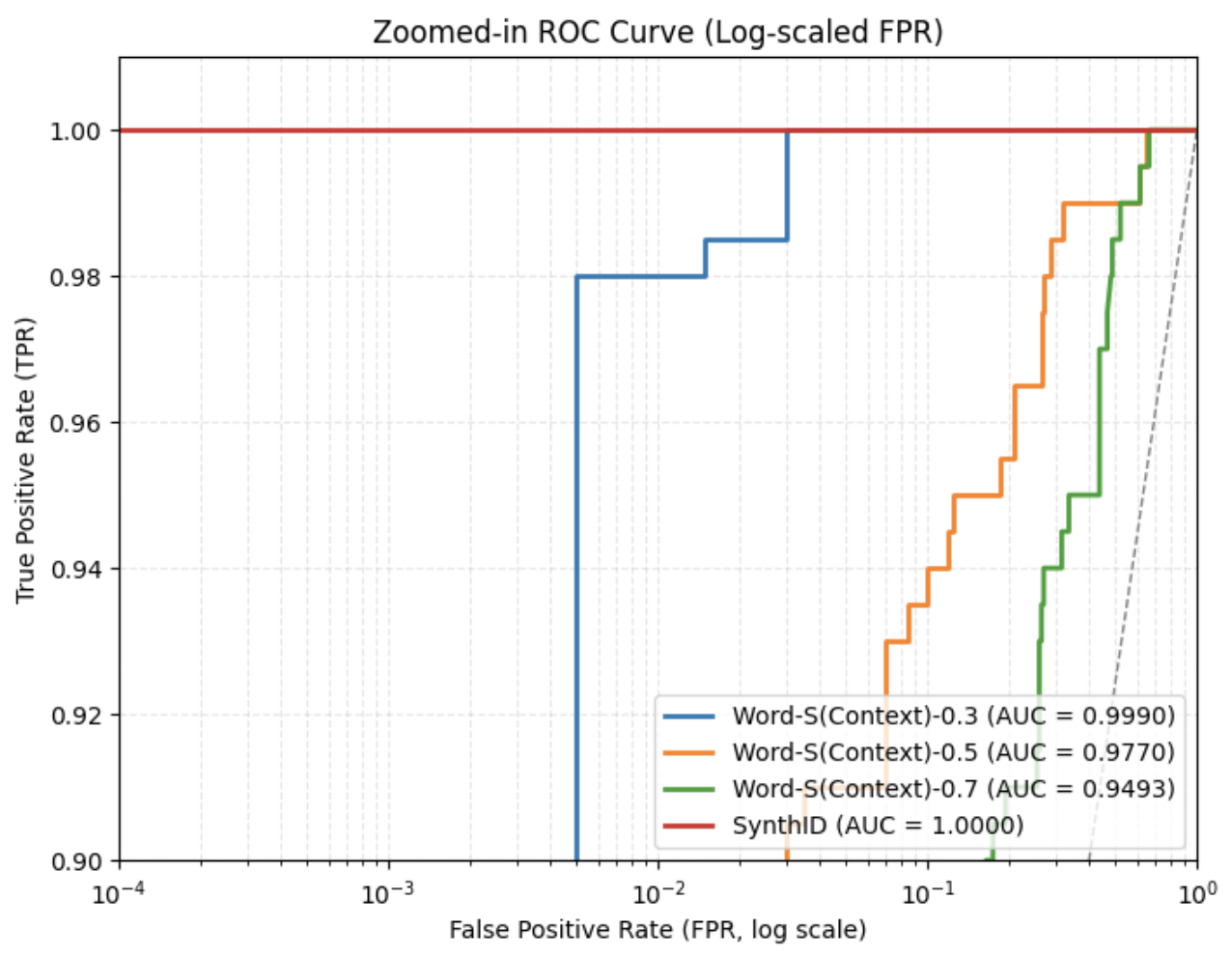
## Chart Type: Zoomed-in ROC Curve
### Overview
The image is a Receiver Operating Characteristic (ROC) curve, specifically zoomed-in and plotting the True Positive Rate (TPR) against the False Positive Rate (FPR) on a logarithmic scale. It compares the performance of different models: "Word-S(Context)-0.3", "Word-S(Context)-0.5", "Word-S(Context)-0.7", and "SynthID". The graph shows how well each model distinguishes between positive and negative cases, with a higher curve indicating better performance.
### Components/Axes
* **Title:** Zoomed-in ROC Curve (Log-scaled FPR)
* **X-axis:** False Positive Rate (FPR, log scale). The scale ranges from 10^-4 to 10^0. Axis markers are present at 10^-4, 10^-3, 10^-2, 10^-1, and 10^0.
* **Y-axis:** True Positive Rate (TPR). The scale ranges from 0.90 to 1.00. Axis markers are present at 0.90, 0.92, 0.94, 0.96, 0.98, and 1.00.
* **Legend:** Located in the bottom-right corner. It identifies the four data series:
* Blue: Word-S(Context)-0.3 (AUC = 0.9990)
* Orange: Word-S(Context)-0.5 (AUC = 0.9770)
* Green: Word-S(Context)-0.7 (AUC = 0.9493)
* Red: SynthID (AUC = 1.0000)
* A dashed gray line extends from the bottom-left to the top-right corner, representing a baseline or random classifier.
### Detailed Analysis
* **SynthID (Red):** This line is horizontal at TPR = 1.00, indicating perfect classification.
* **Word-S(Context)-0.3 (Blue):** The line starts at TPR = 0.90 and rises sharply around FPR = 10^-2, reaching TPR = 0.98, then jumps to 1.00.
* **Word-S(Context)-0.5 (Orange):** The line starts at TPR = 0.90 and rises more gradually than the blue line, with steps at approximately FPR = 0.02, 0.04, 0.06, 0.08, 0.1, reaching TPR = 1.00.
* **Word-S(Context)-0.7 (Green):** This line rises even more gradually than the orange line, with steps at approximately FPR = 0.2, 0.4, 0.6, 0.8, reaching TPR = 1.00.
### Key Observations
* SynthID achieves perfect classification (AUC = 1.0000).
* Word-S(Context)-0.3 performs very well (AUC = 0.9990), closely approaching perfect classification.
* Word-S(Context)-0.5 (AUC = 0.9770) and Word-S(Context)-0.7 (AUC = 0.9493) have lower AUC scores, indicating slightly worse performance.
* The dashed gray line represents a random classifier, against which the models are being compared.
### Interpretation
The ROC curve visualizes the trade-off between the true positive rate and the false positive rate for different classification models. The closer a curve is to the top-left corner, the better the model's performance. SynthID demonstrates perfect classification, while Word-S(Context)-0.3 is a close second. The other two models, Word-S(Context)-0.5 and Word-S(Context)-0.7, show progressively lower performance. The logarithmic scale on the x-axis allows for a detailed view of the models' behavior at very low false positive rates. The AUC values provided in the legend quantify the overall performance of each model, confirming the visual assessment.