## Directed Acyclic Graph (DAG): Causal Model with Covariates and Confounder
### Overview
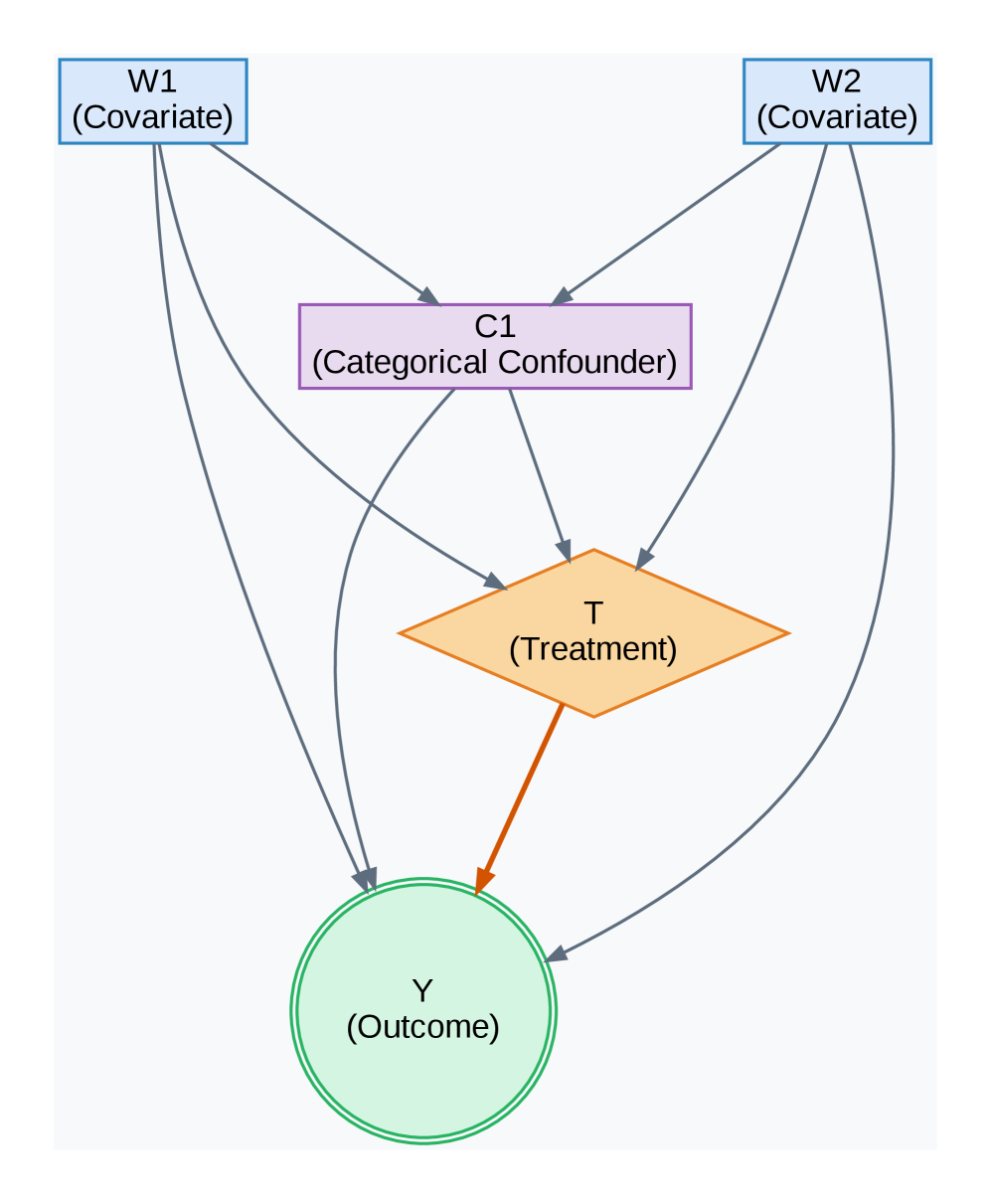
The image displays a directed acyclic graph (DAG), a type of causal diagram used in statistics and epidemiology to represent hypothesized causal relationships between variables. The diagram illustrates a model where two covariates (W1, W2) influence a categorical confounder (C1) and the treatment (T), which in turn affects the outcome (Y). The confounder also directly influences both the treatment and the outcome.
### Components/Axes
The diagram consists of five nodes connected by directed arrows (edges). There are no numerical axes, as this is a conceptual model.
**Nodes (Variables):**
1. **W1 (Covariate)**: Located in the top-left corner. Represented by a light blue rectangle with a blue border.
2. **W2 (Covariate)**: Located in the top-right corner. Represented by a light blue rectangle with a blue border.
3. **C1 (Categorical Confounder)**: Located in the center, below W1 and W2. Represented by a light purple rectangle with a purple border.
4. **T (Treatment)**: Located in the center, below C1. Represented by an orange diamond shape.
5. **Y (Outcome)**: Located at the bottom center. Represented by a light green circle with a double green border.
**Edges (Directed Relationships):**
The arrows indicate the direction of hypothesized causal influence. All arrows are grey except for one.
* From **W1** to **C1** (grey arrow).
* From **W1** to **T** (grey arrow).
* From **W1** to **Y** (grey arrow).
* From **W2** to **C1** (grey arrow).
* From **W2** to **T** (grey arrow).
* From **W2** to **Y** (grey arrow).
* From **C1** to **T** (grey arrow).
* From **C1** to **Y** (grey arrow).
* From **T** to **Y** (a thicker, **orange** arrow, visually emphasizing the primary causal path of interest).
### Detailed Analysis
The diagram explicitly maps the following causal pathways:
1. **Direct Effects of Covariates**: Both covariates (W1, W2) have direct causal paths to all other variables in the model: the confounder (C1), the treatment (T), and the outcome (Y).
2. **Role of the Confounder**: The categorical confounder (C1) is influenced by the covariates and, in turn, exerts a direct causal influence on both the treatment (T) and the outcome (Y). This creates a "backdoor path" from T to Y via C1, which must be controlled for to estimate the true effect of T on Y.
3. **Primary Causal Path**: The central relationship of interest is the direct effect of the Treatment (T) on the Outcome (Y), indicated by the distinct, thicker orange arrow.
4. **Common Causes**: W1 and W2 act as common causes (or sources of variation) for both the confounder and the treatment, and they also directly affect the outcome.
### Key Observations
* **Visual Emphasis**: The arrow from **T to Y** is the only one colored orange and is thicker than the others. This design choice highlights it as the primary causal relationship the model is designed to investigate.
* **Node Coding**: Each variable type is encoded with a distinct shape and color: rectangles for covariates/confounder, a diamond for treatment, and a circle for outcome. This follows common conventions in causal diagrams.
* **Complex Confounding Structure**: The model depicts a scenario where simple adjustment for C1 may not be sufficient to block all confounding, as the covariates W1 and W2 also create additional paths between T and Y.
### Interpretation
This DAG represents a causal inference model for estimating the effect of a treatment (T) on an outcome (Y) in the presence of a categorical confounder (C1) and two covariates (W1, W2).
The diagram suggests that to isolate the true causal effect of T on Y (the orange path), an analyst must account for all common causes of T and Y. In this model, those are:
1. The direct confounder **C1**.
2. The covariates **W1** and **W2**, which affect both T and Y directly and also indirectly through C1.
The model implies that a valid analysis (e.g., using regression adjustment, stratification, or propensity score methods) would need to condition on W1, W2, and C1 to block the "backdoor" non-causal associations between T and Y. The diagram serves as a visual blueprint for specifying a statistical model or identifying the necessary variables for a causal analysis. It underscores that the relationship between T and Y is not isolated but is part of a network of influences.