## Causal Diagram: Treatment Effect
### Overview
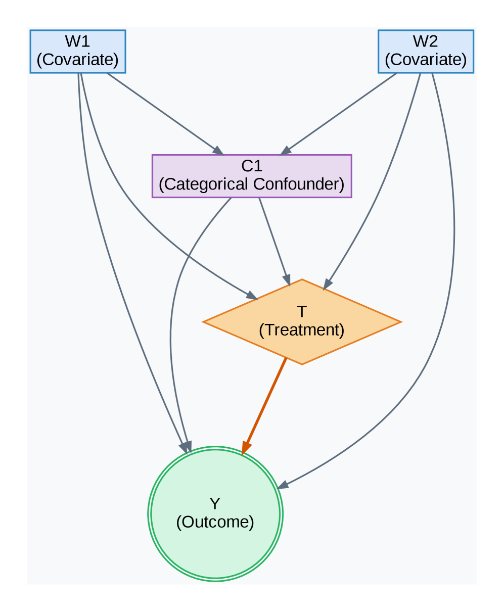
The image presents a causal diagram illustrating the relationship between covariates, a categorical confounder, treatment, and outcome. The diagram uses nodes to represent variables and arrows to indicate causal relationships.
### Components/Axes
* **Nodes:**
* W1 (Covariate): A blue rectangle at the top-left.
* W2 (Covariate): A blue rectangle at the top-right.
* C1 (Categorical Confounder): A purple rectangle in the middle-top.
* T (Treatment): An orange diamond in the middle.
* Y (Outcome): A green circle at the bottom.
* **Edges (Arrows):** Gray arrows indicate causal relationships, except for the arrow from T to Y, which is orange.
### Detailed Analysis
* **W1 (Covariate):**
* Position: Top-left.
* Shape: Rectangle.
* Color: Blue outline, white fill.
* Outgoing Arrows: One to C1, one to T, one to Y.
* **W2 (Covariate):**
* Position: Top-right.
* Shape: Rectangle.
* Color: Blue outline, white fill.
* Outgoing Arrows: One to C1, one to T, one to Y.
* **C1 (Categorical Confounder):**
* Position: Middle-top.
* Shape: Rectangle.
* Color: Purple outline, white fill.
* Outgoing Arrow: One to T.
* **T (Treatment):**
* Position: Middle.
* Shape: Diamond.
* Color: Orange outline, white fill.
* Outgoing Arrow: One to Y (orange).
* **Y (Outcome):**
* Position: Bottom.
* Shape: Circle.
* Color: Green outline, white fill.
* Incoming Arrows: From W1, W2, T, and C1.
### Key Observations
* Covariates W1 and W2 influence the categorical confounder C1, the treatment T, and the outcome Y.
* The categorical confounder C1 influences the treatment T.
* The treatment T directly influences the outcome Y.
* The arrow from T to Y is highlighted in orange, possibly indicating the primary causal path of interest.
### Interpretation
The diagram represents a causal model where the treatment (T) affects the outcome (Y). However, this relationship is confounded by a categorical variable (C1) and influenced by covariates (W1 and W2). The orange arrow from T to Y likely represents the causal effect of the treatment on the outcome, which the analysis aims to isolate and quantify, potentially adjusting for the confounder and covariates. The diagram suggests that W1 and W2 are potential confounders as they influence both the treatment and the outcome.