\n
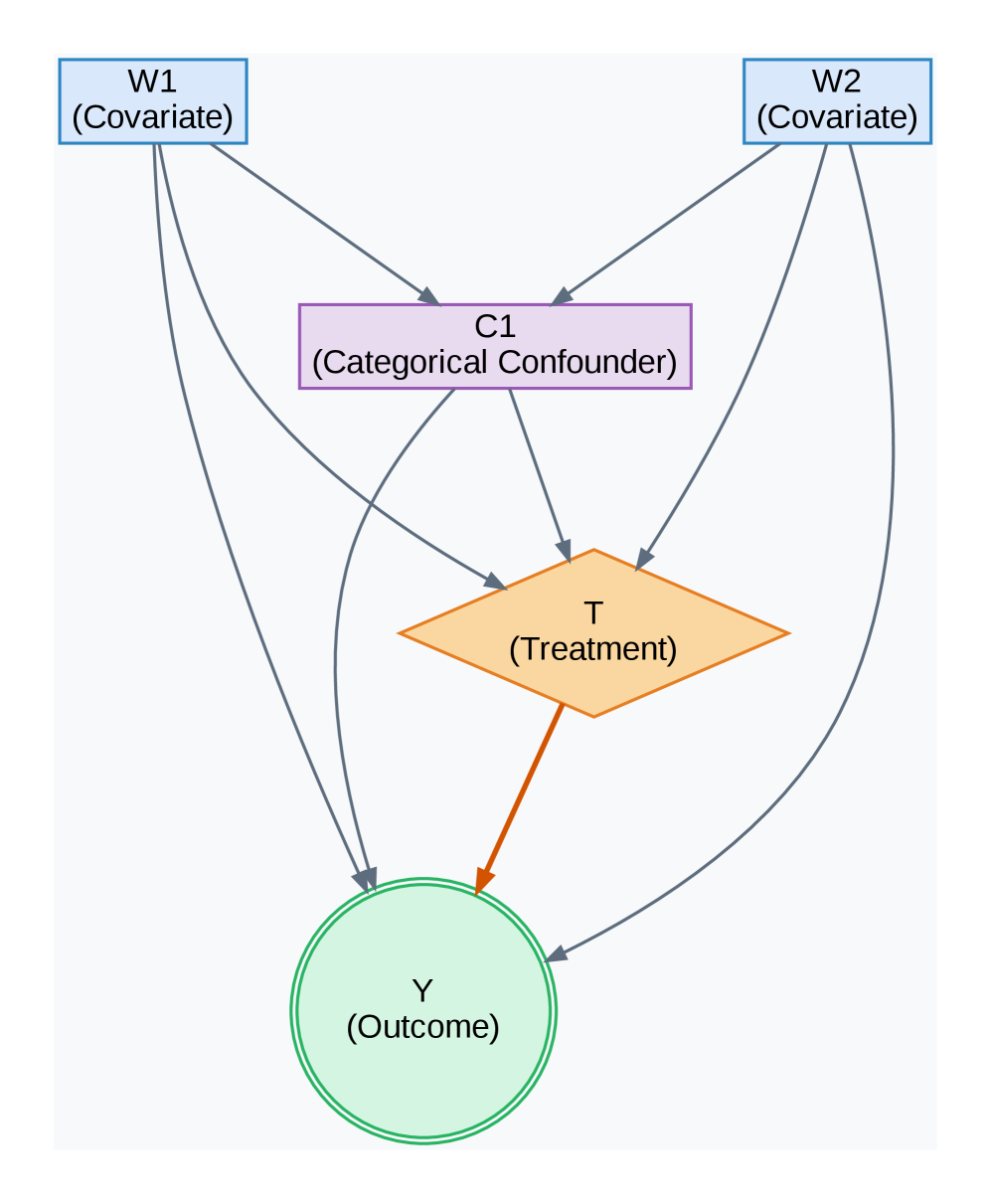
## Diagram: Causal Diagram
### Overview
The image depicts a causal diagram illustrating relationships between variables in a potential observational study. The diagram uses directed acyclic graph (DAG) notation to represent these relationships. The variables are represented by shapes: rectangles for covariates, a parallelogram for treatment, and a circle for the outcome. Arrows indicate the direction of causal influence.
### Components/Axes
The diagram includes the following components:
* **W1 (Covariate):** Represented by a rectangle at the top-left.
* **W2 (Covariate):** Represented by a rectangle at the top-right.
* **C1 (Categorical Confounder):** Represented by a rectangle in the center-top.
* **T (Treatment):** Represented by a parallelogram in the center.
* **Y (Outcome):** Represented by a circle at the bottom-center.
The arrows represent the causal relationships between these variables. The arrows are light gray, except for the arrow between T and Y, which is orange.
### Detailed Analysis or Content Details
The diagram shows the following relationships:
* W1 influences C1.
* W2 influences C1.
* C1 influences T.
* W1 influences T.
* W2 influences T.
* T influences Y.
* C1 influences Y.
* W1 influences Y.
* W2 influences Y.
The orange arrow between T and Y is visually distinct, potentially indicating a primary causal pathway of interest.
### Key Observations
The diagram highlights a potential confounding scenario. C1 is a categorical confounder that influences both the treatment (T) and the outcome (Y). W1 and W2 are covariates that influence both the confounder and the treatment, and also directly influence the outcome. The diagram suggests that estimating the causal effect of T on Y requires accounting for C1, W1, and W2.
### Interpretation
This diagram represents a common scenario in observational studies where confounding variables can distort the observed relationship between a treatment and an outcome. The diagram suggests that simply comparing the outcomes of treated and untreated individuals may not provide an accurate estimate of the treatment effect due to the influence of C1, W1, and W2.
The use of a DAG allows for a visual representation of the assumed causal structure, which is crucial for selecting appropriate statistical methods to control for confounding and estimate causal effects. The orange arrow emphasizes the primary relationship of interest, while the other arrows illustrate potential sources of bias.
The diagram is a conceptual tool for understanding causal relationships and does not contain numerical data. It is a qualitative representation of a hypothesized causal model. The diagram suggests that to estimate the true effect of T on Y, one would need to adjust for C1, W1, and W2 using methods like regression, propensity score matching, or instrumental variables.