\n
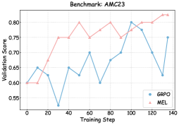
## Line Chart: Benchmark: AMC23
### Overview
The image is a line chart comparing the validation score performance of two methods, "GAPO" and "MEL", over the course of training steps on the AMC23 benchmark. The chart shows that the MEL method demonstrates a generally superior and more stable upward trend compared to the more volatile performance of the GAPO method.
### Components/Axes
* **Chart Title:** "Benchmark: AMC23" (centered at the top).
* **X-Axis:**
* **Label:** "Training Step"
* **Scale:** Linear, from 0 to 140.
* **Major Tick Marks:** 0, 20, 40, 60, 80, 100, 120, 140.
* **Y-Axis:**
* **Label:** "Validation Score"
* **Scale:** Linear, from 0.55 to 0.80.
* **Major Tick Marks:** 0.55, 0.60, 0.65, 0.70, 0.75, 0.80.
* **Legend:** Located in the bottom-right corner of the plot area.
* **Blue line with circular markers:** "GAPO"
* **Red line with circular markers:** "MEL"
* **Grid:** Light gray grid lines are present for both major x and y ticks.
### Detailed Analysis
**Data Series: MEL (Red Line)**
* **Trend Verification:** The red line shows a clear, generally upward trend with moderate fluctuations. It starts at the same point as GAPO but establishes a lead early and maintains it.
* **Approximate Data Points (Training Step, Validation Score):**
* (0, 0.60)
* (10, 0.60)
* (20, 0.75) - Sharp increase.
* (30, 0.75)
* (40, 0.75)
* (50, 0.80) - Peak.
* (60, 0.77)
* (70, 0.80) - Returns to peak.
* (80, 0.77)
* (90, 0.80)
* (100, 0.77)
* (110, 0.80)
* (120, 0.82) - New peak.
* (130, 0.82)
* (140, 0.83) - Highest point.
**Data Series: GAPO (Blue Line)**
* **Trend Verification:** The blue line is highly volatile with significant dips and recoveries. It shows an overall slight upward trend but with much less consistency than MEL.
* **Approximate Data Points (Training Step, Validation Score):**
* (0, 0.60)
* (10, 0.65)
* (20, 0.63)
* (30, 0.55) - Major dip, lowest point.
* (40, 0.65)
* (50, 0.63)
* (60, 0.70)
* (70, 0.60)
* (80, 0.68)
* (90, 0.68)
* (100, 0.80) - Sharp spike, matches MEL's peak at this step.
* (110, 0.78)
* (120, 0.70)
* (130, 0.63)
* (140, 0.75) - Final recovery.
### Key Observations
1. **Performance Gap:** After step 20, the MEL (red) line is consistently above the GAPO (blue) line, except for a single convergence at step 100.
2. **Volatility:** GAPO exhibits extreme volatility, with a dramatic drop at step 30 (to ~0.55) and a sharp, isolated spike at step 100 (to ~0.80).
3. **Stability:** MEL shows a more stable learning curve. Its dips are less severe, and it establishes new performance plateaus (e.g., ~0.75 from steps 20-40, ~0.80 from steps 50-110).
4. **Final State:** At the final recorded step (140), MEL achieves its highest score (~0.83), while GAPO recovers to ~0.75, still significantly below MEL.
### Interpretation
The data suggests that for the AMC23 benchmark, the **MEL method is significantly more effective and robust than the GAPO method**. MEL's trajectory indicates a more reliable learning process, quickly achieving high performance and maintaining it with minor fluctuations, ultimately reaching a higher final score.
The GAPO method's performance is erratic. The severe dip at step 30 could indicate a period of catastrophic forgetting or an unstable update. The isolated spike at step 100 is an interesting anomaly—it suggests GAPO is capable of high performance but cannot sustain it, possibly due to overfitting to a specific batch or instability in its optimization landscape.
The key takeaway is that MEL provides a more dependable and superior training outcome for this specific task. The chart effectively argues for the preference of MEL over GAPO in this context, highlighting not just a higher average score, but a more trustworthy and consistent improvement over time.