## Bar Chart: Overlap Ratio Percentage Distribution
### Overview
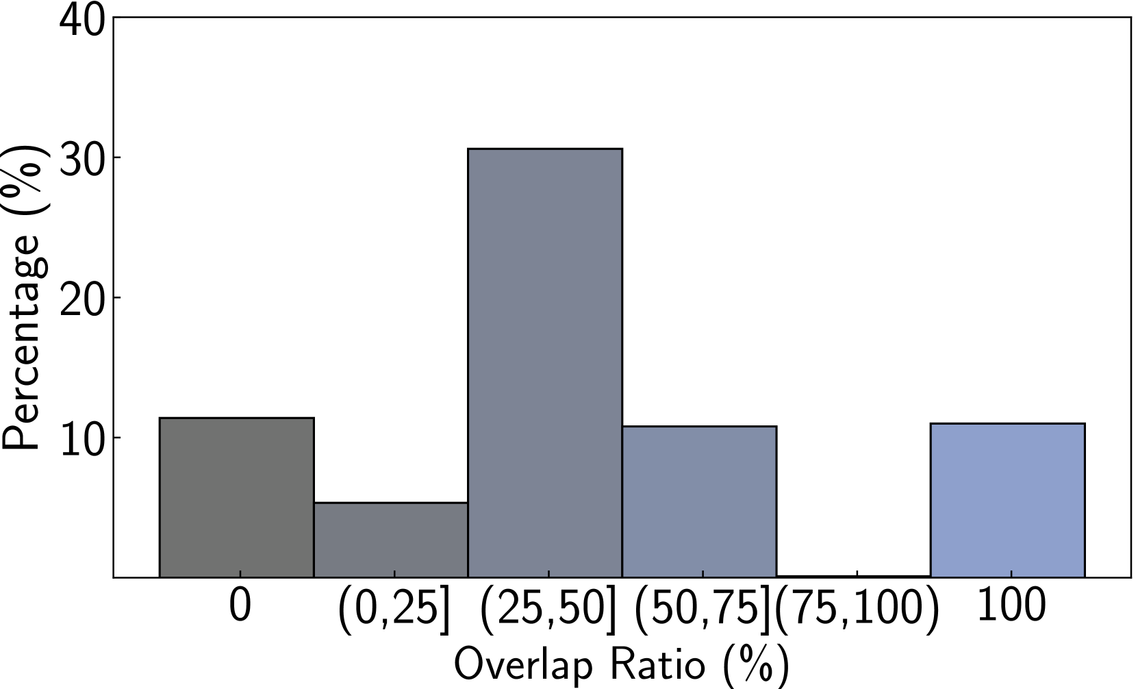
The image is a bar chart illustrating the distribution of percentages across different overlap ratio categories. The x-axis represents the overlap ratio in percentage, divided into bins, and the y-axis represents the percentage of occurrences within each bin.
### Components/Axes
* **X-axis:** Overlap Ratio (%), with categories: 0, (0,25], (25,50], (50,75], (75,100), 100.
* **Y-axis:** Percentage (%), with a scale from 0 to 40. Axis markers are present at intervals of 10 (10, 20, 30, 40).
### Detailed Analysis
* **Category 0:** The bar extends to approximately 11%. The bar color is dark gray.
* **Category (0,25]:** The bar extends to approximately 5%. The bar color is dark gray.
* **Category (25,50]:** The bar extends to approximately 31%. The bar color is gray.
* **Category (50,75]:** The bar extends to approximately 11%. The bar color is gray.
* **Category (75,100]:** There is no bar for this category, implying a percentage of 0%.
* **Category 100:** The bar extends to approximately 11%. The bar color is light blue.
### Key Observations
* The highest percentage occurs in the (25,50] overlap ratio category.
* The (0,25] overlap ratio category has the lowest percentage.
* The percentages for the 0, (50,75], and 100 overlap ratio categories are approximately equal.
* The (75,100] overlap ratio category has a percentage of 0.
### Interpretation
The bar chart suggests that overlap ratios between 25% and 50% are the most frequent. Very low overlap ratios (0-25%) are the least frequent. Overlap ratios of 0% and 100% occur with similar frequency. The absence of a bar for the (75,100] category indicates that such overlap ratios are not observed in the dataset. This distribution could be indicative of a system or process that tends to favor moderate overlap, while avoiding both very little and near-complete overlap.