\n
## Line Chart: Unlabeled Time Series or Process Metric
### Overview
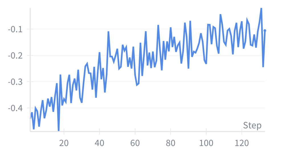
The image displays a single-series line chart plotting a negative numerical value against a sequential "Step" axis. The chart shows a clear, albeit volatile, upward trend over approximately 130 steps. The visual style is simple, with a blue line on a white background with light gray grid lines.
### Components/Axes
* **Chart Type:** Single line chart.
* **X-Axis (Horizontal):**
* **Label:** "Step" (located at the bottom-right of the axis).
* **Scale:** Linear, from approximately 0 to 130.
* **Major Tick Marks:** Labeled at intervals of 20: 20, 40, 60, 80, 100, 120.
* **Y-Axis (Vertical):**
* **Label:** None visible.
* **Scale:** Linear, negative values.
* **Major Tick Marks:** Labeled at -0.4, -0.3, -0.2, -0.1.
* **Data Series:**
* **Representation:** A single, continuous blue line.
* **Legend:** None present.
* **Other Elements:** Light gray horizontal grid lines corresponding to the y-axis tick marks. No chart title is present.
### Detailed Analysis
* **Trend Verification:** The blue line exhibits a strong positive (upward) slope from left to right, indicating the measured value increases (becomes less negative) as the step count increases. The trend is accompanied by high-frequency volatility or noise.
* **Data Point Approximation (Key Points):**
* **Start (Step ~0):** The line begins at its lowest point, approximately **-0.45**.
* **Step ~20:** The value fluctuates around **-0.35 to -0.25**.
* **Step ~60:** The value fluctuates around **-0.25 to -0.15**.
* **Step ~100:** The value fluctuates around **-0.20 to -0.10**.
* **End (Step ~130):** The line ends near its highest point, approximately **-0.10**.
* **Volatility:** The line is highly jagged, with frequent sharp peaks and troughs. The amplitude of these fluctuations appears relatively consistent throughout the chart, spanning roughly 0.1 to 0.15 units on the y-axis between local highs and lows.
### Key Observations
1. **Consistent Upward Trajectory:** Despite significant noise, the underlying trend is unmistakably positive. The value improves by approximately 0.35 units over 130 steps.
2. **High Noise/Volatility:** The process being measured is not smooth. Each step shows considerable variation from the previous one, suggesting an unstable or stochastic process.
3. **Negative Values:** All data points are negative, indicating the metric is measuring something like a loss, error, or deficit that is being reduced over time.
4. **Absence of Context:** The chart lacks a title, y-axis label, and legend. This makes it impossible to know what specific metric is being tracked (e.g., loss function, error rate, profit/loss).
### Interpretation
This chart likely visualizes the performance of an iterative process, such as a machine learning model's training loss, an optimization algorithm's error, or a financial trading strategy's drawdown. The **upward trend** signifies improvement or convergence—the system is getting better at its task as it progresses through more steps. The **high volatility** is a critical characteristic; it suggests the improvement path is noisy, which could be due to factors like a high learning rate, stochastic batch processing, or inherent randomness in the environment.
The **negative values** are key. If this represents a loss function, the goal is to minimize it, but since the values are negative and increasing, it might actually represent the *negative of the loss* (so -Loss), where an increase towards zero is improvement. Alternatively, it could be a direct measure of profit/loss where negative indicates a loss that is being reduced.
**Without additional context, the core story is:** A noisy but consistently improving process over 130 iterations, moving from a state of high deficit/error (~-0.45) to a state of lower deficit/error (~-0.10). The next analytical step would be to identify the metric on the y-axis to understand the real-world significance of this improvement.