## Line Chart: Performance over Steps
### Overview
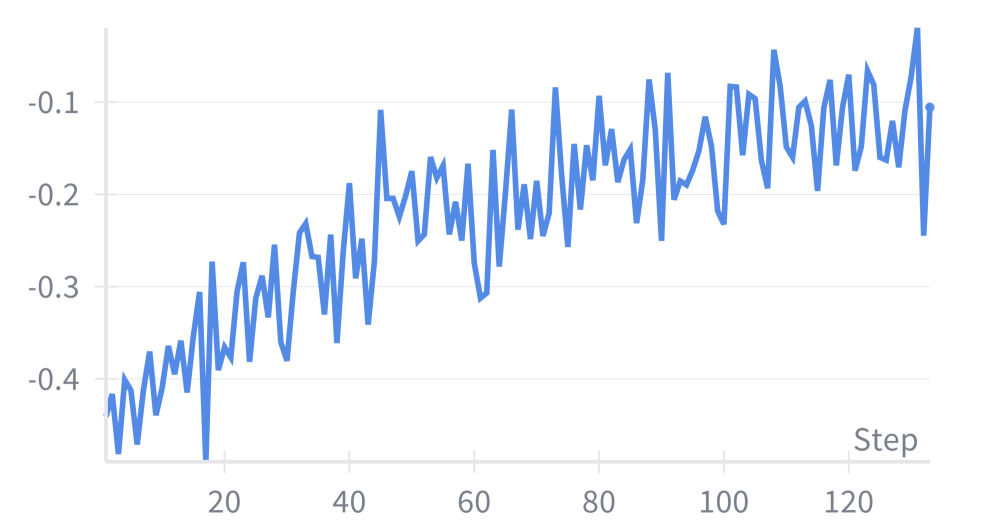
The image is a line chart showing the performance over steps. The x-axis represents the "Step" number, and the y-axis represents a performance metric ranging from approximately -0.45 to -0.1. The blue line shows an upward trend, indicating improving performance as the step number increases.
### Components/Axes
* **X-axis:** "Step" with markers at approximately 20, 40, 60, 80, 100, and 120.
* **Y-axis:** Numerical values ranging from -0.4 to -0.1, with markers at -0.4, -0.3, -0.2, and -0.1.
* **Data Series:** A single blue line representing the performance metric.
### Detailed Analysis
* **Blue Line (Performance):** The blue line starts at approximately -0.44 at step 0. It generally slopes upward, indicating an improvement in performance as the step number increases. The line fluctuates, showing variability in performance at each step.
* At step 20, the value is approximately -0.3.
* At step 40, the value is approximately -0.22.
* At step 60, the value is approximately -0.3.
* At step 80, the value is approximately -0.18.
* At step 100, the value is approximately -0.15.
* At step 120, the value is approximately -0.1.
### Key Observations
* The performance generally improves over the steps.
* There are fluctuations in performance at each step.
* The rate of improvement appears to decrease as the step number increases.
### Interpretation
The chart suggests that the system or model being evaluated is learning or improving its performance as it progresses through the steps. The fluctuations indicate that the performance is not consistently improving, but the overall trend is positive. The decreasing rate of improvement might suggest that the system is approaching a performance limit or that further optimization is needed.