\n
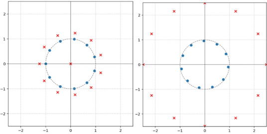
## Scatter Plot Comparison: Circular vs. Perturbed Distributions
### Overview
The image displays two side-by-side scatter plots on a Cartesian coordinate system. Each plot contains two data series distinguished by marker type and color: blue filled circles and red 'x' marks. The plots appear to compare a regular, symmetric arrangement of points (left) with a more irregular or transformed arrangement (right), while one series (blue circles) remains constant.
### Components/Axes
* **Chart Type:** Two separate 2D scatter plots arranged horizontally.
* **Axes:** Both plots have identical X and Y axes.
* **X-axis:** Linear scale, labeled with major ticks at -2, -1, 0, 1, 2. Grid lines are present at these intervals.
* **Y-axis:** Linear scale, labeled with major ticks at -2, -1, 0, 1, 2. Grid lines are present at these intervals.
* **Data Series (Legend inferred from visual encoding):**
* **Blue filled circles (●):** Represent one data series. Present in both plots.
* **Red 'x' marks (✕):** Represent a second data series. Present in both plots.
* **Spatial Layout:** The left plot occupies the left half of the image, the right plot the right half. Each plot has its own set of axes and grid. There are no explicit titles, axis labels, or a formal legend box.
### Detailed Analysis
**Left Plot Analysis:**
* **Blue Circle Series (●):** Forms a perfect circle centered at the origin (0,0). The points are evenly spaced along the circumference. The radius of this circle is approximately 1.0 units (points lie on the grid line for 1 on the positive axes).
* **Red 'x' Series (✕):** Forms a larger, concentric circle also centered at the origin. The points are also evenly spaced. The radius of this circle is approximately 1.5 units (points are midway between the 1 and 2 grid lines). The angular positions of the red 'x' marks are offset from the blue circles; they do not share the same radial lines.
**Right Plot Analysis:**
* **Blue Circle Series (●):** Identical to the left plot. Forms a perfect circle centered at the origin with a radius of approximately 1.0 units.
* **Red 'x' Series (✕):** The points are no longer arranged in a perfect circle. They are scattered at various distances from the origin, forming an irregular, roughly circular cloud. The distribution is not symmetric. Some points are near radius ~1.2, others near ~2.0, and some closer to ~1.8. The angular distribution is also uneven.
### Key Observations
1. **Constant Reference:** The blue circle series is identical in both plots, acting as a fixed reference or control set.
2. **Transformation of the Red Series:** The primary difference between the two plots is the arrangement of the red 'x' series. It transforms from a perfect, larger concentric circle (left) to a scattered, irregular distribution (right).
3. **Symmetry vs. Asymmetry:** The left plot exhibits perfect radial symmetry for both series. The right plot breaks this symmetry for the red series only.
4. **Spatial Relationship:** In the left plot, each red 'x' is radially aligned between two blue circles. In the right plot, this precise angular relationship is lost.
### Interpretation
This visualization likely demonstrates a concept from mathematics, physics, or data science, such as:
* **A Transformation or Perturbation:** The right plot could show the effect of applying a non-linear transformation, noise, or a distortion field to the original red circle data from the left plot, while the blue circle remains unaffected.
* **Model vs. Observation:** The blue circles might represent a theoretical model or ideal state (a unit circle). The left red circles could represent a perfect secondary model, while the right red crosses represent actual, noisy observational data or the output of a complex system.
* **Clustering or Distribution Comparison:** It contrasts a highly structured, deterministic distribution (left) with a more stochastic or complex one (right), using the blue circle as a common baseline for scale and position.
The absence of explicit labels suggests this is a conceptual or pedagogical figure, where the viewer is meant to infer the meaning from the visual patterns and their contrast. The core message is the comparison between order and disorder, or between a simple model and a more complex reality, anchored by a constant reference.