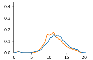
## Line Graph: Unlabeled Data Series Comparison
### Overview
The image depicts a line graph with two distinct data series represented by blue and orange lines. Both lines exhibit a single peak followed by a gradual decline. The graph lacks explicit labels for axes, legend entries, or data series identifiers. The x-axis spans from 0 to 20, while the y-axis ranges from 0 to 0.4. The legend is positioned in the top-right corner but contains no visible text or labels.
### Components/Axes
- **X-axis**: Labeled with numerical markers at intervals of 5 (0, 5, 10, 15, 20). No explicit title or units provided.
- **Y-axis**: Labeled with numerical markers at intervals of 0.1 (0, 0.1, 0.2, 0.3, 0.4). No explicit title or units provided.
- **Legend**: Located in the top-right corner. Contains two colored entries (blue and orange) but no textual labels to identify the data series.
- **Lines**:
- **Blue Line**: Peaks at approximately (x=10, y=0.15), then declines.
- **Orange Line**: Peaks at approximately (x=12, y=0.18), then declines.
### Detailed Analysis
1. **Blue Line**:
- Begins near (0, 0) with minimal activity until x=5.
- Rises sharply to a peak at (10, 0.15).
- Declines gradually to near (20, 0.02).
- Total range: 0.15 (peak) - 0.02 (end) = 0.13 drop.
2. **Orange Line**:
- Begins near (0, 0) with minimal activity until x=5.
- Rises gradually to a peak at (12, 0.18).
- Declines more steeply than the blue line, reaching near (20, 0.01).
- Total range: 0.18 (peak) - 0.01 (end) = 0.17 drop.
3. **Trends**:
- Both lines show a single dominant peak, suggesting a transient event or process.
- The orange line exhibits a delayed peak (x=12 vs. x=10 for blue) and higher maximum value (0.18 vs. 0.15).
- The orange line’s decline is steeper, indicating a faster decay rate post-peak.
### Key Observations
- The orange line consistently surpasses the blue line in both peak height and x-axis timing.
- Both lines share similar starting and ending behaviors but diverge in peak characteristics.
- The absence of legend labels prevents direct interpretation of the data series’ meanings (e.g., "Temperature vs. Time" or "Sales vs. Units").
### Interpretation
The graph likely represents a comparison of two related phenomena with distinct timing and magnitude characteristics. The orange line’s higher peak and later occurrence could indicate a delayed response or a more intense but shorter-lived event compared to the blue line. The steeper decline of the orange line suggests a faster dissipation or resolution of the measured variable. Without contextual labels, the exact nature of the data (e.g., scientific measurements, economic indicators) remains ambiguous. However, the visual trends strongly imply a causal or correlational relationship between the two series, warranting further investigation into their underlying mechanisms.