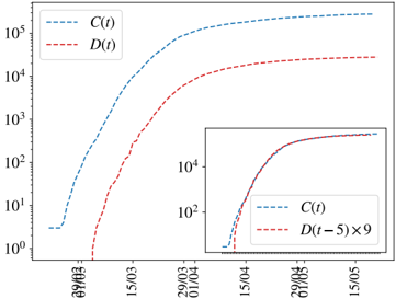
\n
## Line Chart: Temporal Growth of C(t) and D(t) with Inset Detail
### Overview
The image displays a line chart plotting two functions, C(t) and D(t), against time on a logarithmic y-axis. The chart illustrates the growth trajectories of these two variables over a period in March. A smaller inset chart provides a zoomed-in view of a later time segment, comparing C(t) to a scaled and time-shifted version of D(t).
### Components/Axes
* **Main Chart:**
* **Y-Axis:** Logarithmic scale. Major tick marks and labels are at `10^0`, `10^1`, `10^2`, `10^3`, `10^4`, and `10^5`. The axis is unlabeled but represents the magnitude of C(t) and D(t).
* **X-Axis:** Represents time. Tick marks and labels are at dates: `08MAR`, `15MAR`, `22MAR`, `29MAR`, `05APR`, `12APR`, `19APR`, `26APR`.
* **Legend:** Located in the top-left corner. It contains:
* A blue dashed line labeled `C(t)`.
* A red dashed line labeled `D(t)`.
* **Inset Chart:**
* **Position:** Located in the bottom-right quadrant of the main chart area.
* **Y-Axis:** Logarithmic scale. Major tick marks and labels are at `10^2` and `10^4`.
* **X-Axis:** Represents time, showing a subset of the main chart's timeline. Tick marks and labels are at `05APR`, `12APR`, `19APR`, `26APR`.
* **Legend:** Located within the inset, in its top-left corner. It contains:
* A blue dashed line labeled `C(t)`.
* A red dashed line labeled `D(t-5) × 9`.
### Detailed Analysis
* **Data Series C(t) (Blue Dashed Line):**
* **Trend:** Shows a steep, approximately sigmoidal (S-shaped) growth on the log scale. It starts near `10^0` around `08MAR`, rises rapidly through mid-March, and begins to plateau near `10^5` by late April.
* **Approximate Data Points:**
* `08MAR`: ~`10^0` (1)
* `15MAR`: ~`10^2` (100)
* `22MAR`: ~`10^3.5` (~3,162)
* `29MAR`: ~`10^4.5` (~31,622)
* `05APR`: ~`10^5` (100,000)
* `12APR` to `26APR`: Plateaus just above `10^5`.
* **Data Series D(t) (Red Dashed Line):**
* **Trend:** Also shows sigmoidal growth on the log scale, but lags significantly behind C(t). It starts near `10^0` around `15MAR`, rises steeply, and plateaus near `10^4.5` (~31,622) by late April.
* **Approximate Data Points:**
* `15MAR`: ~`10^0` (1)
* `22MAR`: ~`10^2` (100)
* `29MAR`: ~`10^3` (1,000)
* `05APR`: ~`10^4` (10,000)
* `12APR` to `26APR`: Plateaus near `10^4.5`.
* **Inset Chart Analysis:**
* The inset compares `C(t)` (blue) directly to `D(t-5) × 9` (red) from `05APR` to `26APR`.
* The transformation `D(t-5) × 9` shifts the D(t) curve 5 time units to the left and scales its magnitude by a factor of 9.
* **Observation:** In this transformed view, the red line (`D(t-5) × 9`) closely follows the blue line (`C(t)`) during the plateau phase, suggesting that after a time lag and scaling, the growth pattern of D(t) mirrors that of C(t).
### Key Observations
1. **Logarithmic Scale:** The use of a log scale indicates the data spans several orders of magnitude (from 1 to 100,000).
2. **Growth Lag:** D(t) consistently lags behind C(t) by approximately 7-10 days in reaching similar magnitude milestones (e.g., C(t) reaches `10^2` around `15MAR`, while D(t) reaches `10^2` around `22MAR`).
3. **Plateau Levels:** C(t) plateaus at a higher magnitude (~`10^5`) than D(t) (~`10^4.5`).
4. **Inset Relationship:** The inset demonstrates a strong correlation between C(t) and a time-shifted, scaled version of D(t), implying a potential causal or dependent relationship where D(t) follows C(t)'s pattern with a delay and amplitude difference.
### Interpretation
This chart likely models the growth of two related quantities over time, such as cumulative cases in an epidemic (C(t) and D(t) could represent infections and deaths, or two different populations), adoption of technologies, or diffusion of information.
* **What the data suggests:** The sigmoidal curves are characteristic of logistic growth, common in processes with initial exponential growth that slows as it approaches a carrying capacity or saturation point. The lag between C(t) and D(t) is a critical feature, suggesting D(t) is a downstream consequence of C(t).
* **How elements relate:** The main chart establishes the independent growth trajectories and their temporal relationship. The inset is an analytical tool that tests a specific hypothesis: that D(t) can be modeled as a delayed and scaled function of C(t). The close alignment in the inset supports this hypothesis for the later phase of growth.
* **Notable patterns/anomalies:** The most significant pattern is the consistent lag and the successful transformation in the inset. There are no obvious anomalies; the curves are smooth and follow expected logistic patterns. The choice of scaling factor (×9) and time shift (-5) in the inset appears to be a result of fitting or analysis to align the curves, revealing the underlying relationship.