## Candlestick Chart: Price Fluctuation Over Time
### Overview
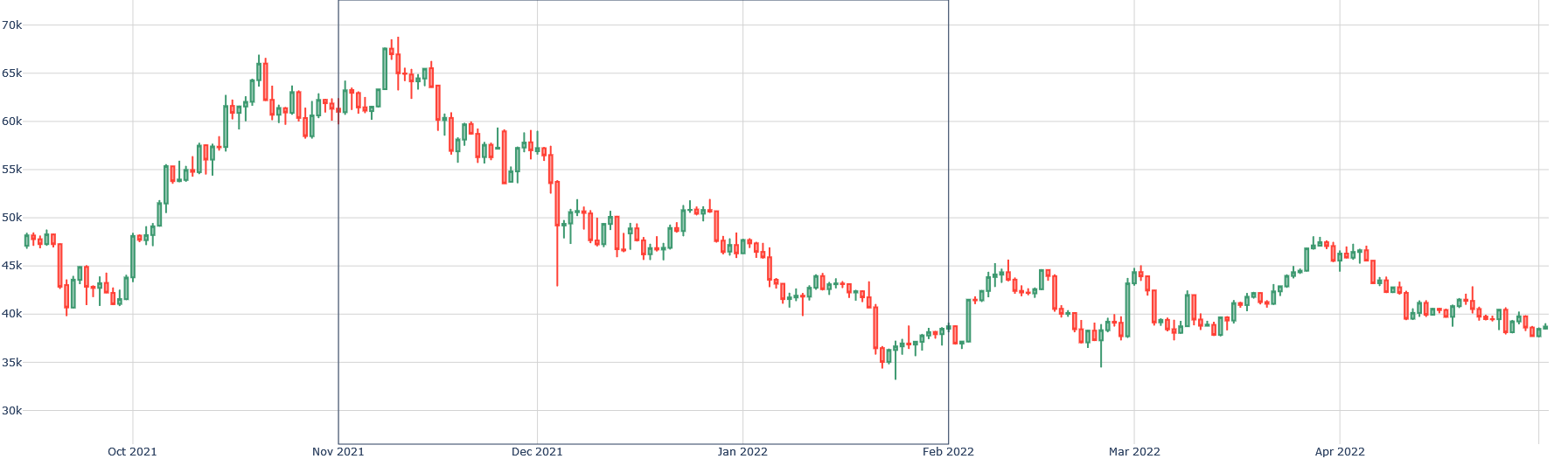
The image presents a candlestick chart illustrating price fluctuations over time. The chart spans from October 2021 to April 2022. The y-axis represents price in thousands (k), ranging from 30k to 70k. The x-axis represents time, marked by months. The chart uses candlestick patterns (red and green) to indicate price movements within each period.
### Components/Axes
* **Y-Axis (Price):** Ranges from 30k to 70k, with increments of 5k.
* **X-Axis (Time):** Labeled with months: Oct 2021, Nov 2021, Dec 2021, Jan 2022, Feb 2022, Mar 2022, Apr 2022.
* **Candlesticks:** Each candlestick represents a period (likely a day or week).
* **Green Candlesticks:** Indicate a price increase during the period (closing price higher than opening price).
* **Red Candlesticks:** Indicate a price decrease during the period (closing price lower than opening price).
### Detailed Analysis
* **October 2021:** Starts around 47k, shows an upward trend, reaching approximately 62k by the end of the month.
* **November 2021:** Continues the upward trend, peaking around 67k in the middle of the month, then fluctuating between 60k and 65k.
* **December 2021:** Shows a significant downward trend, dropping from around 60k to approximately 47k.
* **January 2022:** Continues the downward trend, fluctuating between 40k and 50k.
* **February 2022:** Reaches a low point around 35k, then shows an upward trend towards the end of the month, reaching approximately 45k.
* **March 2022:** Fluctuates between 40k and 45k, with some upward spikes.
* **April 2022:** Shows a slight downward trend, starting around 45k and ending around 38k.
### Key Observations
* **Peak:** The highest price point is observed in November 2021, around 67k.
* **Lowest Point:** The lowest price point is observed in February 2022, around 35k.
* **Volatility:** The period from October 2021 to December 2021 shows high volatility, with significant price swings.
* **Downward Trend:** A clear downward trend is visible from December 2021 to February 2022.
* **Recovery:** A slight recovery is observed from February 2022 to March 2022, followed by a slight decline in April 2022.
### Interpretation
The candlestick chart illustrates the price dynamics of an asset over a seven-month period. The initial upward trend in October and November 2021 suggests a bullish market sentiment. However, the subsequent decline from December 2021 to February 2022 indicates a shift towards a bearish market. The recovery in late February and March 2022 suggests a potential stabilization or a weak bullish reversal, but the slight decline in April 2022 indicates continued uncertainty. The chart highlights the importance of monitoring price trends and volatility to understand market sentiment and make informed decisions.