## Candlestick Chart: Price Trend Over Time
### Overview
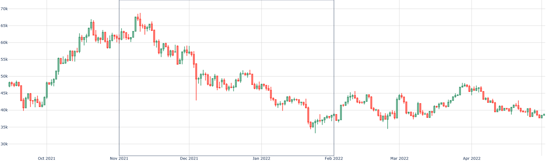
The image presents a candlestick chart displaying price fluctuations over time, spanning from approximately October 2021 to April 2022. The chart uses a standard candlestick representation, with green candles indicating price increases and red candles indicating price decreases. The y-axis represents price, measured in thousands (k), and the x-axis represents time, with monthly markers.
### Components/Axes
* **X-axis:** Time, labeled with months from Oct 2021 to Apr 2022.
* **Y-axis:** Price, ranging from approximately 30k to 70k. The scale is linear.
* **Candlesticks:** Represent price movement over each time period (likely daily or weekly).
* Green Candlesticks: Open price is lower than the closing price.
* Red Candlesticks: Open price is higher than the closing price.
* **Vertical Lines:** Extend from the top and bottom of each candlestick, representing the high and low prices for that period.
### Detailed Analysis
The chart shows a complex price history.
* **Oct 2021 - Nov 2021:** A strong upward trend is visible. Starting around 45k in early October, the price rises to a peak of approximately 68k in November. The trend is characterized by predominantly green candlesticks.
* **Nov 2021 - Dec 2021:** A significant downward trend begins in November, with the price falling from around 68k to approximately 40k by the end of December. This period is dominated by red candlesticks.
* **Dec 2021 - Jan 2022:** The price experiences some volatility, fluctuating between approximately 40k and 52k. There's a mix of green and red candlesticks, indicating periods of both price increases and decreases.
* **Jan 2022 - Feb 2022:** A continued downward trend, with the price falling from around 45k to a low of approximately 35k in late January/early February.
* **Feb 2022 - Mar 2022:** A recovery period, with the price rising from around 35k to approximately 45k by mid-March.
* **Mar 2022 - Apr 2022:** The price experiences another decline, falling from around 45k to approximately 40k by the end of April. The trend is relatively flat during this period.
Approximate Data Points (reading from the chart, with uncertainty of +/- 1k):
* Oct 2021: Starting around 45k, peaking around 60k.
* Nov 2021: Peak around 68k, ending around 58k.
* Dec 2021: Starting around 58k, ending around 40k.
* Jan 2022: Fluctuating between 40k and 52k, ending around 42k.
* Feb 2022: Falling from 42k to 35k.
* Mar 2022: Rising from 35k to 45k.
* Apr 2022: Falling from 45k to 40k.
### Key Observations
* The chart exhibits significant volatility throughout the period.
* There are clear periods of both upward and downward trends.
* The peak price occurs in November 2021, followed by a substantial decline.
* The price appears to be consolidating around the 40k level in April 2022.
* The price never recovers to the November 2021 peak.
### Interpretation
The candlestick chart illustrates the price history of an asset (likely a cryptocurrency, given the price range) over a six-month period. The data suggests a period of strong growth followed by a significant correction. The subsequent fluctuations indicate a period of market uncertainty and consolidation. The inability to regain the November 2021 peak suggests a shift in market sentiment or the emergence of new resistance levels. The chart could be used to analyze market trends, identify potential trading opportunities, or assess the overall health of the asset. The repeated cycles of increase and decrease suggest a cyclical pattern, though predicting future movements based solely on this data would be speculative. The chart provides a visual representation of price action, allowing for quick identification of key trends and potential turning points.