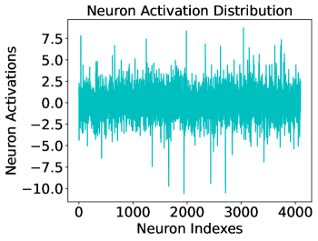
## Chart: Neuron Activation Distribution
### Overview
The image is a line chart titled "Neuron Activation Distribution." It visualizes the activation values of approximately 4,000 individual neurons, plotted against their index number. The chart displays a single, dense data series in a teal color, showing the distribution and variability of activations across the neuron population.
### Components/Axes
* **Title:** "Neuron Activation Distribution" (centered at the top).
* **X-Axis:**
* **Label:** "Neuron Indexes"
* **Scale:** Linear, from 0 to 4000.
* **Major Tick Marks:** 0, 1000, 2000, 3000, 4000.
* **Y-Axis:**
* **Label:** "Neuron Activations"
* **Scale:** Linear, from -10.0 to 7.5.
* **Major Tick Marks:** -10.0, -7.5, -5.0, -2.5, 0.0, 2.5, 5.0, 7.5.
* **Data Series:** A single, continuous line plot in a solid teal color. There is no legend, as only one data series is present.
* **Spatial Layout:** The plot area occupies the majority of the image. The title is positioned above the plot frame. Axis labels are centered along their respective axes.
### Detailed Analysis
* **Data Density:** The line is extremely dense, indicating a data point for each of the ~4,000 neuron indexes. The values fluctuate rapidly from one index to the next.
* **Central Tendency:** The vast majority of activation values are clustered around the 0.0 line on the y-axis. The dense "core" of the data appears to be concentrated roughly between -2.5 and +2.5.
* **Range and Spread:**
* **Upper Bound:** The highest activation spikes reach approximately **7.5**. Several distinct peaks approach this maximum value.
* **Lower Bound:** The lowest activation spikes reach approximately **-10.0**. A few sharp, downward spikes extend to this minimum.
* **Visual Spread:** While the core is near zero, the data exhibits significant vertical spread, with frequent excursions beyond ±5.0.
* **Trend Verification:** There is no overarching upward or downward trend across the neuron indexes (from 0 to 4000). The data appears as stationary noise, with the mean and variance remaining relatively constant across the entire x-axis range. The visual pattern is one of high-frequency oscillation around a central mean.
### Key Observations
1. **Symmetry and Outliers:** The distribution appears roughly symmetric around zero, but with notable outliers on both ends. The most extreme negative outlier (~-10.0) is slightly more pronounced than the most extreme positive outlier (~7.5).
2. **No Systematic Drift:** The activation pattern does not show any gradual increase or decrease as the neuron index increases. The statistical properties (mean, spread) appear consistent from neuron 0 to neuron 4000.
3. **High Variability:** The chart demonstrates that individual neuron activations are highly variable and not tightly constrained to a narrow range. This suggests a layer with a diverse set of responses.
4. **Absence of Structure:** There are no visible clusters, bands, or periodic patterns within the noise. The activations appear randomly distributed within their bounds.
### Interpretation
This chart likely represents the output activations of a single layer (e.g., a hidden layer) in a neural network, where each "neuron index" corresponds to a specific unit in that layer.
* **What the data suggests:** The data suggests this layer is operating in a regime where most neurons have low-magnitude activations centered around zero, but a subset of neurons fire strongly (positively or negatively) in response to the input data. This is a common pattern in trained networks, indicating specialization.
* **How elements relate:** The x-axis (neuron index) is an arbitrary identifier, so the lack of trend is expected. The y-axis (activation) is the functional output. The relationship shown is the population code of the layer—which neurons are active and to what degree for a given input or set of inputs.
* **Notable patterns/anomalies:** The key observation is the presence of extreme outliers (near -10 and +7.5). In many activation functions (like ReLU), negative values are zeroed out. The presence of significant negative activations suggests the use of an activation function like tanh, sigmoid, or a linear layer, or that this plot shows pre-activation (logit) values. The outliers could represent neurons that are highly selective for specific features in the input data.
* **Underlying Information:** This visualization is a diagnostic tool. It helps answer: Is the layer saturated? Are activations well-distributed or collapsed? Are there "dead" neurons (consistently near zero) or "hyperactive" ones? The dense, noisy plot with outliers indicates a healthy, active layer with a diverse response profile, but the extreme values might warrant investigation to ensure they are not causing numerical instability.