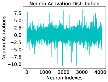
## Line Chart: Neuron Activation Distribution
### Overview
The image depicts a line chart titled "Neuron Activation Distribution," visualizing the activation levels of neurons across a range of indexes. The chart shows significant variability in neuron activations, with values fluctuating between approximately -10.0 and +7.5. The data spans 4,000 neuron indexes, with no discernible pattern or trend.
### Components/Axes
- **Title**: "Neuron Activation Distribution" (top-center, black text).
- **X-Axis**: Labeled "Neuron Indexes," scaled from 0 to 4,000 in increments of 1,000.
- **Y-Axis**: Labeled "Neuron Activations," scaled from -10.0 to +7.5 in increments of 2.5.
- **Data Series**: A single cyan line representing neuron activation values across indexes.
- **Legend**: No explicit legend is present in the image. The cyan line is the only data series.
### Detailed Analysis
- **Neuron Indexes (X-Axis)**: The horizontal axis spans 0 to 4,000, with evenly spaced tick marks at 0, 1,000, 2,000, 3,000, and 4,000.
- **Neuron Activations (Y-Axis)**: The vertical axis ranges from -10.0 (minimum) to +7.5 (maximum), with intermediate ticks at -7.5, -5.0, -2.5, 0.0, 2.5, 5.0, and 7.5.
- **Data Trends**: The cyan line exhibits erratic fluctuations, with peaks reaching up to +7.5 and troughs dipping to -10.0. No consistent upward or downward trend is observed. The line crosses the zero-axis multiple times, indicating alternating positive and negative activation values.
- **Notable Features**:
- The highest peak occurs near Neuron Index 500 (~+7.5).
- The lowest trough occurs near Neuron Index 2,500 (~-10.0).
- The majority of activations cluster between -5.0 and +5.0, with extreme values occurring sporadically.
### Key Observations
1. **High Variability**: Neuron activations show no uniformity, with values spanning the full range of the Y-axis.
2. **Extreme Outliers**: Two extreme values (-10.0 and +7.5) stand out as potential outliers.
3. **No Systematic Pattern**: The lack of a clear trend suggests randomness or noise in the data.
### Interpretation
The chart likely represents a snapshot of neural activity in a computational or biological model, where activations vary unpredictably across neurons. The absence of a trend implies that the system may lack coherence or that the data reflects transient states (e.g., noise, external stimuli). The extreme outliers could indicate neurons with unusually high or low sensitivity, or errors in data collection. This distribution might be used to analyze neural network stability, identify anomalous neurons, or study dynamic activation patterns in response to specific inputs.