## Density Plot: Counterfactual Fairness Audit for Attribute: "black"
### Overview
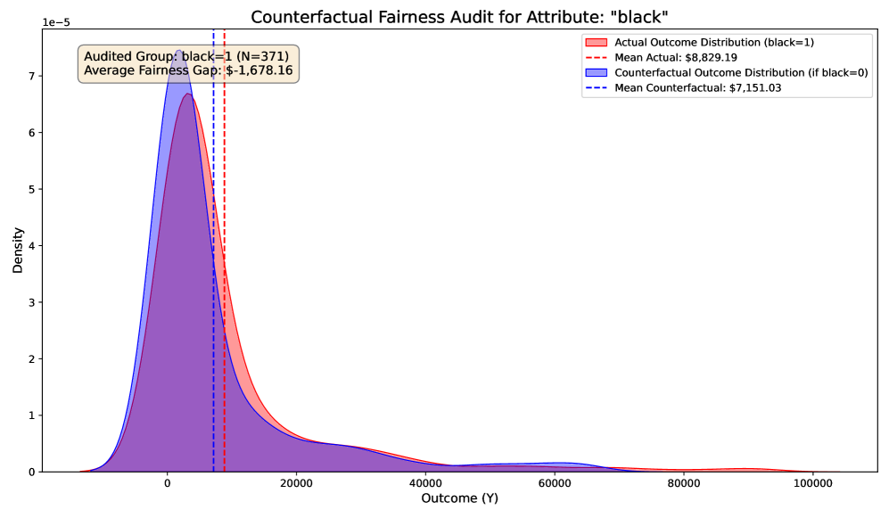
This image is a statistical density plot visualizing a counterfactual fairness audit. It compares the distribution of an outcome variable (Y) for a specific group (where the attribute "black" equals 1) against a simulated counterfactual distribution (what the outcomes would be if the attribute "black" were 0). The chart aims to quantify a potential fairness gap.
### Components/Axes
* **Chart Title:** "Counterfactual Fairness Audit for Attribute: 'black'"
* **X-Axis:** Labeled "Outcome (Y)". The scale runs from 0 to 100,000, with major tick marks at 0, 20000, 40000, 60000, 80000, and 100000.
* **Y-Axis:** Labeled "Density". The scale is in scientific notation, ranging from 0 to 7e-5 (0.00007), with major tick marks at 0, 1, 2, 3, 4, 5, 6, and 7 (all multiplied by 1e-5).
* **Legend (Top-Right Corner):**
* **Red Shaded Area:** "Actual Outcome Distribution (black=1)"
* **Red Dashed Vertical Line:** "Mean Actual: $8,829.19"
* **Blue Shaded Area:** "Counterfactual Outcome Distribution (if black=0)"
* **Blue Dashed Vertical Line:** "Mean Counterfactual: $7,151.03"
* **Annotation Box (Top-Left Corner):**
* "Audited Group: black=1 (N=371)"
* "Average Fairness Gap: $-1,678.16"
### Detailed Analysis
* **Data Series & Trends:**
* **Actual Distribution (Red):** This density curve is right-skewed, with its peak (mode) occurring at a low outcome value, approximately between 0 and 5,000. The curve has a long tail extending towards higher outcome values up to 100,000. The mean is marked by the red dashed line at **$8,829.19**.
* **Counterfactual Distribution (Blue):** This curve is also right-skewed and peaks at a similar low outcome range as the red curve. Visually, its peak appears slightly higher and narrower than the red curve's peak. Its mean is marked by the blue dashed line at **$7,151.03**.
* **Comparison of Means:** The red dashed line (Actual Mean) is positioned to the right of the blue dashed line (Counterfactual Mean) on the x-axis. This visually confirms that the average outcome for the actual group (black=1) is higher than the average outcome in the counterfactual scenario (if black=0).
* **Fairness Gap:** The annotation box calculates the "Average Fairness Gap" as **-$1,678.16**. This value is derived from the difference: Mean Counterfactual ($7,151.03) - Mean Actual ($8,829.19) = -$1,678.16. The negative sign indicates the actual mean is higher than the counterfactual mean.
* **Sample Size:** The analysis is based on a group of **N=371** individuals where the attribute "black" is 1.
### Key Observations
1. **Skewed Distributions:** Both the actual and counterfactual outcome distributions are heavily right-skewed. This indicates that for this group, most observed outcomes are clustered at the lower end of the scale (below ~$20,000), with a smaller number of individuals achieving much higher outcomes.
2. **Shift in Distribution:** While both distributions have a similar shape, the actual distribution (red) appears to have slightly more density in the mid-to-high outcome range (roughly $10,000 to $40,000) compared to the counterfactual distribution (blue). This shift contributes to the higher actual mean.
3. **Overlap:** There is substantial overlap between the two density curves, especially in the lower outcome range. This suggests that for many individuals in this group, the counterfactual change (setting black=0) would not dramatically alter their predicted outcome.
### Interpretation
This chart presents the results of a counterfactual fairness analysis. The core question it addresses is: "For individuals in the group where the attribute 'black' is 1, what would their outcomes look like if that attribute were instead 0?"
The data suggests that, on average, the **actual outcomes for the "black=1" group are higher** than the outcomes predicted in the counterfactual "black=0" scenario. The average fairness gap of -$1,678.16 quantifies this difference.
**Important Contextual Note:** The interpretation of "fairness" here is technical and depends entirely on the model's purpose. A negative gap (actual > counterfactual) could be interpreted in multiple ways:
* If the outcome Y is something desirable (e.g., loan amount, salary), this result might suggest the model is *not* exhibiting a traditional disparate impact against the "black=1" group in this specific audit, as their actual outcomes are higher than the counterfactual.
* However, without knowing the broader context—such as whether the "black=0" group's actual outcomes are even higher, or what the true ground-truth values should be—this single chart cannot determine if the overall system is fair. It only shows the modeled counterfactual effect for one subgroup.
The significant skew in both distributions is a critical finding. It implies that the outcome variable (Y) is not normally distributed, and any analysis or policy based on this data must account for this inequality, where a small proportion of cases account for a large proportion of the total outcome value.