\n
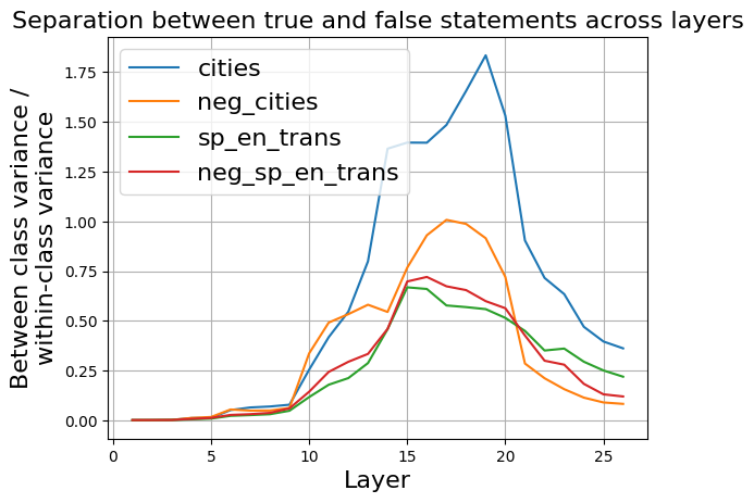
## Line Chart: Separation between true and false statements across layers
### Overview
The image presents a line chart illustrating the separation between true and false statements across different layers. The chart displays four distinct data series, each representing a different condition or dataset. The y-axis represents the "Between-class variance / within-class variance", while the x-axis represents the "Layer" number.
### Components/Axes
* **Title:** "Separation between true and false statements across layers" (Top-center)
* **X-axis Label:** "Layer" (Bottom-center) - Scale ranges from 0 to 27, with tick marks at intervals of 5.
* **Y-axis Label:** "Between-class variance / within-class variance" (Left-center) - Scale ranges from 0 to 1.8, with tick marks at intervals of 0.25.
* **Legend:** Located in the top-left corner, listing the four data series with corresponding colors:
* "cities" - Blue
* "neg\_cities" - Orange
* "sp\_en\_trans" - Green
* "neg\_sp\_en\_trans" - Red
### Detailed Analysis
The chart displays four lines representing the variance across layers.
* **cities (Blue):** This line starts at approximately 0 at layer 0, gradually increases, and exhibits a steep upward slope between layers 15 and 20, peaking at approximately 1.75 at layer 20. It then declines rapidly to approximately 0.25 by layer 25.
* **neg\_cities (Orange):** This line begins at approximately 0 at layer 0, increases more gradually than the "cities" line, reaching a peak of approximately 1.0 at layer 17. It then declines, leveling off around 0.25 by layer 25.
* **sp\_en\_trans (Green):** This line starts at approximately 0 at layer 0, increases steadily, peaking at approximately 0.65 around layer 15. It then declines, reaching approximately 0.2 by layer 25.
* **neg\_sp\_en\_trans (Red):** This line starts at approximately 0 at layer 0, increases gradually, peaking at approximately 0.6 around layer 15. It then declines, leveling off around 0.2 by layer 25.
### Key Observations
* The "cities" line demonstrates the highest variance, particularly between layers 15 and 20.
* The "neg\_cities", "sp\_en\_trans", and "neg\_sp\_en\_trans" lines exhibit similar trends, peaking around layer 15 and then declining.
* All lines start at a very low variance at layer 0, indicating minimal separation between true and false statements in the initial layers.
* The variance generally increases with layer number up to a certain point, then decreases.
### Interpretation
The chart suggests that the separation between true and false statements, as measured by between-class variance, increases with the depth of the layers (up to a point). The "cities" dataset shows the most significant separation, indicating that the model is better at distinguishing between true and false statements related to cities as it progresses through the layers. The negative counterparts ("neg\_cities" and "neg\_sp\_en\_trans") show a similar, but less pronounced, trend. The peak in variance around layer 15-20 suggests an optimal layer depth for maximizing separation. The subsequent decline in variance could indicate overfitting or a loss of generalization ability in deeper layers. The fact that all lines converge towards a low variance at the end suggests that the ability to differentiate between true and false statements diminishes in the very deep layers. This could be due to the model learning to represent the data in a way that obscures the distinction between truth and falsehood.