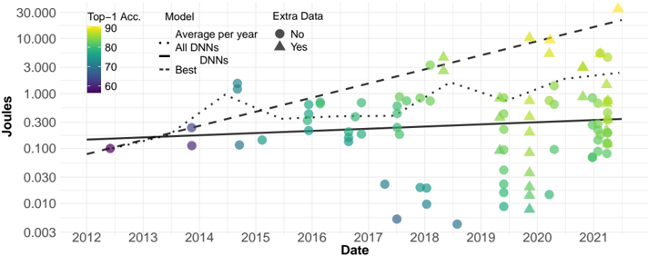
## Line Chart: Joules Over Time by Model Performance
### Overview
The chart visualizes the relationship between energy consumption (Joules) and model performance (Top-1 Accuracy) across three categories: "All DNNs," "DNNs," and "Best." Data spans from 2012 to 2021, with a logarithmic y-axis (Joules) and categorical markers for "Extra Data" (Yes/No). The chart includes a color gradient representing Top-1 Accuracy (60–90) and trend lines for each model category.
### Components/Axes
- **X-axis (Date)**: Years 2012–2021, labeled at 1-year intervals.
- **Y-axis (Joules)**: Logarithmic scale from 0.003 to 30,000.
- **Legend**:
- **All DNNs**: Solid black line.
- **DNNs**: Dashed black line.
- **Best**: Dotted black line.
- **Extra Data**: Circles (No), Triangles (Yes).
- **Top-1 Accuracy**: Color gradient (purple = 60, yellow = 90).
### Detailed Analysis
1. **All DNNs (Solid Black Line)**:
- Starts at ~0.1 Joules in 2012.
- Gradually increases to ~0.3 Joules by 2021.
- Trend: Steady upward slope with minimal fluctuation.
2. **DNNs (Dashed Black Line)**:
- Begins at ~0.03 Joules in 2012.
- Peaks at ~0.1 Joules in 2014.
- Declines sharply to ~0.01 Joules by 2021.
- Trend: Initial rise followed by a steep drop.
3. **Best (Dotted Black Line)**:
- Starts at ~0.01 Joules in 2012.
- Rises to ~0.3 Joules in 2014.
- Plateaus near ~0.3 Joules from 2015–2021.
- Trend: Sharp early growth, then stabilization.
4. **Color Gradient (Top-1 Accuracy)**:
- Data points transition from purple (60) to yellow (90).
- Higher accuracy correlates with higher Joules, especially in later years (2018–2021).
5. **Extra Data Markers**:
- **Triangles (Yes)**: Clustered in the upper-right quadrant (2018–2021), indicating higher Joules and Top-1 Accuracy.
- **Circles (No)**: Scattered across lower Joules values (2012–2017), with mixed accuracy levels.
### Key Observations
- **Best Model Dominance**: The "Best" line consistently outperforms others in Joules after 2014, suggesting superior efficiency or optimization.
- **DNNs Decline**: The "DNNs" category shows a significant drop post-2014, possibly due to model retirement or shifts in data strategy.
- **Energy-Accuracy Tradeoff**: Higher Top-1 Accuracy (yellow points) aligns with increased Joules, particularly in 2020–2021.
- **Extra Data Impact**: "Yes" markers (triangles) dominate high-performance regions, implying additional data enhances results but increases energy use.
### Interpretation
The chart highlights a tradeoff between model performance and energy consumption. The "Best" category’s plateau suggests a stabilization of optimal models, while the decline in "DNNs" may reflect obsolescence or inefficiency. The correlation between Top-1 Accuracy and Joules indicates that advanced models (e.g., those with extra data) require more computational resources. The 2014 peak for "DNNs" and "Best" could mark a technological milestone, after which energy efficiency became a priority. The dominance of "Yes" markers in later years underscores the growing reliance on supplemental data to achieve higher accuracy, albeit at the cost of increased energy use.