## Line Chart: Speedup vs. Optimization Latency
### Overview
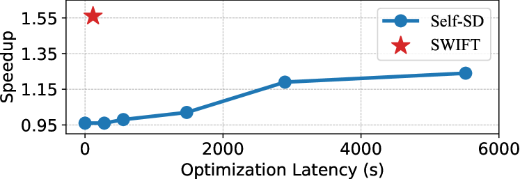
The image is a 2D line chart comparing the performance of two methods, "Self-SD" and "SWIFT," plotting "Speedup" against "Optimization Latency (s)." The chart demonstrates the trade-off between the time spent on optimization and the resulting performance gain.
### Components/Axes
* **X-Axis (Horizontal):** Labeled "Optimization Latency (s)". The scale runs from 0 to 6000 seconds, with major tick marks at 0, 2000, 4000, and 6000.
* **Y-Axis (Vertical):** Labeled "Speedup". The scale runs from 0.95 to 1.55, with major tick marks at 0.95, 1.15, 1.35, and 1.55.
* **Legend:** Located in the top-right corner of the chart area.
* A blue circle icon corresponds to the label "Self-SD".
* A red star icon corresponds to the label "SWIFT".
* **Data Series:**
1. **Self-SD (Blue Line with Circle Markers):** A single continuous line connecting several data points, each marked with a blue circle.
2. **SWIFT (Red Star Marker):** A single, isolated data point represented by a large red star.
### Detailed Analysis
**Data Series: Self-SD (Blue Line)**
* **Trend:** The line shows a positive, sub-linear (logarithmic-like) trend. It starts low and increases as optimization latency increases, but the rate of speedup gain diminishes at higher latencies.
* **Approximate Data Points (Latency (s), Speedup):**
* (0, ~0.95)
* (~250, ~0.96)
* (~500, ~0.98)
* (~1500, ~1.05)
* (~3000, ~1.20)
* (~5500, ~1.25)
**Data Point: SWIFT (Red Star)**
* **Trend:** This is a single, high-leverage point. It achieves a very high speedup with near-zero optimization latency.
* **Approximate Data Point:** (~0, ~1.55)
### Key Observations
1. **Performance Gap:** There is a significant performance gap between the two methods at the low-latency end of the spectrum. SWIFT achieves a speedup of ~1.55 with negligible latency, while Self-SD starts at a speedup of ~0.95 (a slowdown) at zero latency.
2. **Self-SD's Trajectory:** The Self-SD method requires substantial optimization time (over 5000 seconds) to achieve a speedup of ~1.25, which is still considerably lower than SWIFT's speedup at the start.
3. **Diminishing Returns for Self-SD:** The curve for Self-SD flattens, indicating that after a certain point (~3000s), investing more optimization time yields progressively smaller improvements in speedup.
4. **Spatial Placement:** The SWIFT data point is positioned in the top-left quadrant, visually emphasizing its superior efficiency (high Y-value, low X-value). The Self-SD line traverses the chart from bottom-left to center-right.
### Interpretation
The chart presents a compelling case for the SWIFT method over the Self-SD method in the context of this evaluation. The data suggests that **SWIFT is fundamentally more efficient**, delivering a high performance boost (55% speedup) without requiring a costly optimization phase. In contrast, **Self-SD represents a traditional trade-off**: it can improve performance over its baseline, but only after investing significant computational time (latency), and its maximum achievable gain appears limited compared to SWIFT's starting point.
The underlying message is one of algorithmic or architectural superiority. SWIFT likely employs a more intelligent or pre-optimized approach that avoids the lengthy iterative tuning process that Self-SD depends on. For practical applications, especially those where setup time is critical or computational resources are constrained, SWIFT would be the strongly preferred choice based on this data. The chart effectively argues that SWIFT decouples high performance from high optimization cost.