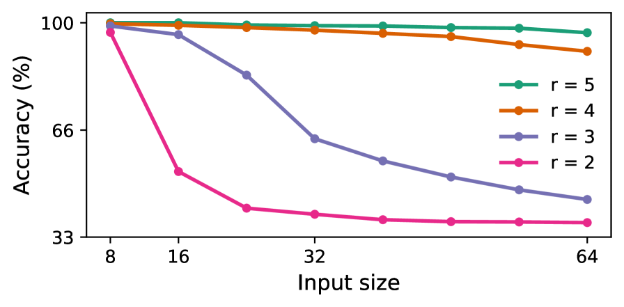
## Line Chart: Accuracy vs. Input Size for Different Rank Values
### Overview
The image is a line chart plotting model accuracy (as a percentage) against input size for four different rank values (r). The chart demonstrates how the performance of models with different rank capacities degrades as the input size increases.
### Components/Axes
* **Y-Axis:** Labeled "Accuracy (%)". The scale is linear, with major tick marks labeled at 33, 66, and 100.
* **X-Axis:** Labeled "Input size". The scale is logarithmic (base 2), with major tick marks labeled at 8, 16, 32, and 64.
* **Legend:** Positioned in the top-right quadrant of the chart area. It contains four entries, each associating a colored line with a rank value:
* Teal line with circle markers: `r = 5`
* Orange line with circle markers: `r = 4`
* Purple line with circle markers: `r = 3`
* Pink line with circle markers: `r = 2`
### Detailed Analysis
The chart displays four data series, each showing a distinct trend. All series begin at approximately 100% accuracy for an input size of 8.
1. **r = 5 (Teal Line):**
* **Trend:** The line is nearly horizontal, showing a very slight, almost negligible downward slope.
* **Data Points (Approximate):**
* Input Size 8: ~100%
* Input Size 16: ~100%
* Input Size 32: ~99%
* Input Size 64: ~98%
2. **r = 4 (Orange Line):**
* **Trend:** The line shows a gentle, steady downward slope.
* **Data Points (Approximate):**
* Input Size 8: ~100%
* Input Size 16: ~99%
* Input Size 32: ~97%
* Input Size 64: ~93%
3. **r = 3 (Purple Line):**
* **Trend:** The line shows a pronounced, steady downward slope, significantly steeper than the r=4 line.
* **Data Points (Approximate):**
* Input Size 8: ~100%
* Input Size 16: ~97%
* Input Size 32: ~64%
* Input Size 64: ~45%
4. **r = 2 (Pink Line):**
* **Trend:** The line exhibits a very sharp, steep decline between input sizes 8 and 16, followed by a much shallower, nearly flat decline from 16 to 64.
* **Data Points (Approximate):**
* Input Size 8: ~99%
* Input Size 16: ~55%
* Input Size 32: ~40%
* Input Size 64: ~38%
### Key Observations
* **Inverse Relationship:** There is a clear inverse relationship between the rank value (`r`) and the sensitivity of accuracy to increasing input size. Lower rank models (r=2, r=3) experience dramatic performance degradation, while higher rank models (r=4, r=5) are much more robust.
* **Convergence at Small Input:** All models, regardless of rank, achieve near-perfect accuracy (~100%) on the smallest input size (8).
* **Divergence with Scale:** As input size increases, the performance of the models diverges significantly. The gap in accuracy between the highest (r=5) and lowest (r=2) rank models grows from ~1% at input size 8 to ~60% at input size 64.
* **Critical Threshold for r=2:** The model with r=2 shows a critical failure mode, losing nearly half its accuracy with just a doubling of input size from 8 to 16.
### Interpretation
This chart illustrates a fundamental trade-off in model capacity (represented by rank `r`) and its ability to generalize to larger, more complex inputs.
* **What the data suggests:** Higher-rank models possess a more expressive or robust internal representation, allowing them to maintain high accuracy even as the problem scale (input size) increases. Lower-rank models appear to be "under-parameterized" for larger tasks; their limited capacity is quickly overwhelmed, leading to a sharp drop in performance.
* **How elements relate:** The x-axis (Input size) represents the scaling challenge. The y-axis (Accuracy) is the performance metric. The different colored lines (r values) represent different model architectures or configurations being tested against this scaling challenge. The legend is essential for mapping the visual trend (line color/slope) to the specific model parameter being varied.
* **Notable implications:** The data implies that for tasks involving large input sizes, selecting a model with a sufficiently high rank is critical for maintaining performance. The r=2 model is effectively unusable for input sizes beyond 16. The near-flat line for r=5 suggests it may have capacity to spare for the tested range, while r=4 is beginning to show strain at the largest input size. This visualization would be crucial for guiding model selection and understanding the scaling limits of different architectural choices.