## Line Chart: Attention over Values, a=40
### Overview
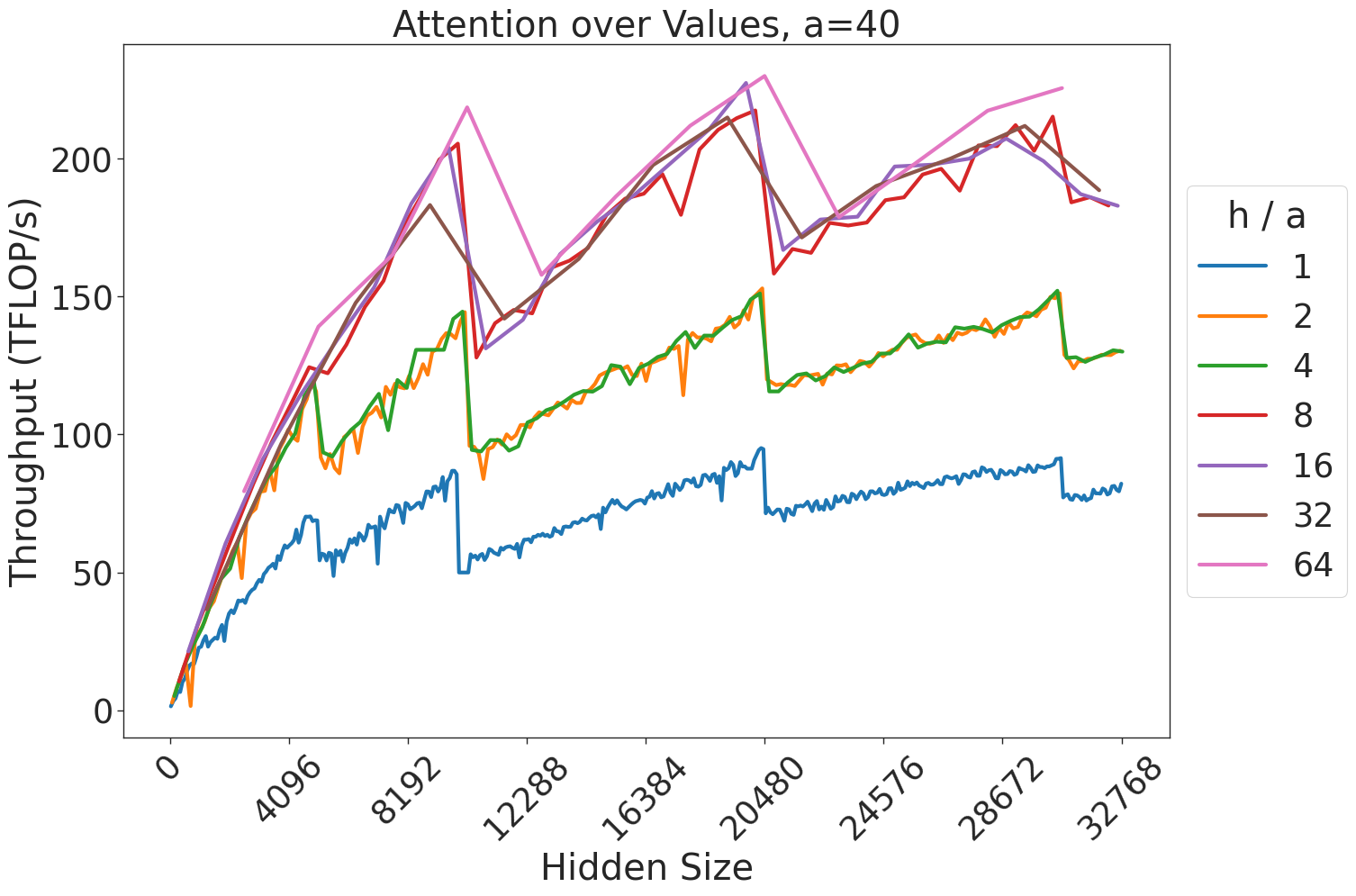
This image displays a line chart illustrating the relationship between "Hidden Size" (x-axis) and "Throughput (TFLOP/s)" (y-axis) for an attention mechanism, parameterized by different "h / a" ratios. The chart demonstrates that throughput generally increases with hidden size but is subject to significant, periodic performance drops (a "sawtooth" pattern), likely indicative of memory alignment or kernel switching thresholds in computational hardware.
### Components/Axes
* **Title:** "Attention over Values, a=40" (centered at the top).
* **X-Axis:** Labeled "Hidden Size". The scale ranges from 0 to 32768. Major tick marks are provided at intervals of 4096 (0, 4096, 8192, 12288, 16384, 20480, 24576, 28672, 32768).
* **Y-Axis:** Labeled "Throughput (TFLOP/s)". The scale ranges from 0 to approximately 230 TFLOP/s, with major grid lines at 0, 50, 100, 150, 200.
* **Legend:** Positioned on the right side of the chart. It defines the "h / a" ratio for seven distinct data series, color-coded as follows:
* **Blue:** h / a = 1
* **Orange:** h / a = 2
* **Green:** h / a = 4
* **Red:** h / a = 8
* **Purple:** h / a = 16
* **Brown:** h / a = 32
* **Pink:** h / a = 64
### Detailed Analysis
The data series exhibit a strong positive correlation between Hidden Size and Throughput, though performance is heavily segmented by the "h / a" ratio.
**1. Trend Verification & Grouping:**
* **Group 1 (Lowest Throughput):** The **Blue** line (h/a=1) consistently performs the lowest, peaking just below 100 TFLOP/s.
* **Group 2 (Mid-Tier Throughput):** The **Orange** (h/a=2) and **Green** (h/a=4) lines are nearly identical, overlapping almost perfectly throughout the entire range. They peak around 150 TFLOP/s.
* **Group 3 (Highest Throughput):** The **Red** (h/a=8), **Purple** (h/a=16), **Brown** (h/a=32), and **Pink** (h/a=64) lines cluster together at the top. These lines show the highest performance, frequently exceeding 200 TFLOP/s.
**2. Sawtooth Pattern Analysis:**
All lines exhibit sharp, vertical drops in throughput at specific Hidden Size intervals.
* **First Major Drop:** Occurs between Hidden Size ~10,000 and ~12,000. For example, the Blue line drops from ~90 TFLOP/s to ~50 TFLOP/s.
* **Second Major Drop:** Occurs between Hidden Size ~20,000 and ~21,000. For example, the Pink line drops from ~230 TFLOP/s to ~160 TFLOP/s.
### Key Observations
* **Performance Clustering:** The "h / a" ratio acts as a multiplier for throughput efficiency. Increasing the ratio from 1 to 2 yields a significant jump, as does the jump from 4 to 8. However, the performance gains diminish as the ratio increases beyond 8 (the lines for 8, 16, 32, and 64 are tightly packed).
* **Hardware/Software Thresholds:** The consistent "sawtooth" drops across all lines suggest that the underlying computational kernel or memory allocation strategy changes at specific Hidden Size boundaries. These are likely "cliff" points where the system switches from an optimized small-matrix kernel to a less efficient large-matrix kernel, or where memory alignment requirements force a performance penalty.
* **Outliers:** There are no significant outliers; the data is highly structured and consistent across all series.
### Interpretation
This chart is a classic representation of performance benchmarking for GPU-accelerated attention mechanisms (likely in a Transformer architecture).
* **What the data demonstrates:** The "h / a" ratio is a critical hyperparameter for throughput. Higher ratios allow the system to utilize the hardware more effectively, likely by better saturating the GPU's compute units.
* **Why it matters:** The "sawtooth" behavior is a critical insight for system architects. If a user is choosing a "Hidden Size" for a model, they should avoid the "cliff" points (e.g., just above 10,000 or 20,000) where throughput drops precipitously. A slightly smaller Hidden Size might actually yield significantly higher throughput than a slightly larger one, due to these architectural bottlenecks.
* **Peircean Investigative Note:** The convergence of the Orange/Green lines and the Red/Purple/Brown/Pink lines suggests that there are diminishing returns on increasing the "h / a" ratio. Once the ratio reaches 8, the hardware is likely already operating near its peak efficiency for the given memory bandwidth, and further increasing the ratio provides negligible throughput benefits.