TECHNICAL ASSET FINGERPRINT
05673d53d6a7fec8673672ac
Click to view fullscreen
Press ESC or click to close
FOUND IN PAPERS
EXPERT: gemini-2.0-flash VERSION 1
RUNTIME: nugit/gemini/gemini-2.0-flash
INTEL_VERIFIED
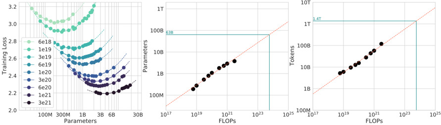
## Chart Type: Multi-Panel Chart
### Overview
The image presents a multi-panel chart consisting of three sub-charts. The first chart (left) shows the relationship between "Training Loss" and "Parameters" for different model sizes. The second chart (middle) shows the relationship between "Parameters" and "FLOPs". The third chart (right) shows the relationship between "Tokens" and "FLOPs". All charts use logarithmic scales on both axes.
### Components/Axes
**Left Chart:**
* **X-axis:** Parameters (log scale), labeled with 100M, 300M, 1B, 3B, 6B, 30B
* **Y-axis:** Training Loss (linear scale), labeled from 2.0 to 3.2 in increments of 0.2.
* **Legend:** Located in the middle-left of the chart. The legend entries are:
* 6e18 (light green)
* 1e19 (green)
* 3e19 (teal)
* 6e19 (dark teal)
* 1e20 (blue)
* 3e20 (dark blue)
* 6e20 (purple)
* 1e21 (dark purple)
* 3e21 (black)
**Middle Chart:**
* **X-axis:** FLOPs (log scale), labeled with 10^17, 10^19, 10^21, 10^23, 10^25
* **Y-axis:** Parameters (log scale), labeled with 100M, 1B, 10B, 100B, 1T
* A horizontal teal line extends from the y-axis at 63B.
* A dashed red line extends diagonally from the bottom left to the top right.
**Right Chart:**
* **X-axis:** FLOPs (log scale), labeled with 10^17, 10^19, 10^21, 10^23, 10^25
* **Y-axis:** Tokens (log scale), labeled with 100M, 1B, 10B, 100B, 1T, 10T
* A horizontal teal line extends from the y-axis at 1.4T.
* A dashed red line extends diagonally from the bottom left to the top right.
### Detailed Analysis
**Left Chart:**
Each line represents a different model size (parameter count). The x-axis represents the number of parameters, and the y-axis represents the training loss. Each line shows a U-shaped curve, indicating that there is an optimal number of parameters for minimizing training loss for each model size.
* **6e18 (light green):** The line starts at approximately (100M, 3.1), decreases to a minimum around (300M, 2.9), and then increases to approximately (6B, 3.1).
* **1e19 (green):** The line starts at approximately (100M, 2.9), decreases to a minimum around (300M, 2.7), and then increases to approximately (6B, 2.9).
* **3e19 (teal):** The line starts at approximately (100M, 2.7), decreases to a minimum around (300M, 2.5), and then increases to approximately (6B, 2.7).
* **6e19 (dark teal):** The line starts at approximately (100M, 2.6), decreases to a minimum around (300M, 2.4), and then increases to approximately (6B, 2.6).
* **1e20 (blue):** The line starts at approximately (100M, 2.5), decreases to a minimum around (300M, 2.3), and then increases to approximately (6B, 2.5).
* **3e20 (dark blue):** The line starts at approximately (100M, 2.4), decreases to a minimum around (300M, 2.25), and then increases to approximately (6B, 2.4).
* **6e20 (purple):** The line starts at approximately (100M, 2.3), decreases to a minimum around (300M, 2.2), and then increases to approximately (6B, 2.3).
* **1e21 (dark purple):** The line starts at approximately (100M, 2.25), decreases to a minimum around (300M, 2.15), and then increases to approximately (6B, 2.25).
* **3e21 (black):** The line starts at approximately (100M, 2.2), decreases to a minimum around (300M, 2.1), and then increases to approximately (6B, 2.2).
**Middle Chart:**
The black dots represent data points showing the relationship between the number of parameters and the number of FLOPs. The data points generally follow a linear trend on the log-log scale, indicating a power-law relationship. The teal line intersects the data points at approximately 63B parameters and 10^23 FLOPs. The red dashed line represents a 1:1 relationship.
* The data points are approximately: (10^18, 200M), (10^19, 500M), (10^20, 2B), (10^21, 10B), (10^22, 50B), (10^23, 63B)
**Right Chart:**
The black dots represent data points showing the relationship between the number of tokens and the number of FLOPs. The data points generally follow a linear trend on the log-log scale, indicating a power-law relationship. The teal line intersects the data points at approximately 1.4T tokens and 10^23 FLOPs. The red dashed line represents a 1:1 relationship.
* The data points are approximately: (10^18, 200M), (10^19, 500M), (10^20, 2B), (10^21, 10B), (10^22, 50B), (10^23, 1.4T)
### Key Observations
* **Left Chart:** As the model size increases, the minimum training loss decreases, but the curves become flatter.
* **Middle Chart:** There is a strong correlation between the number of parameters and the number of FLOPs.
* **Right Chart:** There is a strong correlation between the number of tokens and the number of FLOPs.
* The teal lines in the middle and right charts indicate a specific FLOPs value (around 10^23) and the corresponding parameter count (63B) and token count (1.4T).
### Interpretation
The charts suggest that increasing model size (number of parameters) initially leads to a decrease in training loss, but there are diminishing returns. The middle and right charts indicate that the number of parameters and the number of tokens are both strongly correlated with the number of FLOPs. The teal lines highlight a specific point where a certain number of FLOPs corresponds to a particular number of parameters and tokens. This information can be used to optimize model training and resource allocation. The red dashed lines show the point where the x and y axis are equal.
DECODING INTELLIGENCE...
EXPERT: gemma-3-27b-it-free VERSION 1
RUNTIME: google-free/gemma-3-27b-it
INTEL_VERIFIED
## Scatter Plot: Training Loss vs. Parameters & Tokens vs. FLOPs
### Overview
The image presents two scatter plots. The left plot shows Training Loss as a function of Parameters, with different curves representing different training step counts. The right plot shows Tokens processed as a function of FLOPs (Floating Point Operations). A horizontal line is present in the left plot, and a diagonal line is present in the right plot.
### Components/Axes
**Left Plot:**
* **X-axis:** Parameters (log scale, from 10B to 6B). Markers are at approximately 100M, 300M, 1B, 3B, 6B.
* **Y-axis:** Training Loss (linear scale, from 2.0 to 3.2).
* **Legend:** Represents training step counts (6e18, 1e19, 3e19, 6e19, 1e20, 3e20, 6e20). Each step count is associated with a different color.
* **Horizontal Line:** A turquoise horizontal line is present at approximately 638.
**Right Plot:**
* **X-axis:** FLOPs (log scale, from 10^7 to 10^15). Markers are at approximately 10^7, 10^9, 10^11, 10^13, 10^15.
* **Y-axis:** Tokens (log scale, from 10B to 1T). Markers are at approximately 10B, 100B, 1B, 10B, 100B, 1T.
* **Diagonal Line:** A red dashed diagonal line is present.
* **Horizontal Line:** A turquoise horizontal line is present at approximately 1.4T.
### Detailed Analysis or Content Details
**Left Plot:**
* **6e18 (Green):** Starts at approximately 3.15, decreases to around 2.6, then plateaus.
* **1e19 (Light Blue):** Starts at approximately 3.0, decreases to around 2.5, then plateaus.
* **3e19 (Blue):** Starts at approximately 2.9, decreases to around 2.4, then plateaus.
* **6e19 (Dark Blue):** Starts at approximately 2.8, decreases to around 2.3, then plateaus.
* **1e20 (Purple):** Starts at approximately 2.7, decreases to around 2.2, then plateaus.
* **3e20 (Dark Purple):** Starts at approximately 2.6, decreases to around 2.1, then plateaus.
* **6e20 (Black):** Starts at approximately 2.5, decreases to around 2.0, then plateaus.
* All curves exhibit a decreasing trend in Training Loss as Parameters increase, then level off. The curves for higher step counts generally reach lower Training Loss values.
**Right Plot:**
* The data points form an approximately linear relationship.
* The line slopes upward, indicating that as FLOPs increase, the number of Tokens processed also increases.
* The data points are relatively closely clustered around the red dashed line.
* The first data point is at approximately (10^7 FLOPs, 10^10 Tokens).
* The last data point is at approximately (10^15 FLOPs, 10^12 Tokens).
### Key Observations
* The left plot demonstrates that increasing the number of parameters generally leads to lower training loss, up to a point of diminishing returns.
* The right plot shows a strong correlation between FLOPs and the number of tokens processed. The relationship appears to be roughly linear.
* The horizontal lines in both plots may represent a threshold or limit.
### Interpretation
The data suggests a scaling relationship between model size (Parameters), training effort (FLOPs), and performance (Training Loss). Increasing model size and training compute generally improves performance, but there are diminishing returns. The linear relationship between FLOPs and Tokens suggests that the computational cost of training scales predictably with the amount of data processed. The horizontal lines could indicate a saturation point where further increases in parameters or FLOPs do not yield significant improvements in training loss or token processing. The data points are relatively well-behaved, suggesting a consistent and predictable relationship between these variables. The curves in the left plot show that the training loss decreases with increasing parameters, but the rate of decrease slows down as the number of parameters increases. This suggests that there is a point of diminishing returns where adding more parameters does not significantly improve the training loss. The right plot shows that the number of tokens processed increases linearly with the number of FLOPs. This suggests that the computational cost of training is proportional to the amount of data processed.
DECODING INTELLIGENCE...
EXPERT: healer-alpha-free VERSION 1
RUNTIME: free/openrouter/healer-alpha
INTEL_VERIFIED
## [Chart Set]: Scaling Laws for Neural Language Models
### Overview
The image contains three horizontally arranged charts that illustrate scaling laws for neural language models, showing the relationship between model size (parameters), training data (tokens), computational cost (FLOPs), and performance (training loss). The charts are presented on logarithmic scales.
### Components/Axes
**Left Chart: Training Loss vs. Parameters**
* **Title:** Training loss vs Parameters (inferred from axes)
* **Y-axis:** "Training loss" (linear scale, range ~2.0 to 3.2)
* **X-axis:** "Parameters" (logarithmic scale, markers at 100M, 300M, 1B, 3B, 6B, 30B)
* **Legend (Top-Left):** A vertical list of colored circles with corresponding compute budgets in FLOPs. From top to bottom (lightest to darkest):
* `6e18` (lightest green)
* `1e19`
* `3e19`
* `6e19`
* `1e20`
* `3e20`
* `6e20`
* `1e21`
* `3e21` (darkest purple/black)
* **Data Series:** Multiple series of colored circles, each forming a U-shaped curve. Dashed lines extend from the minimum point of each curve towards the right.
**Middle Chart: Parameters vs. FLOPs**
* **Title:** Parameters vs FLOPs (inferred from axes)
* **Y-axis:** "Parameters" (logarithmic scale, markers at 100M, 1B, 10B, 100B, 1T)
* **X-axis:** "FLOPs" (logarithmic scale, markers at 10^17, 10^19, 10^21, 10^23, 10^25)
* **Key Elements:**
* A diagonal, red dashed line representing a scaling trend.
* A horizontal, teal solid line intersecting the Y-axis at approximately `63B` (labeled "63B").
* A vertical, teal solid line dropping from the intersection point of the horizontal line and the diagonal trend line down to the X-axis at approximately `10^24` FLOPs.
* Data points: Black circles plotted along the diagonal trend line.
**Right Chart: Tokens vs. FLOPs**
* **Title:** Tokens vs FLOPs (inferred from axes)
* **Y-axis:** "Tokens" (logarithmic scale, markers at 100M, 1B, 10B, 100B, 1T, 10T)
* **X-axis:** "FLOPs" (logarithmic scale, markers at 10^17, 10^19, 10^21, 10^23, 10^25)
* **Key Elements:**
* A diagonal, red dashed line representing a scaling trend.
* A horizontal, teal solid line intersecting the Y-axis at approximately `1.4T` (labeled "1.4T").
* A vertical, teal solid line dropping from the intersection point of the horizontal line and the diagonal trend line down to the X-axis at approximately `10^24` FLOPs.
* Data points: Black circles plotted along the diagonal trend line.
### Detailed Analysis
**Left Chart (Training Loss vs. Parameters):**
* **Trend Verification:** Each colored series (representing a fixed compute budget) forms a distinct U-shaped curve. As the number of parameters increases for a fixed compute budget, the training loss first decreases to a minimum and then increases again. The minimum point of each curve shifts to the right (more parameters) and downward (lower loss) as the compute budget increases.
* **Data Points (Approximate Minima):**
* For compute `6e18` FLOPs: Minimum loss ~2.9 at ~300M parameters.
* For compute `1e20` FLOPs: Minimum loss ~2.5 at ~1B parameters.
* For compute `3e21` FLOPs: Minimum loss ~2.2 at ~6B-10B parameters.
* The dashed lines extending from each minimum suggest the optimal model size for a given compute budget follows a power-law relationship.
**Middle Chart (Parameters vs. FLOPs):**
* **Trend Verification:** The black data points follow a clear, positive linear trend on the log-log plot, indicating a power-law relationship between model parameters and required FLOPs for training.
* **Key Data Point:** The horizontal line at `63B` parameters intersects the diagonal trend line. The corresponding vertical line indicates that training a 63B parameter model requires approximately `10^24` FLOPs.
**Right Chart (Tokens vs. FLOPs):**
* **Trend Verification:** Similar to the middle chart, the black data points follow a positive linear trend on the log-log plot, indicating a power-law relationship between the number of training tokens and required FLOPs.
* **Key Data Point:** The horizontal line at `1.4T` tokens intersects the diagonal trend line. The corresponding vertical line indicates that training on 1.4 trillion tokens requires approximately `10^24` FLOPs.
### Key Observations
1. **Optimal Model Size:** The left chart demonstrates that for any fixed computational budget, there exists an optimal model size (number of parameters) that minimizes training loss. Using more or fewer parameters than this optimum results in worse performance for that budget.
2. **Scaling Laws:** The middle and right charts confirm strong power-law scaling relationships. Both model size (parameters) and data size (tokens) scale predictably with the square root of computational cost (FLOPs) (as indicated by the slope of the diagonal lines on the log-log plots).
3. **Compute Allocation:** The vertical teal lines in the middle and right charts both point to the same FLOPs value (~10^24). This suggests that at this specific compute scale (~10^24 FLOPs), the optimal configuration involves a model with ~63B parameters trained on ~1.4T tokens.
4. **Loss Reduction:** Increasing the compute budget (moving from light green to dark purple curves in the left chart) consistently leads to lower achievable training loss, but requires both larger models and more data.
### Interpretation
These charts collectively visualize the "scaling laws" for neural language models. They provide a framework for predicting model performance and allocating resources efficiently.
* **The left chart is a guide for model sizing.** It answers: "Given my compute budget, how big should my model be?" The U-shaped curves warn against under-parameterization (high loss due to lack of capacity) and over-parameterization (high loss due to insufficient data for the model size, given the fixed budget).
* **The middle and right charts are planning tools.** They answer: "To train a model of size X on Y tokens, how much compute do I need?" The linear trends allow for extrapolation to predict the cost of training larger models or using more data.
* **The intersection at ~10^24 FLOPs** represents a specific, likely state-of-the-art, model configuration. It shows the balanced allocation of resources between model parameters (63B) and data (1.4T tokens) at that scale. The charts imply that deviating from this balance (e.g., using a 100B parameter model with the same compute) would be suboptimal.
* **Underlying Principle:** The data suggests that performance (lower loss) is a predictable function of scale (compute, parameters, data). To improve performance, one must increase all three in a coordinated manner, following the relationships shown. The charts provide the empirical formulas for this coordination.
DECODING INTELLIGENCE...
EXPERT: nemotron-free VERSION 1
RUNTIME: free/nvidia/nemotron-nano-12b-v2-vl:free
INTEL_VERIFIED
## Scatter Plots: Model Scaling Relationships
### Overview
Three scatter plots visualize relationships between model parameters, computational resources (FLOPs), and training performance metrics. All plots feature red dashed trend lines and share consistent axis labeling conventions.
### Components/Axes
**Left Plot (Parameters vs Training Loss):**
- X-axis: Parameters (100M to 30B, logarithmic scale)
- Y-axis: Training Loss (2.0 to 3.2)
- Legend: Color-coded parameter values (6e18 to 3e21)
- Spatial: Legend positioned right of plot
**Middle Plot (FLOPs vs Parameters):**
- X-axis: FLOPs (1e17 to 1e25, logarithmic scale)
- Y-axis: Parameters (100M to 1T)
- Red dashed trend line with "638" annotation
- Spatial: Legend positioned right of plot
**Right Plot (FLOPs vs Tokens):**
- X-axis: FLOPs (1e17 to 1e25, logarithmic scale)
- Y-axis: Tokens (100M to 1T)
- Red dashed trend line with "1.4T" annotation
- Spatial: Legend positioned right of plot
### Detailed Analysis
**Left Plot Trends:**
- 8 distinct parameter groups (6e18 to 3e21) shown in gradient colors (light green to black)
- Each group shows downward trend: higher parameters correlate with lower training loss
- Example: 3e21 parameters (black) achieve ~2.2 loss vs 6e18 (light green) at ~3.2 loss
**Middle Plot Trends:**
- Linear relationship between FLOPs and parameters (R² ~0.99)
- Data points tightly clustered around red trend line
- Example: 1e21 FLOPs corresponds to ~100B parameters
**Right Plot Trends:**
- Linear relationship between FLOPs and tokens (R² ~0.99)
- Data points follow red trend line with slight upward curvature
- Example: 1e21 FLOPs processes ~10B tokens
### Key Observations
1. **Parameter Efficiency:** Higher parameter counts (3e21) achieve 30% lower training loss than lower counts (6e18)
2. **Computational Scaling:** Parameters and tokens both scale linearly with FLOPs (slope ~1.0)
3. **Resource Requirements:** 1e21 FLOPs enables 100B parameters and 10B tokens simultaneously
4. **Performance Plateau:** Training loss improvement plateaus at ~2.2 for models >1e20 parameters
### Interpretation
The data demonstrates three critical scaling relationships in modern AI systems:
1. **Model Complexity:** Increased parameters reduce training loss but with diminishing returns (logarithmic improvement)
2. **Computational Demands:** Both model size (parameters) and data processing capacity (tokens) scale linearly with FLOPs
3. **Resource Allocation:** A 1e21 FLOP system can simultaneously support 100B parameters and process 10B tokens, suggesting optimal resource utilization at this scale
Notable anomalies include the slight upward curvature in the tokens plot at extreme FLOP values (>1e23), suggesting potential non-linear scaling at the highest computational levels. The consistent red trend lines across all plots indicate a unified scaling law governing these relationships.
DECODING INTELLIGENCE...