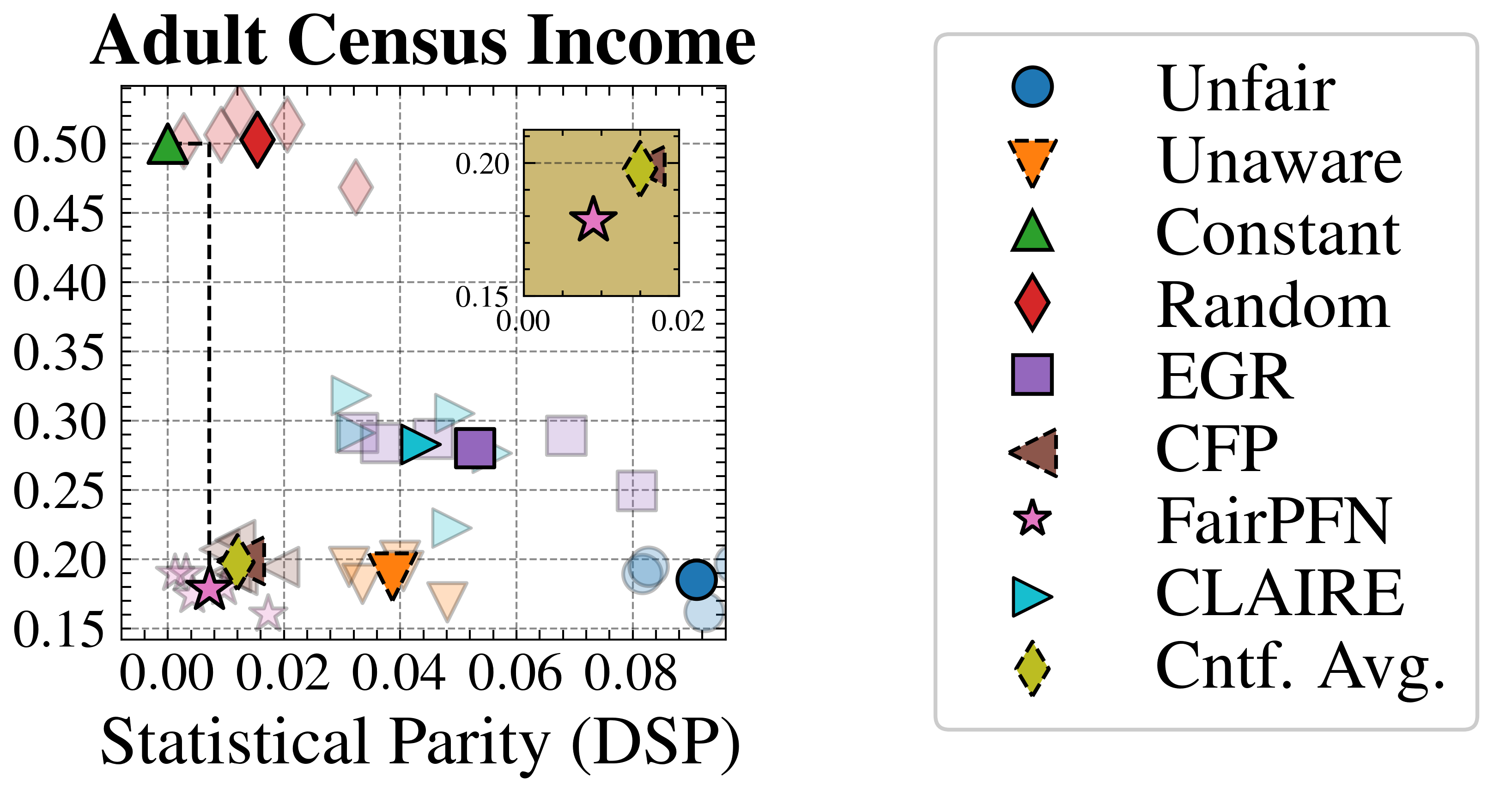
## Scatter Plot: Adult Census Income Fairness-Accuracy Trade-off
### Overview
The image is a scatter plot comparing various machine learning methods on the "Adult Census Income" dataset. It visualizes the trade-off between a fairness metric (Statistical Parity, DSP) on the x-axis and an unlabeled performance metric (likely accuracy or error rate) on the y-axis. The plot includes an inset zoomed-in view of a specific region. A legend on the right maps unique marker shapes and colors to method names.
### Components/Axes
* **Main Plot Title:** "Adult Census Income"
* **X-Axis Label:** "Statistical Parity (DSP)"
* Scale: Linear, ranging from 0.00 to approximately 0.09.
* Major Ticks: 0.00, 0.02, 0.04, 0.06, 0.08.
* **Y-Axis:** Unlabeled numerical scale.
* Scale: Linear, ranging from 0.15 to 0.50.
* Major Ticks: 0.15, 0.20, 0.25, 0.30, 0.35, 0.40, 0.45, 0.50.
* **Legend (Right Side):** A vertical list mapping markers to method names.
* **Blue Circle:** Unfair
* **Orange Inverted Triangle (dashed border):** Unaware
* **Green Triangle:** Constant
* **Red Diamond:** Random
* **Purple Square:** EGR
* **Brown Left-Pointing Triangle (dashed border):** CFP
* **Pink Star:** FairPFN
* **Cyan Right-Pointing Triangle:** CLAIRE
* **Yellow Diamond (dashed border):** Cntf. Avg.
* **Inset Plot (Top-Right Quadrant):** A smaller, zoomed-in scatter plot with a tan background.
* **Inset X-Axis:** Ranges from 0.00 to 0.02.
* **Inset Y-Axis:** Ranges from 0.15 to 0.20.
* Contains two data points: a pink star (FairPFN) and a yellow diamond (Cntf. Avg.).
### Detailed Analysis
The plot displays multiple data points for each method, suggesting results from different runs or configurations. Below is an approximate mapping of key points for each method, identified by matching the legend to the plot markers. Coordinates are estimated from the grid.
* **Unfair (Blue Circle):** Clustered in the bottom-right corner.
* Approximate Coordinates: (DSP ≈ 0.085-0.090, Y ≈ 0.17-0.19). This indicates high statistical disparity (unfairness) and low performance on the y-axis metric.
* **Unaware (Orange Inverted Triangle):** Located in the lower-middle region.
* Approximate Coordinates: (DSP ≈ 0.035-0.045, Y ≈ 0.18-0.20).
* **Constant (Green Triangle):** A significant outlier in the top-left.
* Approximate Coordinates: (DSP ≈ 0.005, Y ≈ 0.50). This shows very low disparity but the highest y-axis value.
* **Random (Red Diamond):** Another outlier near the top-left.
* Approximate Coordinates: (DSP ≈ 0.015, Y ≈ 0.50). Similar to Constant, with slightly higher DSP.
* **EGR (Purple Square):** Points are scattered in the middle band.
* Approximate Coordinates: One cluster around (DSP ≈ 0.045-0.055, Y ≈ 0.28-0.30). Another point near (DSP ≈ 0.075, Y ≈ 0.25).
* **CFP (Brown Left-Pointing Triangle):** Points are in the lower-left cluster.
* Approximate Coordinates: (DSP ≈ 0.010-0.020, Y ≈ 0.18-0.22).
* **FairPFN (Pink Star):** Primarily clustered in the lower-left, with one point highlighted in the inset.
* Main Cluster Approximate Coordinates: (DSP ≈ 0.005-0.015, Y ≈ 0.17-0.20).
* Inset Point: (DSP ≈ 0.010, Y ≈ 0.175).
* **CLAIRE (Cyan Right-Pointing Triangle):** Scattered in the middle region.
* Approximate Coordinates: Points around (DSP ≈ 0.030-0.050, Y ≈ 0.22-0.30).
* **Cntf. Avg. (Yellow Diamond):** Found in the lower-left cluster and the inset.
* Main Cluster Approximate Coordinates: (DSP ≈ 0.010-0.015, Y ≈ 0.19-0.21).
* Inset Point: (DSP ≈ 0.018, Y ≈ 0.195).
### Key Observations
1. **Performance-Fairness Trade-off:** There is a visible inverse relationship. Methods with very low DSP (fairness), like Constant and Random, have the highest y-axis values. Methods with higher DSP, like Unfair, have lower y-axis values.
2. **Clustering:** Most methods (Unaware, CFP, FairPFN, Cntf. Avg., some EGR/CLAIRE) cluster in a region of low-to-moderate DSP (0.01-0.05) and low y-axis values (0.17-0.30).
3. **Outliers:** The "Constant" and "Random" methods are extreme outliers, achieving near-zero DSP but at a very high y-axis value, which may indicate a trivial or degenerate solution.
4. **Inset Purpose:** The inset zooms in on the region of lowest DSP (0.00-0.02) and lowest y-axis values (0.15-0.20), highlighting the precise positions of FairPFN and Cntf. Avg., which are very close in this fairness-performance space.
### Interpretation
This chart evaluates algorithmic fairness on the Adult Census Income dataset. The x-axis (Statistical Parity/DSP) measures disparity in outcomes between protected groups; lower values are fairer. The unlabeled y-axis likely represents a model performance metric (e.g., error rate, where lower is better, or accuracy, where higher is better). Given the context, the high y-values for "Constant" and "Random" suggest the y-axis is likely **error rate** (as a constant predictor would have high error).
The data demonstrates the classic fairness-accuracy trade-off: maximizing fairness (minimizing DSP) often comes at the cost of increased error (higher y-value). The "Unfair" baseline has high error but also high disparity. Advanced methods (FairPFN, Cntf. Avg., CFP) cluster in a "sweet spot" with relatively low DSP and low error, suggesting they successfully balance the two objectives. The "Constant" and "Random" methods achieve perfect fairness (DSP≈0) but are useless models with very high error, serving as a boundary reference. The plot argues that methods like FairPFN and Cntf. Avg. offer a practical compromise, achieving fairness with minimal performance degradation compared to the unfair baseline.