## Scatter Plot: Adult Census Income vs Statistical Parity (DSP)
### Overview
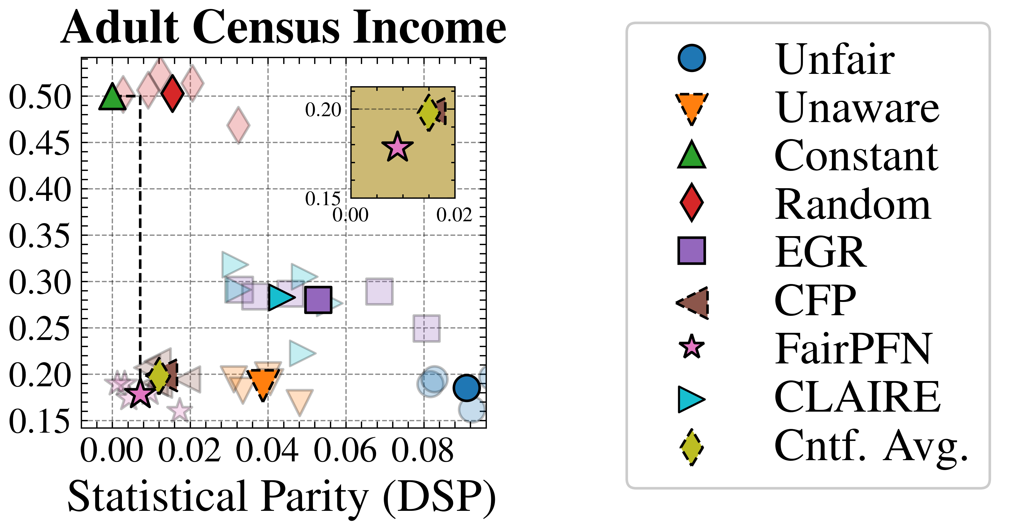
The image is a scatter plot comparing "Adult Census Income" (y-axis) against "Statistical Parity (DSP)" (x-axis). Data points are represented by distinct geometric shapes and colors, each corresponding to a fairness metric (e.g., Unfair, Unaware, Constant). A legend on the right maps symbols to metrics. The plot includes a vertical dashed line at x=0.02 and a horizontal dashed line at y=0.45, with an inset box in the top-right corner highlighting specific data points.
---
### Components/Axes
- **X-axis (Statistical Parity, DSP)**: Ranges from 0.00 to 0.08 in increments of 0.02.
- **Y-axis (Adult Census Income)**: Ranges from 0.15 to 0.50 in increments of 0.05.
- **Legend**: Located on the right, outside the plot area. Symbols and colors include:
- Blue circle: Unfair
- Orange triangle: Unaware
- Green triangle: Constant
- Red diamond: Random
- Purple square: EGR
- Brown triangle: CFP
- Pink star: FairPFN
- Cyan triangle: CLAIRE
- Yellow diamond: Cntf. Avg.
- **Dashed Lines**:
- Vertical line at x=0.02 (Statistical Parity threshold).
- Horizontal line at y=0.45 (Income threshold).
- **Inset Box**: Beige-colored box in the top-right corner (x=0.00–0.02, y=0.15–0.20) containing a pink star and yellow diamond.
---
### Detailed Analysis
- **Data Points**:
- **Unfair (blue circles)**: Clustered near the bottom-right (x≈0.08, y≈0.15–0.20).
- **Unaware (orange triangles)**: Spread across mid-range x (0.02–0.06) and y (0.20–0.35).
- **Constant (green triangles)**: Near the top-left (x≈0.00–0.02, y≈0.45–0.50).
- **Random (red diamonds)**: Scattered across the plot, with some near the top-right (x≈0.06–0.08, y≈0.30–0.40).
- **EGR (purple squares)**: Concentrated near the center (x≈0.04–0.06, y≈0.25–0.30).
- **CFP (brown triangles)**: Clustered near the bottom-left (x≈0.00–0.02, y≈0.15–0.20).
- **FairPFN (pink stars)**: Located near the origin (x≈0.00–0.02, y≈0.15–0.20).
- **CLAIRE (cyan triangles)**: Spread across mid-range x (0.02–0.06) and y (0.20–0.35).
- **Cntf. Avg. (yellow diamonds)**: Clustered near the top-right (x≈0.06–0.08, y≈0.30–0.40).
- **Inset Box**: Contains a pink star (FairPFN) and yellow diamond (Cntf. Avg.), suggesting a focus on these metrics in the highlighted region.
---
### Key Observations
1. **Thresholds**:
- The vertical dashed line at x=0.02 may represent a target or acceptable range for Statistical Parity.
- The horizontal dashed line at y=0.45 could indicate a benchmark for Adult Census Income.
2. **Clustering**:
- Metrics like **Unaware** and **CLAIRE** show moderate Statistical Parity (x≈0.02–0.06) and mid-range income (y≈0.20–0.35).
- **Unfair** and **CFP** exhibit low Statistical Parity (x≈0.00–0.02) and low income (y≈0.15–0.20).
- **Constant** and **Cntf. Avg.** have high Statistical Parity (x≈0.00–0.02) and high income (y≈0.30–0.50).
3. **Inset Focus**: The beige box emphasizes **FairPFN** and **Cntf. Avg.**, possibly indicating their significance in the highlighted region.
---
### Interpretation
The plot illustrates trade-offs between Statistical Parity (DSP) and Adult Census Income across fairness metrics. Metrics like **Unaware** and **CLAIRE** balance moderate parity and income, while **Unfair** and **CFP** prioritize low parity at the cost of income. **Constant** and **Cntf. Avg.** achieve high parity and income but may lack fairness considerations. The inset box highlights **FairPFN** and **Cntf. Avg.**, suggesting these metrics are critical for evaluating fairness-income trade-offs. The thresholds (x=0.02, y=0.45) likely represent ideal or target values for these metrics.