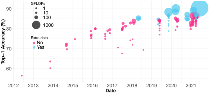
## Scatter Plot: Top-1 Accuracy vs. Date
### Overview
The image is a scatter plot showing the relationship between Top-1 Accuracy (in percentage) and Date (from 2012 to 2021). The size of each data point represents GFLOPs, and the color indicates whether "Extra data" was used (Yes/No).
### Components/Axes
* **X-axis:** Date, ranging from 2012 to 2021.
* **Y-axis:** Top-1 Accuracy (%), ranging from 60% to 90%.
* **Data Points:** Each point represents a data entry, with its position determined by date and accuracy.
* **Size Legend (Top-Left):**
* Smallest circle: 1 GFLOPs
* Small circle: 10 GFLOPs
* Medium circle: 100 GFLOPs
* Largest circle: 1000 GFLOPs
* **Color Legend (Left):**
* Pink: No (Extra data)
* Light Blue: Yes (Extra data)
### Detailed Analysis
* **General Trend:** The Top-1 Accuracy generally increases over time from 2012 to 2021.
* **2012:** One data point at approximately (2012, 56%), pink, very small size (close to 1 GFLOP).
* **2013:** No data points.
* **2014:** Three data points, all pink (No extra data). The accuracy values are approximately 60%, 63%, and 70%. The GFLOPs are small.
* **2015:** Two data points, both pink. Accuracy values are around 73% and 78%. The GFLOPs are small.
* **2016:** Several pink data points, with accuracy ranging from 75% to 80%. The GFLOPs are small.
* **2017:** Several pink data points, with accuracy ranging from 80% to 85%. The GFLOPs are small.
* **2018:** Several data points, mostly pink, with accuracy ranging from 82% to 86%. One light blue data point (Yes to extra data) with accuracy around 85%. The GFLOPs are small.
* **2019:** A mix of pink and light blue data points. Accuracy values are generally above 80%. The GFLOPs are small.
* **2020:** A cluster of pink and light blue data points, with accuracy ranging from 83% to 90%. The GFLOPs vary from small to large.
* **2021:** A cluster of pink and light blue data points, with accuracy ranging from 80% to 90%. The GFLOPs vary from small to large.
### Key Observations
* Accuracy generally increases over time.
* The use of "Extra data" (light blue points) becomes more prevalent in later years (2019-2021).
* Higher GFLOPs (larger circles) are more common in the later years (2020-2021), and they tend to correlate with higher accuracy.
* There's a noticeable jump in accuracy between 2014 and 2016.
### Interpretation
The scatter plot suggests that Top-1 Accuracy has improved over time, likely due to advancements in technology and the use of "Extra data." The size of the data points, representing GFLOPs, indicates that increased computational power also contributes to higher accuracy. The clustering of data points in the later years suggests a saturation point in accuracy improvement, where further gains may require significantly more computational resources or different approaches. The "Extra data" seems to have a positive impact on accuracy, especially in recent years.