\n
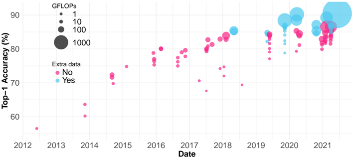
## Scatter Plot with Bubble Encoding: Top-1 Accuracy vs. Date
### Overview
The image is a scatter plot with bubble encoding, visualizing the progression of machine learning model performance over time. The chart plots "Top-1 Accuracy (%)" against "Date" (year). Each data point represents a model, with its size encoding computational cost (GFLOPs) and its color indicating whether "Extra data" was used in training. The data spans from approximately 2012 to 2021.
### Components/Axes
* **X-Axis (Horizontal):**
* **Label:** `Date`
* **Scale:** Linear, yearly markers from `2012` to `2021`.
* **Y-Axis (Vertical):**
* **Label:** `Top-1 Accuracy (%)`
* **Scale:** Linear, ranging from approximately 55% to 90%, with major gridlines at 60%, 70%, 80%, and 90%.
* **Legends:**
1. **GFLOPs (Bubble Size):** Located in the top-left corner.
* Smallest dot: `1` GFLOP
* Medium dot: `10` GFLOPs
* Large dot: `100` GFLOPs
* Largest dot: `1000` GFLOPs
2. **Extra data (Color):** Located below the GFLOPs legend.
* Pink/Magenta dot: `No`
* Light Blue/Cyan dot: `Yes`
* **Data Points:** Numerous circles (bubbles) of varying sizes and two colors scattered across the plot area.
### Detailed Analysis
* **Temporal Distribution & Color (Extra Data):**
* **2012-2017:** The plot is dominated by **pink dots** (`Extra data: No`). A single, very small pink dot appears near 2012 at ~57% accuracy.
* **2018 Onward:** **Blue dots** (`Extra data: Yes`) begin to appear and become increasingly prevalent from 2019 to 2021. The blue dots are generally clustered at higher accuracy levels (mostly above 80%) compared to the pink dots in the same time period.
* **Accuracy Trend (Y-axis vs. X-axis):**
* **Overall Trend:** There is a clear upward trend in Top-1 Accuracy over the years. The lowest accuracy points are in the early years (2012-2014), and the highest are in the most recent years (2020-2021).
* **Pink Series (`No` Extra Data):** Shows a general upward slope but with high variance. Points are scattered widely between ~60% and ~85% from 2014 onward. There is a notable cluster of pink dots around 2016-2017 between 75-80%.
* **Blue Series (`Yes` Extra Data):** Appears to have a steeper upward trend and less variance. From 2019 onward, blue dots are densely packed between ~82% and ~90%.
* **GFLOPs Trend (Bubble Size vs. Time/Accuracy):**
* **Temporal Trend:** Bubble sizes generally increase over time. The largest bubbles (representing ~1000 GFLOPs) appear almost exclusively from 2019 to 2021.
* **Correlation with Accuracy:** Larger bubbles (higher GFLOPs) are strongly associated with higher accuracy, especially in the later years. The cluster of high-accuracy blue dots in 2020-2021 contains many of the largest bubbles.
* **Notable Outlier:** A very large blue bubble (≈1000 GFLOPs) is positioned at the top-right, near 2021, achieving the highest accuracy on the chart (≈90%).
### Key Observations
1. **The "Extra Data" Divide:** The introduction of models using "Extra data" (blue) after 2018 marks a distinct shift. These models consistently achieve higher accuracy and dominate the top performance tier in recent years.
2. **Computational Cost Escalation:** There is a clear progression towards models with vastly higher computational cost (GFLOPs). The largest models (1000 GFLOPs) are recent and are among the top performers.
3. **Performance Saturation?** The highest accuracy values (88-90%) achieved in 2020-2021 by large, blue models show a tighter clustering, potentially indicating a plateau or slower rate of improvement at the very top end.
4. **Variance in "No Extra Data" Models:** The pink series shows significant vertical spread at any given time point, indicating that without extra data, model accuracy is highly variable and likely depends heavily on architecture and other factors.
### Interpretation
This chart tells a story of rapid advancement in computer vision model performance over a decade, driven by two key factors: **scale** (computational cost, GFLOPs) and **data** (use of extra training data).
* **The Data-Driven Leap:** The emergence of the blue series post-2018 suggests that leveraging larger or additional datasets became a critical, perhaps dominant, strategy for pushing accuracy boundaries. It correlates with a jump to a new performance tier (>85%).
* **The Scale Imperative:** The consistent increase in bubble size shows that achieving state-of-the-art results has required exponentially more computation. The largest models are not just more accurate; they are orders of magnitude more computationally expensive than their predecessors.
* **A Two-Pronged Progression:** The most successful recent models (top-right cluster) combine both strategies: they use extra data (blue) and are very large (big bubbles). This implies that the current frontier of performance is defined by the synergy of massive data and massive compute.
* **Peircean Insight:** The chart is an indexical sign of the AI research community's shifting priorities. The visual clustering of blue, large bubbles in the recent top-right quadrant is a direct trace of the field's movement towards data-centric and compute-intensive paradigms. The high variance in the pink series acts as a sign that architectural innovation alone (without data scaling) yields less predictable progress.
**Language Declaration:** All text extracted from the image is in English.