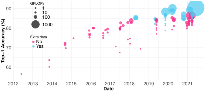
## Scatter Plot: Top-1 Accuracy vs. Date with GFLOPs and Extra Data Indicators
### Overview
The image is a scatter plot showing the relationship between **Top-1 Accuracy (%)** and **Date** (2012–2021), with two data series differentiated by **Extra Data** (Yes/No) and **GFLOPs** (computational power). The plot uses color (pink/blue) and dot size to encode these variables.
---
### Components/Axes
- **X-axis**: "Date" (2012–2021, annual intervals).
- **Y-axis**: "Top-1 Accuracy (%)" (50%–90%).
- **Legend**:
- **Extra Data**:
- Pink dots = "No extra data"
- Blue dots = "Yes extra data"
- **GFLOPs**: Dot size encodes computational power:
- Smallest: 1 GFLOP
- Medium: 10 GFLOPs
- Large: 100 GFLOPs
- Largest: 1000 GFLOPs
- **Spatial Grounding**:
- Legend: Top-left corner.
- Data points: Distributed across the plot, with blue dots (higher GFLOPs) generally larger and clustered toward the right (later dates).
---
### Detailed Analysis
1. **Data Series Trends**:
- **Pink Dots (No Extra Data)**: