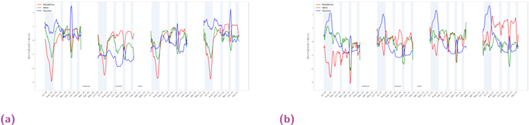
## Time Series Chart: Normalized Index Comparison
### Overview
The image contains two sets of time series charts, labeled (a) and (b), comparing normalized indices for "Residence", "Work", and "Transit" over a period of several months. Each chart displays these three categories as distinct colored lines, with the x-axis representing time (dates) and the y-axis representing the normalized index. The charts are segmented by vertical shaded regions, possibly indicating different phases or events.
### Components/Axes
* **Y-axis:** "Normalized Index" ranging from approximately -4 to 4.
* **X-axis:** Dates ranging from approximately July 2020 to February 2021. The specific dates are marked at irregular intervals.
* **Legend:** Located at the top-left of each chart.
* Red line: "Residence"
* Green line: "Work"
* Blue line: "Transit"
* **Vertical Shaded Regions:** Light blue vertical bands appear at irregular intervals, possibly indicating specific periods or events.
### Detailed Analysis
**Chart (a):**
* **Residence (Red):** The "Residence" index starts high, drops sharply in August, fluctuates, and then rises again towards the end of the period.
* Initial value (July 2020): Approximately 1.
* Lowest value (August 2020): Approximately -4.
* Final value (February 2021): Approximately 2.
* **Work (Green):** The "Work" index starts relatively high, decreases slightly, and then fluctuates within a narrow range.
* Initial value (July 2020): Approximately 1.5.
* Final value (February 2021): Approximately 1.
* **Transit (Blue):** The "Transit" index starts high, drops significantly in August, and then fluctuates at a lower level.
* Initial value (July 2020): Approximately 2.
* Lowest value (August 2020): Approximately -2.
* Final value (February 2021): Approximately 2.
**Chart (b):**
* **Residence (Red):** The "Residence" index starts high, drops sharply in August, fluctuates, and then rises again towards the end of the period.
* Initial value (July 2020): Approximately 1.
* Lowest value (August 2020): Approximately -4.
* Final value (February 2021): Approximately 2.
* **Work (Green):** The "Work" index starts relatively high, decreases slightly, and then fluctuates within a narrow range.
* Initial value (July 2020): Approximately 1.5.
* Final value (February 2021): Approximately 1.
* **Transit (Blue):** The "Transit" index starts high, drops significantly in August, and then fluctuates at a lower level.
* Initial value (July 2020): Approximately 2.
* Lowest value (August 2020): Approximately -2.
* Final value (February 2021): Approximately 2.
### Key Observations
* Both charts show similar trends for "Residence", "Work", and "Transit".
* "Residence" and "Transit" indices experience a significant drop in August 2020.
* "Work" index remains relatively stable compared to "Residence" and "Transit".
* The vertical shaded regions do not appear to correlate strongly with specific changes in the "Work" index, but they do seem to align with some fluctuations in the "Residence" and "Transit" indices.
### Interpretation
The charts likely represent the impact of an event (possibly related to lockdowns or seasonal changes) on people's movement patterns. The drop in "Transit" and "Residence" indices in August 2020 could indicate a period of increased restrictions or a shift in behavior. The relatively stable "Work" index suggests that work-related activities were less affected compared to residential and transit activities. The similarity between charts (a) and (b) suggests that they represent similar data or locations. The shaded regions may represent periods of specific interventions or policy changes that influenced these trends.