## Time-Series Line Charts: Normalized Values Over 2020
### Overview
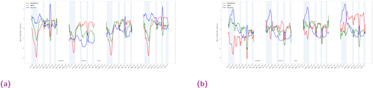
The image displays two side-by-side line charts, labeled (a) and (b), comparing the normalized values of three different series over the course of the year 2020. Both charts share the same structure, axes, and legend but show different data patterns. The charts appear to be from a technical or scientific report, likely analyzing the impact of an intervention against baseline and control conditions.
### Components/Axes
* **Chart Layout:** Two distinct charts arranged horizontally, labeled "(a)" on the left and "(b)" on the right.
* **Y-Axis (Both Charts):**
* **Title:** "Normalized Value"
* **Scale:** Linear scale ranging from 0.0 to 1.0, with major tick marks at 0.0, 0.2, 0.4, 0.6, 0.8, and 1.0.
* **X-Axis (Both Charts):**
* **Title:** None explicitly stated, but the axis represents time.
* **Scale:** Monthly intervals for the year 2020. Labels are formatted as "YYYY-MM" and include: `2020-01`, `2020-02`, `2020-03`, `2020-04`, `2020-05`, `2020-06`, `2020-07`, `2020-08`, `2020-09`, `2020-10`, `2020-11`, `2020-12`.
* **Legend (Both Charts):** Located in the top-right corner of each chart's plot area.
* **Blue Line:** "Baseline"
* **Red Line:** "Intervention"
* **Green Line:** "Control"
* **Background Elements:** Both charts feature light blue vertical shaded bands at irregular intervals, which may denote specific events, phases, or periods of interest.
### Detailed Analysis
**Chart (a):**
* **Baseline (Blue):** Shows moderate volatility. It starts around 0.6, dips in February, peaks sharply near 1.0 in March, drops again, and has another significant peak around July (~0.9). It ends the year near 0.7.
* **Intervention (Red):** Exhibits the most dramatic short-term fluctuations. It begins near 0.5, plummets to its lowest point (~0.1) in late January/early February, recovers sharply, and then oscillates with high frequency between approximately 0.3 and 0.8 for the remainder of the year.
* **Control (Green):** Appears the most stable of the three. It generally fluctuates within a narrower band, mostly between 0.4 and 0.7, without the extreme peaks or troughs seen in the other two series.
**Chart (b):**
* **Baseline (Blue):** Shows higher peaks compared to chart (a). It starts around 0.5, has a notable peak near 0.9 in March, another very high peak close to 1.0 in May, and a final major peak near 1.0 in October. It ends the year around 0.6.
* **Intervention (Red):** Also highly volatile but with a different pattern than in (a). It starts lower (~0.3), has a deep trough in February (~0.1), and then shows several sharp spikes, notably reaching near 0.9 in April and again in December.
* **Control (Green):** Follows a pattern somewhat similar to the Baseline in this chart, with peaks in March and May, but generally at a lower magnitude. It shows a significant dip in September (~0.2).
### Key Observations
1. **Volatility Contrast:** The "Intervention" series (red) is consistently the most volatile in both charts, characterized by sharp, rapid changes. The "Control" series (green) is generally the smoothest.
2. **Divergent Patterns:** The relationship between the series is not consistent. In chart (a), the Baseline and Intervention often move in opposite directions (e.g., March peak in Baseline vs. Intervention trough). In chart (b), they show more synchronized peaks (e.g., both high in May).
3. **Temporal Anomalies:** The deepest troughs for the Intervention series occur early in the year (Jan-Feb) in both charts. The highest peaks for the Baseline series occur in the spring (March/May) and fall (October).
4. **Background Bands:** The light blue vertical shading is present in both charts but its timing does not perfectly align between (a) and (b), suggesting it marks events specific to each dataset's context.
### Interpretation
These charts are designed to visually compare the dynamic behavior of three conditions over time. The "Normalized Value" y-axis suggests the data has been scaled, likely to allow direct comparison of different metrics or to protect raw data confidentiality.
* **What the data suggests:** The "Intervention" appears to induce significant instability or reaction in the measured variable, as evidenced by its high volatility. The "Baseline" represents the natural or untreated state, which also shows considerable variation, possibly due to seasonal or external factors. The "Control" serves as a reference, showing a more dampened response.
* **How elements relate:** The side-by-side presentation of (a) and (b) implies a comparison between two different scenarios, locations, or experimental runs. The differing patterns between the two charts indicate that the effect of the intervention (and the behavior of the baseline) is context-dependent. The shaded bands likely highlight periods where a specific external factor was active, allowing the viewer to correlate those periods with changes in the data series.
* **Notable patterns:** The most striking finding is the consistent, extreme reactivity of the Intervention series. An investigator would want to examine the events causing the sharp drops in January/February and the reasons for the high-frequency oscillations thereafter. The synchronization of peaks in chart (b) versus their opposition in chart (a) is a critical anomaly that would require explanation—perhaps indicating a confounding variable or a different underlying mechanism in scenario (b).
**Language Declaration:** All text in the image is in English. No other languages are present.